Mobile SEO: The ultimate guide

We are addicted to our smartphones. For many people, the smartphone is the first thing they check when they get out of bed in the morning and the last thing they look at before they go to sleep. People use them for everything – it’s huge! Mobile phones have dramatically changed our lives and how we use the web, and consequently, it has changed SEO. Mobile SEO helps you to reach customers and satisfy their needs while enjoying the experience. This guide to mobile SEO has lots of tips and tells you everything you need to know to deliver the perfect mobile experience.
Table of contents
- What is mobile SEO?
- Why is mobile SEO so important?
- Mobile SEO vs. desktop SEO
- Google looks at mobile sites first
- How to improve mobile SEO
- Mobile SEO is designing for performance
- Focus on user experience
- Optimize for local
- Finetune your mobile content
- Add Schema structured data markup to a mobile site
- A mobile SEO guide full of tips
What is mobile SEO?
Mobile SEO stands for mobile search engine optimization. Mobile SEO is about offering an exceptional experience to visitors of your mobile site. It’s about making your mobile site load quickly and without issues and presenting stellar content matching users’ search intent. Having a flawless mobile site is incredibly important in today’s mobile-first world — especially since Google crawls your site with smartphone crawlers.
Why is mobile SEO so important?
Mobile SEO is crucial because it helps you reach your customers in the right place at the right time and give them the very best experience. Mobile traffic has eclipsed desktop traffic. Billions of people interact with their smartphones hundreds of times a day. Our whole lives are in these devices – it’s almost scary to see how attached we’ve become to our smartphones. Many call it an extension of themselves and something they can’t live without. To reach these people, you need a mobile SEO strategy.
Mobile does not necessarily mean on the go. Studies have found that people often grab the nearest device to look something up quickly; more often than not, that’s their smartphone. They use it to inform themselves about products before deciding to buy something at any time or place. According to research by Google, smartphone users have a higher buyer intent than desktop users. They’re focused and ready to buy. It’s your job to be there when they are looking for your products or services.
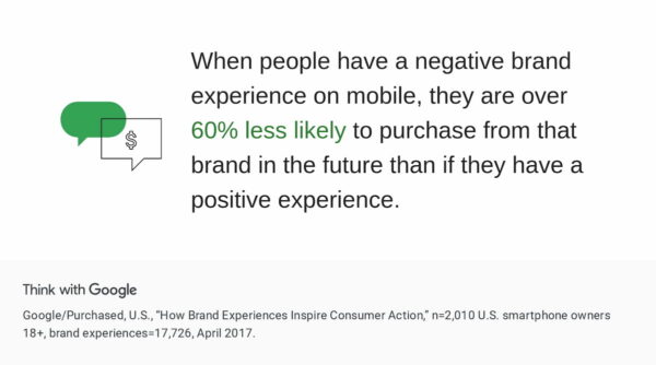
It is easy to see mobile SEO in terms of solving technical problems or content issues, but it is also very much a user experience and branding thing. Getting a bad experience from a brand on a mobile phone might scare away a potential customer forever. Offering a great experience increases the chance of consumers recommending your brand.
Mobile SEO vs. desktop SEO
There’s quite a difference between desktop SEO and mobile SEO, but the goals are often comparable. You want to reach your audience and convert them into paying customers. In some ways, desktop SEO tactics also work for mobile SEO, but in a slightly different form. Three significant themes apply: focus on performance, user experience, and content. In desktop SEO, you’ll often focus more on the general public, while mobile SEO can also have more of a local focus.
What is different, though, is the results you get on mobile versus desktop. Depending on your device, different results may pop up for the same search query. Plus, other factors influence the mobile search results, like your location. This means that getting a good ranking for your product or content on a desktop doesn’t guarantee the same result on mobile. When evaluating your performance on mobile, always keep an eye on the mobile search results.
In addition, it is always a good idea to regularly check what Google is doing on mobile, in general, but especially in your niche. Google continues its push for so-called rich results — often powered by structured data — which are more prominent on mobile. Think about it: searching for flights, events, jobs, movies, music, products, and even simple facts will trigger a Google-owned rich result. We’re going to see a lot more of this going forward.
Google looks at mobile sites first
The importance of mobile SEO is made even clearer by Google’s 2016 announcement of the mobile-first index. Google switched to the mobile-first index, so all sites should be indexed mobile-first. What does this mean? For the first time, Google will determine rankings based on the quality of the mobile version of the site instead of the desktop version.
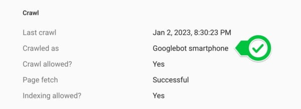
A smartphone version of Googlebot will crawl your mobile site and determine if its performance, content, and user experience are up to scratch. If so, you might get a better ranking. Other sites might rank higher if it is lacking, and you could lose out. Even if you’re not focusing on mobile, you will still be judged by your mobile site, so you have to take action.
What to look out for?
Right now, Google uses mobile-first indexing when evaluating sites. To get Google to discover and understand it correctly, you must keep your mobile site crawlable by removing all possible barriers, such as poorly loading scripts and not blocking stuff in your robots.txt. It also has to load lightning-fast if you want to be indexed well.
Google’s Gary Illyes wrote a blog post detailing some of the things you should take care of for the mobile-first index. These include offering the same awesome content on mobile and desktop sites, investing in structured data, offering the correct metadata, checking your hreflang setup, and ensuring that your servers can handle the increased crawl rate. Later, they added another post with even more possible improvements, like ensuring you serve images and video in the proper format.
Does mobile equal desktop?
You can no longer present less information on your mobile site than on your desktop site. Your content has to be identical on both because you will only rank based on the information on your mobile page. Don’t hide stuff! We wrote a post about the so-called mobile parity. Or, as former Googler Maile Ohye told us in an interview:
“To “optimize” for the mobile-first index, make sure that what you serve to mobile users is the version of the content you’d want Google to index, not a pared down version, or a version that gets updated later than desktop, or a version that redirects to the mobile homepage.”
Maile Ohye
Don’t forget to tell Google your site is mobile-friendly. You can add a viewport declaration – if you’re using responsive design – or a Vary header when using dynamic serving. More on this later – or in Google’s developer documentation.
Read more: 5 things you need to know about mobile-first indexing »
Google’s focus on Page Experience
In May 2020, Google announced a ranking factor called Page Experience. Page experience is becoming an important aspect of SEO, and it refers to the overall quality of user interactions with a web page. As a search engine, Google is highly concerned with providing its users with the best possible browsing experience. To ensure this, Google uses a set of metrics known as the Core Web Vitals to evaluate the quality of a web page’s experience. These metrics include factors such as the time it takes for the page to load, the level of interactivity and responsiveness, and the stability of the content as the page loads.
For example, a web page that takes too long to load, has a poor layout and has unstable content while loading will be considered a poor page experience. On the other hand, a page that loads quickly, has a clean layout, and has stable content will be considered to have a good page experience.
Offer a great experience
Google uses these metrics to determine the ranking of web pages in its search results. Pages with good page experience are more likely to be ranked higher, while those with poor page experience are less likely to be ranked as high. This means that having a good page experience can help increase the visibility of your website and ultimately drive more traffic to your site.
While Google has advocated site speed for years, the page experience update adds something new: user experience. For the first time, Google considers how users experience a site. The Core Web Vitals metrics help you make sense of the perceived page experience and prioritize improvements.
How to improve mobile SEO
Mobile SEO is – like regular SEO – all about ensuring your site is crawlable and findable. Also, you need stellar performance, great content, and a flawless UX. To get it right, you need to know how your site is currently performing and what your visitors are doing. For example, will people use the same keywords on mobile to find you? People often change how they search while using a mobile device. And what do you want people to do? Offering to navigate to the nearest Whole Foods is less than ideal when you’re on a desktop machine. It makes total sense on your smartphone, though.
Mobile SEO tips, hints and tools
You need to become best friends with Google Search Console and PageSpeed Insights. Its tools are legendary and a big help if you want to find out how your site is doing in the search results and how it is performing. For instance, using the Performance Report, you can see how mobile and desktop users use words to find what they need. Are you targeting the right words? Should you focus on something else?
Googlebot needs to be able to crawl your JavaScript, CSS, and image files to index your site correctly. There is a handy tool for this inside Search Console: URL Inspection. This tool lets you see exactly how Googlebot sees and renders your content. When the screen doesn’t align, and the tool lists errors, you’ve got work to do.
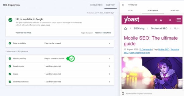
Mobile Usability tool
Another Google Search Console feature that makes your life easier is the Mobile Usability report. This tool checks your site and presents an overview of posts and pages that don’t follow Google’s mobile-friendly rules. It is an excellent way to start improving your mobile SEO with the tips you get.
Other tools
Some other great tools to up your mobile SEO game are Google’s Rich Results Test, Lighthouse, Analytics, Semrush, Ahrefs, Ryte, ScreamingFrog, and SimilarWeb.
Read more: Google Search Console: Search appearance
Read more: DIY: Test your mobile site
Mobile SEO is designing for performance
The first thing you should focus on when improving mobile SEO is performance. Performance almost entirely boils down to page speed. It’s a no-brainer: the faster your site is, the happier your users will be — and, by extension, Google. It’s well known that a site has to load within a couple of seconds, or your visitors will give up and go elsewhere. If you combine this with the fact that sites are only getting bigger, you have your work cut out.
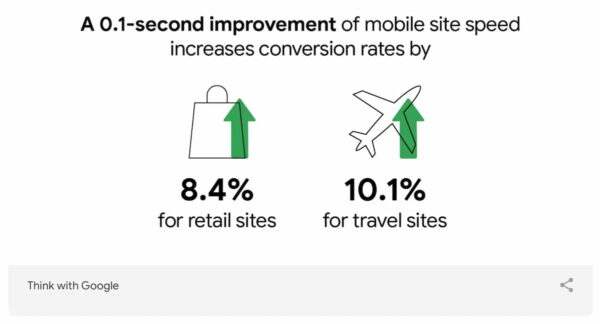
Optimizing performance, however, is a continuous process. Your site will never be fast enough because there’s always more you can improve – that’s ok, and there’s no need to rush out to score 100/100 on every speed test. By closely monitoring your mobile site’s performance, you can immediately jump onto every opportunity to improve it. Google loves fast sites, and so do your customers.
Read more: How to improve your mobile site
Read more: What is page speed, and how does it influence SEO?
Responsive design vs. dynamic serving vs. separate domain
While developing your mobile site, you’ll have three options: responsive design, dynamic serving, or a separate site on a subdomain. Google prefers responsive design because you only have one site that adapts to the device it’s used on. There’s only one code base, so maintenance is easy. According to Google, responsive design will make your site eligible for addition to the mobile-first index. Always let Google know that your site is mobile-friendly by adding the meta name=“viewport” declaration in the head of your documents.
<meta name="viewport" content="width=device-width, initial-scale=1.0">Dynamic serving
Dynamic serving takes a different approach. It uses server-side technology to serve a different version of your site to mobile users, depending on how they access it. The URL stays the same, but the files sent are completely different. You need to add the Vary header to get Google to crawl your site. This way, Google immediately knows it will receive mobile-optimized files from somewhere else. A Vary header appears like this when a browser makes a request:
Vary: User-AgentA separate domain
The third option is a separate mobile site on a different URL, usually an m. domain, like m.example.com. Google supports this method only if you connect your desktop and mobile domains correctly. Use rel="alternate" and rel="canonical" to tell Google how these pages are connected. You can find more on these different types and how it uses these on Google’s developer’s pages. Or you can read our rel=”canonical” ultimate guide.
Improve page speed of your mobile site
One of the most important tips for mobile SEO is improving page speed. PageSpeed Insights shows you exactly how fast your site loads on mobile and desktop. It also suggests performance-improving enhancements. Use this alongside the Developer Tools in browsers and the Page Experience Report in Search Console to see how your site renders its contents.
Meet the three Core Web Vitals
Among other things, PageSpeed Insights looks at the three current Core Web Vitals metrics:
- CLP (largest contentful paint): The largest contentful paint happens when the largest element of a requested page appears on the screen. A good grade gives users the feeling that the site loads fast. A slow site can lead to frustration.
- FID (first input delay): The first input delay is the time between a user’s first interaction with an element on the requested page and the reaction of the browser to that input. How quickly your page reacts to input is of utmost importance for it to appear fast and responsive.
- CLS (cumulative layout shift): The cumulative layout shift measures the total time of movement on screen that happens during loading. This gives you an idea if stuff is jumping around, which could make your site appear jerky.
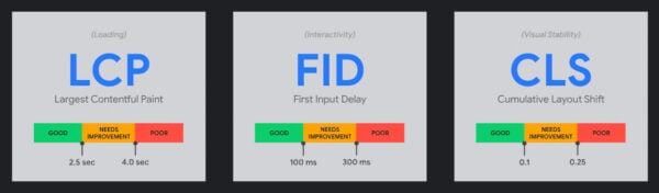
Type in your URL; Insights will give you two scores: mobile and desktop. These will be different. If your score is red, you have much work to do. Orange means an average performance, and green is good. It’ll give you suggestions on enhancing the performance of your site. Follow these suggestions, and you’ll be on the right track. Try to get the Core Web Vitals in the green, but don’t overdo it.
But…
I hear you thinking:
“Nobody has a score of 0/100, right?”
Well, think again. A combination of factors can do your mobile site a lot of harm. Find a bad hosting provider, install WordPress on a crappy shared hosting platform, activate thirty plugins, and upload a hundred non-optimized images to your blog, and you will score poorly. Even huge sites with big budgets score badly. But these things can be fixed. Run PageSpeed Insights and other speed analysis tools and follow their advice.
Which mobile SEO tips can help improve your site speed?
- Optimize images and use fewer images (implement lazy loading and add proper dimensions for images in CSS)
- Invest in quality hosting
- Update PHP version to the most recent version
- Keep your redirects in check
- Fix render-blocking content above the fold
- Prioritize visible content
- Optimize and minify CSS, HTML and JavaScript
- Cache your assets
- Use a CDN
- Make the transition to HTTP/2
- Upgrade to HTTPS
- Load fewer assets like JavaScript libraries
- Load fewer ad servers
- Improve server response time
To help you, we’ve listed five things you can do to boost your Core Web Vitals. When improving your page speed, you should always ask yourself if you need all these assets, libraries, images, plugins, theme features, et cetera. The famous saying “less is more” is still as valuable as ever.
Read more: Site speed tools and suggestions »
Progressive Web Apps (PWA)
PWAs offer another way of targeting mobile users. A progressive web app (PWA) is an all-in-one solution that works on all devices for all users. It’s the perfect crossover between the app world and the web world. The web app works like an app without publishing it in an app store. PWAs combine the load speeds of mobile sites with the best functionality of a native app. When done correctly, a good PWA might fool users into thinking they are using a native app. Google has resources if you want to know how to create indexable PWAs.
Thanks to technologies like service workers, the browser can do much more in the background while keeping the front end updated in real-time. This makes it a good option if you need an app but can’t justify the cost. There will be a lot happening with progressive web apps in the next few years. Every major browser- mobile and desktop- now supports service workers, even Apple’s Safari on macOS and iOS.
Focus on user experience
Besides being easily found and lightning fast, your mobile site should offer an enjoyable user experience — especially now Google will factor it into their algorithm. Find out which common tasks your customers have on your site. What is their search intent? Try to remove obstacles and ensure users can achieve their goals quickly. There’s a lot you need to consider when optimizing user experience. Here are a couple of things you need to think about:
- First and foremost: don’t forget your customer!
- Make your site mobile site useful and enjoyable
- Make your site search useful and easy to find
- Fix your font size: your typography needs to be top-notch.
- Keep enough room between the clickable elements.
- Make your sub-menu clickable, so users don’t automatically go back home instead of the submenu.
- Put your phone number on the homepage and make it clickable. This way, people can call you if they want to do business.
- Don’t make users pinch and zoom to see – and use – your interface.
- Make your buttons large enough for your fingers.
- Fix your forms: bad forms are unusable on mobile.
- Cut the clutter.
- Test, adjust, and test again!
Read more: 10 ways to improve mobile UX »
Optimize for local
While we use our smartphones in our homes, these devices become even more helpful when we’re out and about. Google found that 76% of people who searched for something nearby visited a related business within a day. 28% of those visits led to a sale.
To cope with that local demand, or so-called near me searches, you need to work on your local SEO. Local search results can look very different from regular desktop searches, so you must know what to target and how to target it.
Tip to improve your mobile site for local search
Here are some ways you can improve your local SEO for mobile:
- Write locally oriented content: It’s one of the best things you can do to improve local rankings.
- Build local links: Ask, and you shall receive.
- Google Business Profile: Previously known as Google My Business, you should definitely sign up and fill in your details. Here, you can keep your NAP data up to date, respond to reviews and upload photos, among other things.
- Reviews: Ask your customers for reviews, mark them up with structured data and present them on a particular page on your site. This does wonders.
- Photos: Take beautiful pictures of your business and add them to your Google Business Profile.
- Schema.org: Add structured data for NAP details, products, reviews, etc., and you get rich mobile search results like rich cards or carousels.
- Contact details: Make sure your contact information is always correct and up to date. If not, fix it.
- Yoast Local SEO for WordPress plugin: This plugin can do a lot of the hard local SEO work for you.
Read more: Local search and local SEO, the ultimate guide
Read more: Ultimate guide to small business SEO
More to read: Local ranking factors that help your business’ SEO
Finetune your mobile content
Smartphone screens are small. On that screen, the text gets truncated and wrapped in a seemingly never-ending stream of paragraphs. Users have to scroll endlessly. Text on a mobile screen can potentially give any web designer a headache. But the design – and use – of text is of crucial importance to the success of your site. If your site is unreadable or just plain ugly, people will not read your 1,000-word article. Well, maybe not even your 100-word summary. Fix your typography.
People read a lot on their smartphones, but you have to make it as easy as possible for them to do so. You also need to make sure that your content is up to scratch.
Read more: Optimize your mobile content
Write for the small screen
Always keep the restrictions of the small screen in mind when creating or editing content. Don’t use too many long sentences, keep your paragraphs to around four sentences and break up text using bullet points, lists and headings. Nothing is more daunting to your visitor than a massive block of unformatted text. Check your content on a smartphone to see how it looks and find ways to improve it. The Yoast SEO Premium analysis can help you improve your content.
Read more: Copywriting for mobile
Write better meta descriptions and titles
Google shows less information in the search results on mobile than on a desktop. Your meta descriptions and your titles will be truncated if you make them too long. Think about that when you optimize your posts and pages. You lose several characters when optimizing your meta descriptions and titles for mobile. In Yoast SEO’s Google preview, you can switch between a mobile and desktop preview. This way, you can compare the differences between the two and find the perfect middle ground. Yoast SEO also uses the titles and meta descriptions to fill your structured data, so make it clear to search engines what your page is about.
Read more: The Google preview in Yoast SEO
Prepare for voice search
When working on your content, you should account for voice search. Yes, it’s been around for a while, but with the popularity of Apple’s Siri, Amazon’s Alexa, and Google’s Home assistant, things are moving faster. More and more people are using their voices to perform actions on the web, and your content has to provide the answers. If done correctly, you might kill two birds with one stone: you’ll not only respond to questions mobile users have, but it might also lead to so-called featured snippets or answer boxes on desktop searches. Getting a featured snippet almost guarantees your content to be a top answer for assistants. Curious about what’s powering conversational search?
To prepare for voice search, you need to take a good look at your current content. Ask yourself, does it answer any question a user might have? If not, change it. Find out which questions people use to find your content and optimize for that. Use Google’s autofill or tools like Answer the Public or AlsoAsked.com to find ideas for questions to answer.
Read more: How to prepare for voice search
Add Schema structured data markup to a mobile site
Structured data is incredibly important. Using structured data markup to describe elements on your site, you can open a line of communication with search engines. Structured data in the form of Schema.org makes it clear to search engines what all the different elements on your site mean. If done correctly, search engines can use this data to give you highlighted search results, known as rich results or rich snippets. This way, your site immediately stands out from the crowd, which could lead to a higher click-through rate.
Structured data allows for many new ways of presenting search results. For instance, the rich results we see in the carrousel use data you can add to your mobile site. The result is a snippet that is mobile-optimized and very attractive to click. Since Google is heavily investing in improving and expanding the types of rich results, these might be your ticket to enhanced visibility. Try to get those featured snippets!
Structured data is one of the most important topics to get your head around. See our structured data course for an easy way to learn how to add structured data to your mobile site. This course is part of our Yoast SEO Academy training subscription.
Yoast SEO takes care of your Schema needs

Adding Schema to your site has always been a struggle — but not any more! Yoast SEO is making it easy for you. The popular WordPress SEO plugin automatically adds an extensive list of Schema structured data properties to your site. Not only that, Yoast SEO also ties everything together in a neat graph. This graph makes it incredibly easy for a search engine to understand the true meaning of your site.
That’s not all, because the free Yoast SEO structured data content blocks turn the WordPress block editor into a helpful tool to craft FAQ pages and how-to articles — with more block types to come. Both of these Schema types have a relatively easy-to-get rich result on mobile attached to it.
Read more: Structured data with Schema.org: the ultimate guide
A mobile SEO guide full of tips
This ultimate guide to mobile SEO gives you many tips to improve your mobile site’s performance. Mobile SEO should always be a work in progress because there are always new developments, but also technologies arrive and are superseded. The world is always changing, and you need to keep up. If you do, the rewards can be great.
So, what are you waiting for? Get your smartphone, check your site on a mobile browser and find and fix those issues. Use this mobile SEO guide well because this is an important topic! This is the time to take action because you might get left behind if you don’t.
Keep reading: WordPress SEO: The definitive guide to higher rankings for WordPress sites »
