10 ways to improve mobile UX

You have a mobile website, right? Is it responsive or did you use a plugin to make it look good? Does it convert? As mobile internet usage has exploded over the years, your mobile website’s user experience (or mobile UX) should get as much attention as the user experience of your desktop website. Even more so, as Google will increasingly judge your site based on your mobile version. In this post, I’d like to share ten things you can do to enhance the User Experience (UX) of your mobile website.
Let me make a differentiation to start with. Although all things mentioned in this post also apply to tablets, we had smartphones in mind when writing this post. But, in 2020, you not only have to keep smartphones in mind as many other devices can consume your content. Reading this post on your smartwatch? Sure, why not.
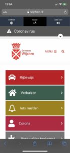
1. Use a task-based design
Design your mobile website and its structure with the user in mind — while not forgetting about mobile SEO. Your user uses a mobile phone. They might be on their way to whatever and needs to check something on your website. What could that be? Think a moment about the things visitors do on your website (check Google Analytics, use common sense about your business or conduct proper testing). Decide on top tasks for your mobile website.
According to top task expert Gerry McGovern, top tasks are the small set of tasks (usually less than ten, often less than five) that matter most to your customers. These are the key tasks that users expect to do quickly on your site. Optimize your mobile site in such a way that these tasks are accessible with the most ease possible.
David Allen already told you. You need to get things done. If someone finds your website and starts browsing it, make sure they can easily find and complete what they wanted to do. On their mobile phone, there are probably loads of apps that they are used to using. Being on a mobile device might make it harder for the user to focus. Distractions are everywhere, not just on the phone. Design your mobile UX to make sure they get things done, before switching to other apps instead.
2. Add a clear menu and a search option

One of the main elements of mobile UX is search. You have to be able to search at a moments notice. A search option should always be available when reading a page, when clicking to another. The thing is that although we strive to present the easiest website possible like mentioned in the above section, there will always be elements that just don’t fit in that easy. For all that content, it would be good to use a mobile search option.
If you are a real estate broker or sell clothes online, that search option might as well be the most important element on your mobile homepage. Please show that search option in the content area in that case, and make it available via the menu bar on other pages.
One more thing about mobile UX related to search: having the option is just step one. Make sure your internal search result pages look awesome as well. The results should be ordered on relevancy, for instance, on both desktop and mobile. Make sure individual results can be distinguished, so improve the separation of results.
3. No dividers needed
About that lack of separation; that doesn’t mean you should use all kinds of dividers on your mobile website. Dividers take up space, and that might have a negative influence on mobile UX instead. Think of ways to style elements, so they all look like separate sections, without the need for a divider. Use borders, white space, headings. There are lots of things that can be done to improve that mobile UX without adding line elements that just take up space. Of course, it’s not prohibited to use them. Just make sure they fit in and don’t distract users from doing their tasks.
4. Use short forms
As on your desktop website, your mobile site could or should aim for conversion. Buying products, or getting a quote for your services. Subscribing to your newsletter or simply filling out a contact form are all actions that need user input. On a mobile phone, six-page forms ruin the mobile UX. Users might fill these out, but it is mighty big might as it is a six-page form.
For optimal mobile UX, you want to keep forms as short as possible. Remove all the things you want to ask but don’t need. Newsletter? Just the e-mail address (with a <input type="email"> input field). Quote? Last name and e-mail address. Shop? Delivery address invoice address Address. Or at least an option to copy the delivery address to the invoice address. Do make sure you are following the GDPR guidelines, though!
5. Tone it down
You might think your desktop site looks fantastic with all those colors and huge images, but on your mobile website, the effect will be perceived differently. There will be less focus. Your website doesn’t have to be black and white only, but a nice white background, black letters and one or perhaps two supporting colors is enough for a better mobile UX.
Do make sure that your mobile site and desktop site have mobile parity — they should offer the same experience on mobile as well as desktop. This not only goes for the content, but should also go for the design. Plus, today, when you are evaluating your site you should always look at it from a mobile-first perspective. So, should you ever start a redesign project for your site — do it mobile-first.
Toning things down also goes for your wild animations and such. Every non-essential bit of JavaScript that you add to your site makes it harder to load and run. Plus, animation don’t always make sense on a mobile site. Keep your site lean and mean!
6. Button hit areas
It’s so obvious, yet still a cause for concern. Mobile websites are mostly browsed by using fingers and thumbs and buttons don’t always provide enough space to hit them easily. In Google’s developer documentation, you can find this under Accessible Tap Targets. And we need to be able to click elements with that thumb as well.
In that Google article linked above, you can find numbers for that tap target:
A minimum recommended touch target size is around 48 device independent pixels on a site with a properly set mobile viewport. For example, while an icon may only have a width and height of 24px, you can use additional padding to bring the tap target size up to 48px. The 48×48 pixel area corresponds to around 9mm, which is about the size of a person’s finger pad area.
In addition, the usability experts at Nielsen found that touch targets on mobile should have a rendered size of at least 1 cm x 1 cm to prevent errors and frustration. Closely related to button hit areas is the way touch elements are often too close together — something Nielsen also described in that research article. It’s annoying to click a link and end up somewhere else, just because the link next to it is too close to the link you wanted.
7. Don’t use too many font sizes
Typography can make or break a mobile website. Not only is the type of font you pick of importance, but the sizes of those fonts as well. You can’t just use all the desktop font sizes on your mobile website. There are two reasons for that:
- The mobile screen size. You don’t want the title to fill the screen; you want to make sure the article starts within the first view of the page. Neither do you want the base font (like your paragraph font) to be too small to read without having to pinch and zoom.
- You’ll create a mess when using more than three font sizes. The size differences will be much more visible. That’s why you should limit the number of font sizes to two, maybe three.
Google’s mobile-friendly tests even check if your font sizes are in order. This mostly goes for the body font, but still.
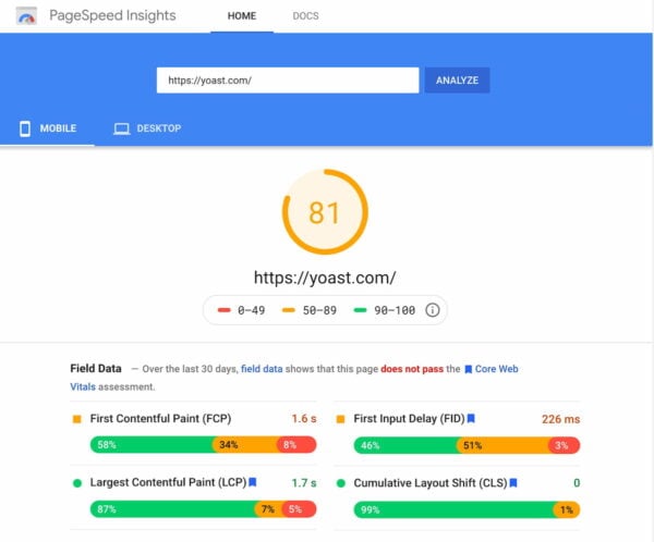
8. Optimize for speed
Another major factor for the right level of mobile UX is speed. There are multiple tools to check site speed. Most of the time, there are several things you can do enhance performance. The first one always seems obvious: image optimization. You should at least reduce image size using tools such as Squoosh. In addition to that, you should combine and minify the CSS and JavaScript files that are loaded. The fewer connections to the server that needs to be made, the faster your website will be and the better the mobile UX. Of course, you should also use great hosting as that often turns out to be a quick win for many sites.
Site speed is a hot topic at Google. Not too long ago, they announced a new set of metrics called the Core Web Vitals. These metrics give Google insights for a new ranking factor: Page Experience. In 2021, mobile sites will be also be judged on the experience they offer users. Of course, site speed is one of those factors. Read up on the three Core Web Vitals and follow the five ways to enhance your page experience for your mobile site.
9. Don’t go overboard with ads
Many sites use ads to make a little money and that’s totally fine. But what you shouldn’t do is scare the user with pop ups and the like. You don’t really respect the user when the first thing you let them experience is a sign up form for your newsletter. Make sure that stuff loads properly before you introduce your ads and CTAs. Plus, keep them tasteful and toned down. You are looking to build a connection and form a relation with a user and that doesn’t happen when you flash BUY MY STUFF in their face the second they get on your mobile site. This is a bad user experience — and one that might even get Google angry.
10. Test your mobile UX again and again.
When serving a responsive website to your visitors, you need to make sure that every change on your desktop site is also tested on the mobile version of your site. That is the only way you can make sure your mobile website is always up-to-date. Make sure to test your mobile site again and again.
So, in conclusion, mobile UX is about a lot of things. In this article we have discussed these ten ways to improve your mobile UX:
- Use a task-based design
- Provide a good menu with a search option
- No need to add dividers when sections are clear to begin with
- Make forms as short as possible
- Don’t add too many colors in your design
- Make sure buttons and links can be clicked
- Don’t go overboard with font size variations
- Make your website as fast as possible
- Don’t do intrusive ads and pop ups
- Test all changes to your website on mobile devices
Looking forward to your tips!
These are just ten things of the many things we think you should take into consideration when optimizing your mobile UX. We’re sure you can come up with more, and we’re looking forward to your thoughts on the subject: what other things do you feel a mobile website should take in account?
Read more: Mobile SEO: the ultimate guide »
The speed of my blog is 91 on the desktop, but it is showing 37 on the mobile view.
How I can improve the speed of the mobile view?
Hi there, I believe this article will be able to help you improve your site speed on mobile: https://yoast.com/mobile-seo-ultimate-guide/#pagespeed
Good luck!
Improving mobile UX is a good idea as more and more people are using their hand held devices daily.
According to recent predictions, there are high chances that the results of digital marketing would start varying and depend on how well the website has been optimized for the mobile in the future. While we all might be addicted to smartphones, not all of us are able to work our way around the technology to benefit our business as well, apart from social media. I would like to take a moment and commend the writer of this blog for bringing to the fore subjects that would teach rising businesses and websites a lot about mobile search engine optimization so that they can make the most of their website.
Thank you so much! I’ll pass it on :)
Do you think that it plays a role where you are from when it comes to pagespeed test? Because I have tested your website on pagespeed insights and the “best” result that I’ve got (of your website) was 75 (usually it was in the 60’s range). Desktop version only variated from 93-95…
Of course, still WAAAAY better than my current website, but the new one is going live by the end of the year…
Hi Luka, thanks for your comment! The results of these tests tend to fluctuate, so this can explain why you’re getting different results :)