Mobile parity: does your site offer a singular experience?

You might have heard the term parity before in SEO, specifically mobile parity. It all comes down to one thing: you should see your site as a single thing. You shouldn’t have a ‘mobile site,’ as distinct from a ‘desktop site.’ You should have one site — which may use CSS to display elements differently based on the device viewport. As Google switched over to mobile-first indexing, it is good to remind you that your site’s mobile view should offer the same experience as your desktop view. Let’s see what that means.
Table of contents
What is mobile parity?
We talk about parity when we look at the complete experience a site offers — it should provide the same experience in a device-specific way. Before Google started to treat the mobile view of your site as the defacto version of your site, we’d compare a desktop site to a mobile site. Are both similar, or even better, the same? Does your mobile site resemble the desktop site, or are there differences?
Today, you shouldn’t think in terms of mobile and desktop sites anymore. You should see your site as a single thing. With mobile-first indexing fully rolling out, Google will use what it finds on the mobile view of your site to judge the experience you offer.
If you have different sites for reasons, ensure that the mobile experience is the ‘main’ version — i.e., the optimized site for mobile visitors. Hiding big text blocks on the mobile view only to show these on the desktop view is, therefore, a no-go.
Do a parity audit
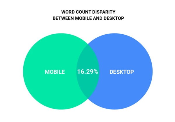
Digital marketing expert Mike King wrote a thought-provoking article discussing why he thinks the lack of mobile parity might impact many sites this year. He concludes that many sites still don’t match their various experiences and that mobile sites have fewer internal links and a lower word count than their desktop counterpart. This is disconcerting because your site will be judged on your mobile view, and if you offer less, Google sees less.
To help get more insights on your site’s parity, he even built a tool called Parito that audits your page based on various contexts — crawler combinations. Try the tool and see how similar your mobile and desktop views are!
Let’s go over a number of things that relate to this mobile parity.
Content is king
Yes, content is king. And it shouldn’t matter which device someone uses to visit your site to read your content. They are looking for specific information or a specific product, so you better make sure the content is singular. Don’t hide larger images on a mobile device or put some more content behind tabs. Make everything available in a single, recognizable way.
A consistent experience on all devices
Looking at your website’s experience, you need to ensure that it sends the same “message” on every device. We’ve seen fantastic desktop sites with a mobile version that has been very toned down. There’s no need for this — only a singular user experience provides users with the same look and feel and content everywhere. The same will go for Progressive Web Apps and similar developments. If the content structure aligns with your website, make sure other things align.
Think beyond strict device-specific boundaries
Ever thought that your site might be visited on a smart fridge? The boundaries of traditional mobile and desktop devices have to go. Your site should offer a singular experience, whatever the device. For now, Google ranks your website based on the mobile view of your website, so there might be work to do. In the past, many website owners, web designers, web agencies, etcetera, created and sold mobile sites as an extra to a desktop site. “See how this website looks on your computer screen and how it gradually slims down to your mobile device” is a sentence of the past. It is now device agnostic.
Quality matters, contents matters, design, UX, and branding matters. Make sure your website covers all your bases and gives it a quality look and feel. Ask yourself: If you wouldn’t have a desktop site, would you still be able to get the same conversion/traffic/engagement results on your website as you currently do?
Check your internal links
In everything related to mobile parity, internal links seem to surface as a point of attention. People hide things, remove things, change things when making a website responsive. They kill a sidebar, reduce the number of footer links, might even change the menu. All these actions affect the number of internal links a page has.
Internal links influence SEO, just like external links to your website do. They play an essential part in setting up cornerstone content and most other content strategies. You change your site structure with every one of those changes. With mobile-first indexing, your mobile site becomes most important, so you might ruin that structure just because your site lacks parity for the internal links.
It’s not just the visual stuff
Of course, other issues may arise. Do all those 301 redirects work correctly in all instances and on all devices? Most of those will probably work without a problem, but there are always things getting overlooked. Make sure your site is appropriately responsive so Google can crawl it from a single smartphone crawler. There are all sorts of stuff to consider, like canonical links, robots meta tags, etc. You don’t want to go wrong here.
Your mobile site is your site
We hope we have given you some food for thought for your own website. Mobile parity is something you need to check, to make sure your visitors and Google aren’t missing out on anything. Prevent that your focus on desktop doesn’t hurt your rankings!
Read more: Mobile SEO: the ultimate guide »

So what about AMP format? If we rely on it for our mobile version, Google however will not consider it?
What a (nasty) joke that Google insists on mobile parity when their own products don’t have it!. I can’t tell you how many times I’ve had to request the “desktop site” (on my phone) to get something accomplished. Shame on you Google!
Hey David. Yeah, I understand your frustration. We shouldn’t focus too much on Google, though. We should focus on building the best possible site for our users. That’s where our energy should go. Good luck!
I shall use them all!
That’s great, good luck!
çok faydalı bir yazı teşekkür ederim
rica ederim :)