The importance of typography
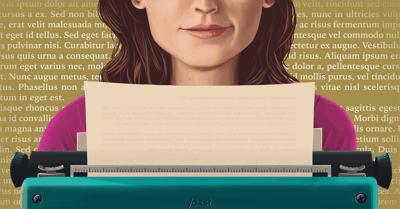
For a blog, it’s of great importance that people can read the texts of your post properly. Reading from screens is hard, so make sure you don’t make it any harder than it already is. In this post, we’ll give tips on how to improve the typography of your blog.
Typography and readability
The readability of a particular text depends both on its content (for example, the complexity of its vocabulary) and its typography. In my previous post about readability, I gave tips to make sure the complexity of your text is adapted to your audience.
Typography is the science of arranging your letters in order to make written text readable and appealing. Before digitization kicked in, typography was a specialized occupation, nowadays typography is something everybody has to deal with, at least everybody who owns or maintains a website. Typography involves selecting typeface (font family), font size, line length, line-spacing and letter-spacing.
Font
Font size
Make sure you use at least 14 pixels for your font size. That size is a good read on both the larger desktop screens and our mobile screens. The preferred font size for a website nowadays is much larger than it was ten years ago. Back then, a font of 10 pixels allowed you to add more text to a page and made your page look more like a book. With the growth of computer screens, nowadays 16 pixels is very normal.
Font color
What font color to use is largely depending on the type of blog you have and what design your website uses. In general, we say that using a black font on a white background is still the best read. The general thought is that outlines are sharper and letters are easier to distinguish and identify.
The one thing you should do regarding font and background color, is test the contrast of your font color and background. There are a number of tools available, all with their own kind of contrast checker. A really easy and good one is Colorable. Colorable allows you to enter the foreground (text color) and background (background color). It will tell you immediately if the contrast is right or wrong and what score the combination of colors gets. Colorable is based upon the WCAG accessibility guidelines.
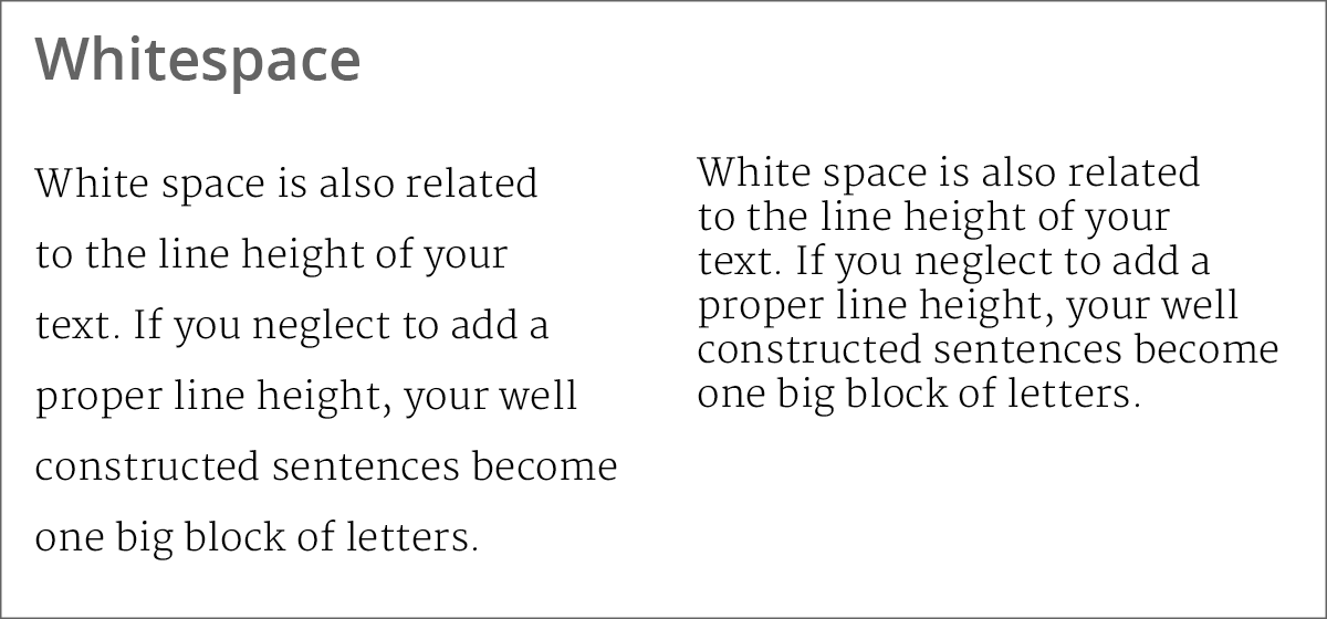
Whitespace
Next to font size, you also want to make sure that the text has sufficient room to breathe. If you’re using a larger font size, but forget to add whitespace for headings and paragraphs, your text will still be unreadable. Whitespace is especially important on a mobile device.
Besides adding enough whitespace between headings and paragraphs, you should also add enough whitespace between the lines. If you neglect to add a proper line height, your well-constructed sentences become one big block of letters. This is far from user-friendly and will make your page very unappealing for a visitor.
Typography of links
The design of the links in your texts itself is important. Of course, backlinks are important for SEO. However, the design of the links is important for Usability. Make absolutely clear what’s a link and what isn’t. You can do so by picking a different color or by adding an underline.
To emphasize the link you can easily combine the two options above. Also, make sure you change the style when hovering your mouse cursor over the link. Remove the underline or change the color.
Line length
A final thing to consider when it comes to typography is the length of your text lines. In Readability: the Optimal Line Length, Christian Holt mentions a number of suggested text lines, stating these should be 50 to 65 or 75 characters. Ilene Strizver states that non-justified text should be 9 to 12 words per line, and justified text should be 12 to 15 words. From our experience, 10 to 15 words is indeed a good read.
Conclusion
Making sure your text is nicely written and not too difficult is only one aspect of readability. In order to read a text properly, the typography of your text should be OK too. Make sure to use a decent font size, think about the contrast of the colors you use and add whitespace. Focusing on both aspects of readability (typography and difficulty) will make sure that people will start and keep reading your blog posts.
Read more: 5 tips to improve the readability of your post »

This is really a very good post. Quality of content is what always gets the visitors coming.
One thing I’d add is paragraph length. As most web users switch to a mobile-first approach, keeping paragraphs to a couple of sentences is good for mobile screens.
Excellent article! When it comes to fonts, which ones would you recommend using to maximize readability?
Hi Dayanna… I generally use SF UI Display & Din Pro while designing website. And thanks Marieke for sharing typography experience with us.