Contact page examples: What makes a great contact page?

In this post, we’ll go over a number of contact page examples, so you’ll be able to review your own contact page and improve it. For a lot of companies, that contact page is the main reason they have a website in the first place. For others, the contact page filters or manages all incoming contact requests. The right information on these contact pages, combined with, for instance, a map or images, really improves user experience. And that way you can even use your contact page to improve the overall SEO of your website.
Table of contents
But first…
Please understand that there is more than one way to look at a contact page. Some websites use it to direct customers to their customer service, others fill their contact page with call-to-actions and direct visitors to their sales team. Small businesses will use their contact page to direct people to their store or office. What works for others, might not work for your contact page. It highly depends on what kind of business you have. Go read and decide for yourself what improves your contact page!
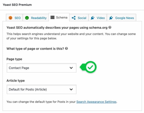
And don’t forget to set your Schema to Contact Page!
Chances are you are running Yoast SEO on your site, of course. If you haven’t done so, you should go to your contact page and set the correct page type in the Schema tab to Contact Page. By doing this, you describe to search engines that the particular page they are now reading is really a contact page.
Essential elements of your contact page
Think about what you are looking for when visiting a contact page on any website. Some people don’t like to call, so they rather email a company. Saves time, and it’s less intrusive. It’s good to provide a short form, but an actual email address might work better for some. So we’d advise providing both.
Ok, let’s look at all the essentials:
- Company name.
- Company address.
- General company phone number.
- General company email address.
- Contact form.
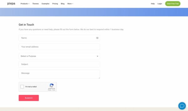
A simple contact form
You want people to contact you so you have to lower the barrier for them to do so. One of the things that can block that process is asking too many fields to fill in before you can send your question. Don’t ask a million things in the form when customers want to contact you — keep it minimal.
Multiple departments
If you have more than one department that can be reached by phone or email, list all. Add a clear heading and the details of how that department can be contacted. An example: universities and hospitals usually have separate departments for students, patients, press, business opportunities and more. YouTube has a variety of departments/directions to point you to on their contact page. Obviously, these departments should only be listed if their details should be available for everyone visiting that website.
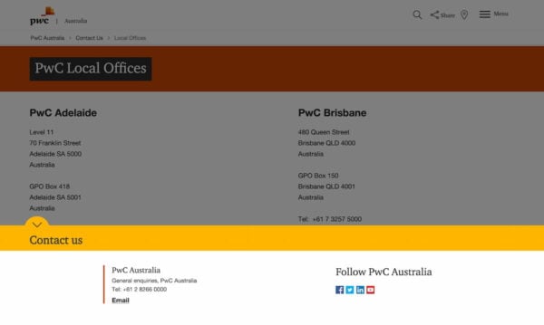
Multiple locations
If you have multiple locations, list all address details (NAP plus email) for every one of those locations. But please make sure to highlight your headquarters one way or the other. If you have a local business, our Local SEO plugin can set the primary location for you. For instance, the US Chamber of Commerce lists one main address and a link to a separate page with all the locations. Makes sense, and provides a focused user experience.
These are the bare necessities. What else can we do to make that contact page awesome for visitors and Google?
Spice up your contact page
Contact pages that list the bare necessities are dull. And there is so much more you can do to spice up that contact page!
Why and when should I contact you?
It sounds so obvious, but you actually might want to tell your visitors why and when they should or shouldn’t contact you. It pays off to create a safe environment, to assure people you have no annoying holding tunes, that you’ll connect them with a human being from minute one, or simply that you won’t be taking calls after 2 PM for whatever reason.
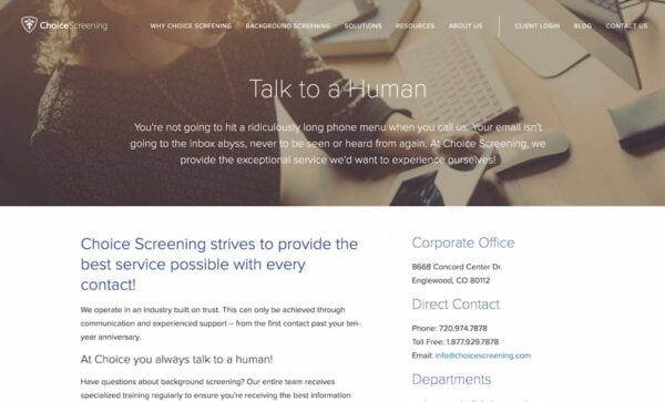
By explaining a bit more about your contact policies, you a) add text to an otherwise dull page and b) are able to manage expectations. Hubspot pointed us to this nice contact page example that does this well: ChoiceScreening.
An awesome call-to-action
Add a great call-to-action to your contact page. That could be a button at the bottom of your contact form, but also a phone number that is displayed in a prominent spot. Just make sure it’s immediately clear what you want your visitor to do on that contact page. Pick your preferred contact method.
There are plenty of contact page examples that have done their call-to-action right, Jetblue for instance:
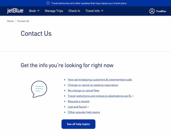
Before showing you their contact details they try to answer your question on their website already. It’s very clear that they want you to check for yourself first, hence the large “See all help topics”-option. It’s a common practice for a contact page, which undoubtedly saves time for your business.
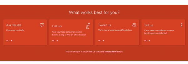
Nestlé gives you a number of options to choose from, being Ask Nestlé, Call us, Tweet us and Tell us. We like that concept as well, although there is no one call-to-action standing out from the rest, so we’re not sure what will work best. Another example, on the ABN AMRO contact page you’ll notice a yellow CTA that invites you to call them.
Social accounts
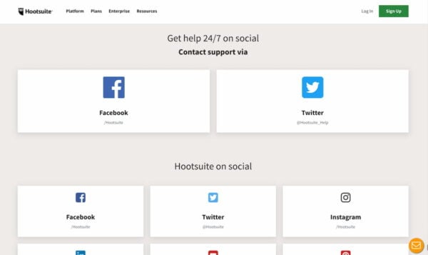
Social media is a very common way to stay in touch with (potential) customers and some customer services have made an art out of helping customers that way. Be sure to list your active social networks on your website. And make sure to respond to any (serious) mention of your company or direct message you receive. Hootsuite, for instance, being a social media company, has a nice section on theirs that contains all their social networks. Of course, they emphasize the option to use these to get in contact with them.
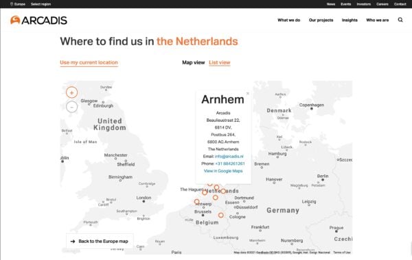
A map and directions
A map isn’t a necessary element for every contact page, but hey, it looks nice and gives your visitor an idea of where you are situated. If your company has multiple locations, it provides a nice overview of your (global) reach and will tell the visitor if there is a location nearby.
If you have a business where customers come into your office, shop or whatever to do business or purchase products, directions do come in handy. Scribd has this incorporated in Google Maps. You can automate a lot of this if you are on WordPress. Our Local SEO for WordPress plugin allows you to add a directions option right on your contact page. It allows you to add a map with your location and a handy option to show the directions from the address the visitor is right now. If you have customers coming to your store/business, I would add directions that way.
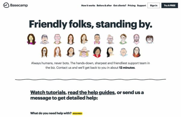
Your staff and your business
Present your friendly staff on your contact page, or at least the ones people will reach when calling, tweeting or emailing your company. Your board of directors is also an option. Try to make it interesting and get people to feel a connection with your company. Last but not least, if you frequently have people come into your office or store, it might make sense to add an image of your building. That way people will immediately recognize your business when they drive up to it.
Go and build an awesome contact page
A lot to digest, right? And you thought just listing your address and email would suffice. Think again. If you have a business that depends on people contacting you, be sure to pick any of the additions listed above to improve the user/customer experience of your contact page. We hope the contact page examples we mentioned will help you improve your contact page as well!
Read more: Five annoying contact page mistakes »

Explain why anyone should contact them and how they can assist their guests in solving their problems. Have an email address and a phone number so that tourists can find the details they need easily.
You’re right, Ryan. These are essentials for a great contact page :)