Make a great website menu for your users and SEO

Website menus are one of those things you take for granted — until you encounter a really bad one. In the ideal scenario, users get an instant overview of what a site has to offer, and they can reach all the important stuff with just one or two clicks. In the worst case, users end up frustrated and unable to find what they’re looking for. This post will walk you through the basics of menu design and help you understand which options will work best for your site.
Why your website menu is important
Your website’s menu is important because it helps users navigate your site. Sure, sometimes a user will arrive on the page they were looking for straight from Google. But usually, your visitors will want to look at various pages on your site. Or they land on your homepage and will need to navigate to the right page from there. That’s why your menu should be available on every page, and ideally, you would even have a sticky menu. Meaning that it scrolls down with the content to make sure it’s always in view. That way it doesn’t matter where your users are: they’ll always be able to find what they need.
Besides the essential navigation function of a menu, it’s also a neat way of letting users know what your site has to offer. You can think of it like a banner on each page, saying “This is what we do”. Make the most of that opportunity!
What makes a great site menu?
A great site menu should include links to the most important parts of your website. So it’s up to you to figure out what to put in it. But whatever content you decide to include, it’s essential to keep your menu usable.
Don’t: add too many menu items
One of the worst things you can do is overload your menu with too many links. This will make it look cluttered, and users will need to work hard to find what they need. Depending on your choice of menu design, some of the links could end up inaccessible if you have too many. For instance, if you’re using a drop-down menu, users might struggle to access links that appear off-screen.
Do: be selective or use alternative navigation options
The best option is to be selective about what you include in your menu, but for larger or more complex sites this won’t be possible. Luckily, there are lots of other solutions to a crowded menu. One solution is to create hub pages or categories, and add these to your menu instead. Then users can navigate to the relevant category or hub, and find their way to more specific content from there.
A second solution is to add sub-menus; these are additional menu options which only appear when the user hovers or clicks on a particular menu area. Sub-menus can be handy, but they can also become cluttered and difficult to use. So if you do use sub-menus, do so in moderation.
The third option is to include a search bar as part of your navigation menu. That way, if a user can’t see what they’re looking for in your menu, they can search your site for what they need. A search bar is a great feature to include, whether your menu is too cluttered or not. But do take some time to configure your search function well, because otherwise it won’t really help.
Tip: Yoast SEO Premium includes an Algolia integration you can use to improve your site search results. Using it will help push your most important content to the top of the results. Give it a go!
Don’t: only design your site menu for desktop
It’s easy to forget about mobile users when you’re using a desktop computer to build your website. But that’s the last thing you want to do, especially when it comes to your site menu design. A menu that looks good and works well on desktop might be completely unusable on a phone or tablet. Now that more and more people are using mobile devices to go online, it’s really important to consider menu design for both desktop and mobile.
Do: make sure your website menu works on mobile
There are two options for creating a menu that works on both desktop and mobile. You could add a responsive menu with a layout that adapts to the screen size being used. Alternatively, you can create a specific menu for the mobile version of your site. Whichever solution you choose, test it out on a few different screen sizes to make sure the end result is user-friendly.
Common website menu designs
There are loads of different menu styles to choose from. Hamburger menus, drop-down menus, and sidebar menus are a few well-known examples. There are also some very abstract and creative menus out there. However, the way that you implement these styles has a big impact on the overall impression and usability.
Here are some of the more standard options:
Minimalist site menu
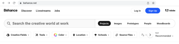
If you have a simple website and only one or two online goals, it makes sense to opt for a minimalist menu design. For example, Behance is a ‘network for showcasing and discovering creative work’, so it doesn’t need a complicated menu. They only include 3 menu options: ‘Discover’, ‘Livestreams’, and ‘Jobs’. This lets the user focus on the search field and the creative works being displayed instead.
Some sites use a more minimalist menu style to cater to their mobile users. A hamburger menu (which looks like this: ☰) is a popular minimalist choice for mobile sites as it takes up a very small amount of screen space. For instance, on the mobile version of Joolz.com there are three simple icons to help users navigate: search, shopping cart, and a hamburger menu. Clicking on the hamburger menu expands it to show a list of their product categories. Solutions like this work really well on mobile devices.

Classic site menu
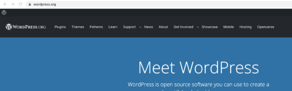
Classic menus are probably the simplest to work with. These focus on selecting the main categories or areas of the site and use buttons with text labels to guide users to the right place. A horizontal navigation bar is the most common type of classic menu. Sometimes menus like this have a few drop-down options below the main menu items, too. WordPress.org uses a classic menu design on its desktop site. Two of the menu items have a drop-down button to show more options: ‘Support’ and ‘Get Involved’.
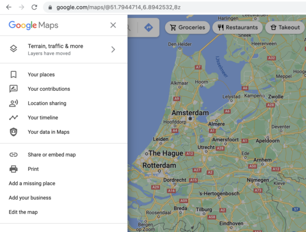
Another classic menu style is the sidebar. You can see this kind of menu in action on Google Maps. Usually, these kinds of menus can be opened using a hamburger menu button and closed again using the ×-button. This is a great way to offer full-screen content, as the menu is hidden most of the time.
Mega menus
Mega menus are a kind of drop-down menu, but instead of having a single column of links under each main menu item, there is space for multiple columns. These menus are popular with larger and more complex sites, as they offer space for many more links than other menu styles. So in theory, you can be less picky about which links to include. Right?
Well actually, this supposed benefit can be the downfall of mega menus. Even though all the links can fit in there, including too much content in your menu can be overwhelming for users. That being said, if you limit yourself to a moderate amount of menu links, a mega menu can be a great option for your site.
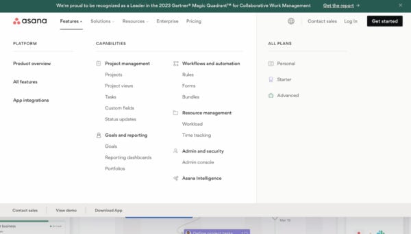
On asana.com you can see they’re using a mega menu with a manageable number of links below each main menu item:
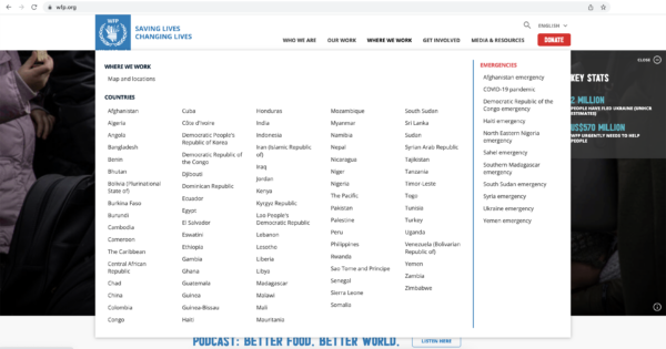
An example of a very full mega menu can be found on the World Food Program desktop site. In this case, the drop-down menu shows a list of countries, so users will still be able to navigate this menu quite easily. But just imagine if all these links were about different topics. Then users would struggle to find what they need, as if they were rummaging around in a messy drawer.
Other navigation options
You can do a lot with your site menu, but it’s not the only navigation option. Many sites add extra navigation links to their site header or footer. You’ll often see options to log in or change the site language in these spaces. However, if you do choose to add footer links you must disable infinite scrolling, or your users will never be able to reach the footer.
Another possibility is to create a sitemap page that users can access. This shows a structured list of all your site’s pages. These are becoming less popular than they once were, but they can still be a powerful tool for site navigation.
Site menus and SEO
Does your site menu influence SEO? Sure it does! You’re unlikely to get a lot of internal linking benefit from adding items to your menu. But there are other ways your menu can benefit your SEO, and that benefit has to do with how users experience your site.
If users can’t find what they’re looking for, they’re likely to leave more quickly and not come back to your site again. Google can pick up on those kinds of signals. So a great menu can help your SEO, albeit in an indirect way.
Which site menu will you choose?
As a general rule, it’s a good idea to keep your menu as simple as possible. Especially for smaller sites and those just starting up, a classic or minimalist-style menu should work great for you. If you have an enormous site you’ll need to think harder about what your users need to see, and how best to display that content.
Once you have a design you’re happy with, it won’t hurt to ask a few people to try it out and give you their feedback. If you’re really serious about making your site menu usable, you could carry out task-based user testing. Either way, make sure your website menu works for your users and provides them with a great experience!
Read more: Holistic SEO: Improve every aspect of your website »
