DIY: Test your mobile site!

More than half of all internet traffic comes from mobile devices (fact). So if you are ignoring your mobile site, you might be missing out on on a big part of your audience. In this post, I’d liked to go over a couple of ways you can check your own mobile sites. After this post, you’ll be able to test your mobile website yourself on key elements and improve your mobile SEO.
Use your phone to test your mobile site
Open your phone’s browser and go to your website. See how it looks. You didn’t see that advice coming, right..? I know of business owners that have never done this. They paid a ton of money to create a mobile site but haven’t looked at it after their designer presented the design. Like Nike said: just do it. See what you are missing. Get a feel for the performance as well.
Things that you need to check on your mobile site:
- Top tasks. Make sure visitors can find your main pages in an instant. Ask people people of they can use your site. Start with friends and family.
- Address and phone number. People use mobile websites of shops to set their navigation, for instance. If you want customers to find your store, list your address. If you want people to call you, this is the main call-to-action on your mobile site. Make it clickable.
- A working menu and a search option. It’s nice to add a hamburger menu as it saves space, but please make sure it folds out. Add a search option as a backup for your menu.
- Mobile design and UX. Make sure your mobile site is not just your entire website squeezed in that little screen without proper responsive scaling. Do make sure that your mobile site offers the same content as your desktop site — i.e. mobile parity.
- Buttons and links. Make sure these are easy to spot and large enough to click.
- Readability. Reading from a screen is hard, make sure that your typography is in order.
- Performance. How is the site speed? And the page experience?
Please find more information on this in our mobile UX article.
Note that different phones will differ in how they present your website. For that very reason, we recommend checking the mobile version of website in other ways as well to find flaws in your mobile site.
Google’s Mobile-Friendly Test
Mobile-friendliness is a ranking factor. Mobile-first is the game. Google created a test tool, which makes it easy to see how Google sees your website. Bing also has a similar mobile-friendly test.
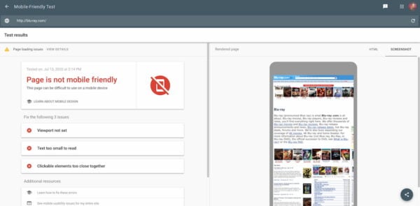
The Google Mobile-Friendly Test shows a rendering of your mobile page. If that page looks like the one on above, my guess is there is still work to do. Even if Google tells you your website is mobile-friendly. Remember that it’s an automated check. Do check all the things in this article manually, just to make sure you’re not missing things. Sometimes common sense is much more valuable than what Google tells you :)
Web developer toolbar
You can also test your mobile site straight from your browser. In your Chrome browser, simply visit your own website and right-click somewhere on the browser screen. Click ‘Inspect’. You can also open it from the menu bar Tools > Developer Tools. After that, click the second icon in the inspector’s menu bar:
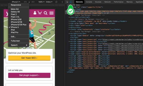
This will open the website like in the screenshot above. It will allow you to see if your website is fit for multiple screens sizes. Firefox has a similar feature called responsive design mode.
When you select for instance any iPhone in that drop down, and it shows your entire website scaled down to fit the screen, you know your mobile site isn’t mobile-friendly.
Performance testing
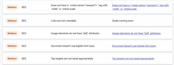
Mobile-friendliness is more than simply checking how your mobile site looks in a browser. Performance plays a big role. So, if you want to make your mobile site a success you need to make performance a priority. Again, there are a lot of tools that can give you insights into the performance of your site. One of those tools is Google’s Web.dev/measure. Simply add your URL and hit Run Audit.
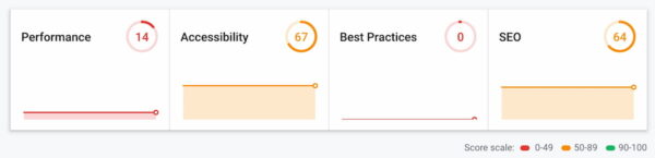
The tool will show some metrics and ways to enhance those scores. Go through the advice and see what you can do to improve your mobile site. Also keep an eye on tools like PageSpeed Insights that’ll give you a better idea of the site speed aspect of your mobile site.
Test your mobile site: conclusion
If you want to check if your mobile site works at all, use the Inspect tool in your browser and Google’s mobile-friendly test. Check for a number of specifics if your website is fit for mobile devices, like top tasks and the size of your buttons. If you would like some more guidance in breaking up your design to fit multiple screens, please read this article on our development blog.
Read more: Mobile SEO: the ultimate guide »
Wow great. I realy need to optimize my website. Thanks a lot.
Greetings.
You’re welcome! And good luck with your site :) You can find more articles on mobile SEO here: https://yoast.com/tag/mobile-seo/
I am having a lot of issues in my blog. The major one is my site displays significantly smaller on mobile devices but fine on desktop. My logo is very small and the site looks mismatched after I tried js and CSS minification. I tried optimizing almost everything but I am still facing issues. I am rolled everything back.
Hi, sorry to hear this. It’s hard to say from here what’s wrong. Perhaps check our ultimate guide on mobile SEO to check if you follow best practices? https://yoast.com/mobile-seo-ultimate-guide/ Hope this helps, good luck!
Yes, I have checked my website. my website is mobile-friendly, but here is an issue (Links and tap targets are too close/small). how can solve it…..
Hi, congrats on your mobile-friendly site! This article explains what the boundaries should be for tap targets on your site and how to fix them: https://web.dev/tap-targets/ Good luck!
Thank you!
Yes, I already check with developers console and looks the same as the cellphone. Also Bing shows the same as the phone.
Same to me!, but Google Mobile Test still show different version :(
That’s great to hear!
i dont understand the mobile friendly concept of google search console. on one day its says shows green the other day it again gives errors.
Mobile-friendliness and accessibility are the 2 main parts that I want to optimize on my site. The most common problem which I encounter is the speed of the website on Mobile devices. Sure, using AMP can provide that necessary speed, but it renders all the design useless. Currently, I am using AMP for some time. But I’ll surely switch over to custom responsive design which is light enough to work on mobile devices.
Thanks for wiring another good piece. Simple and effective!
Hi Rajat, thanks for your comment! And you’re right, AMP ‘strips’ down a lot of your design in favor of speed. Which can mean presenting your mobile site in a different way that you would like to. But it sounds like you’re on the right track, so lots of luck with your mobile site!
Thanks for this great info. I don’t know why the result varies each time I test the site with Google mobile friendly test.
Hi, me again…
I will add more information about my last reply, I tested the site with Mobile Friendliness Test Tool on Bing and is 100% friendly, but no in Google Tool…
How can I “convince” Google that my site is fine for mobile? hehehe…
Thank you guys!!
Hi, excellent info!! Thanks.
Do you know why “Google Mobile Test” show my site different than in a real phone? In phones looks really good (friendly) but google says is not mobile friendly… and show a odd mobile version.
This is a problem for ranking because G is not taking the real mobile version to test (and rank). How may fix this?
Thank you!!!!
Hi Max,
It’s hard to say without seeing the site in question, but it could be any number of things.
There are a few things to consider, though:
– Google’s preview tools aren’t always representative of how Google sees the pages when they crawl it. So, a ‘bad’ preview might not mean a ‘bad’ page.
– That said, it *should* generally be pretty close – so if it’s getting it *very* wrong, that might mean that you have problems with your theme, CSS, JavaScript, or with blocking robots from accessing some of those resources.
– I’d test by using Google Chrome’s “developer console”, going to the Network tab, and setting the user-agent to emulate Google + previewing the page in mobile mode. That should give you a feel for what Google might be seeing on the page.
Thank you Jono!
Yes, I already check with developers console and looks the same as the cellphone. Also Bing shows the same as the phone.
Sorry, the website is: certificacionaeronautica.com
I’m worry because this may affect the SERP positioning.
I send the comment to Google but still not answer.
thanks again.
Wow great articule. I really need to impruve my mobile site. and we will see how it work.
Thanks
Piotr
You’re welcome and good luck!
Wow, this article really improved my mobile version of my site. Very detailed explanation, and I was able to audit a site Google Mobile-Friendly Test, and BANG! my website is Mobile Friendly.
That’s great, Richard! Congrats and good luck with your site.
Thank you for this complete and practical article. Good tools and solutions are included in it. No site can do better than you in providing SEO tools and articles.
Thanks for this tips. I just created my website and I’m looking out for ways to make it more mobile friendly.
Thanks so much, Aranikala