Breaking up responsive design

Over the last couple of weeks I have been dealing with the fine art of CSS. Although that is not my daily business anymore – because I lead the website review team here at Yoast – I really enjoyed mastering SCSS and using that for an actual design. During this field trip, I encountered several front end discussions about responsive web design that intrigued me. They actually fascinated me enough to write this post and invite you to share your thoughts about these issues in the comments. We will all benefit by sharing experience, right?
I’m not Will Hunting, I’m not the only one being able to solve this issue, so I will just write down the steps I took in styling a responsive website for all devices. And am looking forward to your thoughts on this.
First tracks
The first thing I wanted to overcome was the issue of relative font sizes. What would be the best practice and why? As rem seems to be the standard these days, that decision was quickly made. First declare pixels for older browsers, than rem for current browsers.
Being old school, I have been scaling down the browser base font (16 pixels in most cases) to 62.5% for a couple of years now. It is just so much easier calculating up and down from 10 pixels, right? Of course that would mean using a font size of 16 pixels for paragraphs would lead to this CSS:
p {
font-size: 16px;
font-size: 1.6rem;
}
Oh the simple things. But this actually made my browser (Chrome for Mac) show a 1.6 * 16 = 25,6 pixel font before showing the 16 pixels I intended it to be. I wouldn’t put my finger on why this was happening, so I just decided to see how Jeremy Keith was doing this. Ever since Reboot 8 (Copenhagen) I have been following this man from a distance, as he seems to be the no-nonsense guy that just does things the right way. His website does not use the 62.5% ‘hack’, but simply calculates rem font sizes from the 16 pixels standard. The simplest things are usually the best. And yes, I did change my entire stylesheet to match that method. Luckily for me I used a separate SCSS file for font sizes, so this really was a ten minute change ;)
Padding and margin
Second stop was padding and margin. I have been going over this a couple of times, trying to decide on what to use for this: px, em or rem. I must have read a dozen articles on the topic. Of course there are always purists that tell you to always use em for this, but my conclusion was that, as for now, it really does not matter. You just want your white space to look right on all screen sizes. I decided to stick with pixels, as it is just the clearest, most easy way to do this.
There is just one exception in my book: padding-bottom for things like paragraphs and list, perhaps even headings. I use em for that. That might be a personal legacy, or something I an used to, but it seems to make sense to relatively calculate the whitespace below relatively sized elements, as a factor of that element (so using em).
Design your mobile website
With all element dimensions set, I took up the almost impossible task to decide where my design was going to change into the mobile design it should be. I think that is actually step one in responsive design: design the mobile version of your website. Don’t just take the website, reduce browser width to 320 pixels and see how you can make that look good.
Seriously, sit down and try to paint the mobile picture for your website. And all elements in it you can think of. Using Genesis and building plugins ourselves, this meant adding a gazillion (OK, perhaps a little less than that) widgets to a sidebar, scratch that, to all sidebars and styling these one by one.
It will make sure you forget as little as possible. Even writing this post made me realize I forgot one or two widgets, so keep in mind that this is of course also an ongoing process.
With the mobile and regular site designed, it is time to decide where to break your design for different devices.
Breaking up is hard to do
There are two ways to go:
- Breaking up the design using em’s
- Breaking up the design using pixels
Now note that this is not an exact science. As designs differ, these breaking points differ. Again, in my book. Looking forwards to your thoughts and ideas.
Relative breakpoints
The main idea behind using em’s is pixel independency. At the moment, that usually means 1024 pixels is replaced by 1024/16 = 64em. Vasilis van Gemert did an interesting article on Smashing Magazine on these breaking points earlier this year. It also deals with questions like what we should call them (I really don’t care about how we call them, to be honest) and how we could add columns to a layout using responsive design.
 Regarding that last one: that is a really nice extra, but I’m dealing with a blog design here. There is no left Twix, there is just the entire two-piece Raider inside the wrapper: main content and sidebar.
I’m under the impression we have been given tools and feel the need to use all. But when hammering one piece of wood to another for a client, you just need a hammer and nails. In most cases, you do not need a power drill. Your client probably has not even thought of doing things this way. Adding extras should not be a billable hour filler without an actual purpose.
In the article, I especially like the sentence: “If the user prefers a bigger font, then the layout would always be optimized in a way that’s relative to the font size.” I like it because I partly agree. And mainly because it is food for thought. It’s a starting point for nice projects like Marko Dugonjić. But would that work in my real world?
I want a design to look nice and readable on all devices. Vasilis also makes a great, valid point about the length of a sentence, that I wanted to take in account. It simply should be an easy read. The eye can’t cope with long lines, in most cases. I don’t agree with the mentioned conclusion “If you start with a small screen and you grow it, every time the width of the main content grows wider than either 75 characters or 10 words, something should happen. Simply said, these are your breakpoints.” I have been thinking about this when styling a full width page and just decided, after a quick word with our designer, not to make that full width actually full width, but just limited the width of an inner <div> within the main content <div>. But this really is your call. This is simply how we decided to do it.
Absolute breakpoints
As there does not seem to be a fixed set for relative breakpoints, I decided to go with absolute breakpoints instead. Using pixels, you can easily determine where you want the design to break. No calculating, just simple measuring and responding to what the design does.
Most designs are not that complex, column wise, so styling them nicely towards a mobile version is not that hard, just make sure to check every variation possible in your page layout.
I decided on three screen widths to start with:
- 1024 pixels
- 640 pixels
- 320 pixels
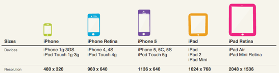
That’s a regular iPad (landscape), an iPhone 5 and up (landscape) and an iPhone (not retina, portrait). Yes, we like Apple here at Yoast. But we also test on other devices, don’t worry ;) I just needed some starting points, on which I would check what design changes where necessary.
The rest is pretty simple. Set your browser to that width, add a media query like this to your stylesheet:
@media (max-width:1024px) {
div.content {
width:67%;
}
div.sidebar {
width:25%;
}
No, these are not exact numbers. Of course the percentages make sure the <div>s are more flexible. Of course you also play with your browser width when styling your responsive website. It’s just easier like that. But let’s not go into those details. Let’s discuss these breakpoints some more.
Now this might be a personal issue, but I think there is nothing wrong with adding multiple media queries to a stylesheet. If you have read or written an article on how adding multiple media queries affects site speed, I’d love to read that, please drop a link in the comments below.
For me, these three breakpoints work like a charm. I have to make a sidenote though: the design has a max width of 1280 pixels, which spreads the breakpoints nicely over the range desktop to mobile.
I do think that, apart from the three breakpoints I mentioned, you should be specific about what width you are targeting, so using a media query like @media (min-width:855px) AND (max-width:1024px) { ... } is totally alright. There will always be gaps to fill in between these breakpoints, and as mentioned earlier, I want a design to look nice and readable on all devices. Now it does.
In conclusion
So, taking all things in consideration, these are the outcomes of me building a responsive template:
- use rem for font sizes and calculate these from the browser default, usually 16px,
- use whatever seems appropriate for padding and margin, which in my case is usually pixels for most block elements and em for whitespace related to text, and
- use pixels to set breakpoints.
Regarding these breakpoints: you should test that. See what works for your design. That brings me to my final question:
What are your experiences with responsive design? At what width have you set your breakpoints and more important: are these fixed sizes for all designs or do you set them again for each new website?
Please add your experiences in the comments below.
Michiel was one of our very first employees and used to be a partner at Yoast. Kick start your site optimization with his articles!
SEO for beginners webinar
Learn the essentials to start SEO confidently and boost your site’s visibility.
All Yoast SEO WebinarsWordCamp US 2026
Team Yoast is Attending, Sponsoring, Yoast Booth at WordCamp US 2026! Click through to see who will be there, what we will do, and more!
See where you can find us nextThe SEO Update by Yoast – August 2026
Expert analysis of the latest SEO & AI news developments with Carolyn Shelby and Alex Moss. Watch the update here. 📺
All Yoast SEO Podcasts
Really very informative article do find percentages do work relatively well if used properly. Thanks..
Ever growing number of smart phones and tablet devices needs responsive design elements.
Thanks for the won derfull article
Ever growing number of smart phones and tablet devices needs responsive design elements.
Thanks for clarifying this aspect in deta
great article..more covinient to use n share..great thanks for the share…!!
Hi Michiel,
regarding the performances of the media queries, I just found an interesting answer to a question on Stackoverflow that suggests to download the Chrome Canary or the Webkit Nightly build. These two have included an audit menu that tells you how long each CSS selector takes to run.
Thanks for the addition, Giulio!
I have be also struggling with the best thing to use in the places listed above. I find it is quite confusing where you should use px, rem and %. Hopefully some of your hints will make this easier.
thanks for the share..brilliant post
On my website I’m using responsive too… the code is like this
@media only screen and (min-width:200px) and (max-width:1237px) {
.container{width:100%;}
.copyright-wrap{width:100%;}
.top-nav{width:100%;}
.slide-caption{width:100%;max-height:12em;position:relative;}
.slide-wrap img{width:100%}
}
for below 869px media screen I recondition the column to 100% so, the column would looks just one row. Making the website to be responsive is not that hard for me.
Do these tips have compatibility with HTML5 markups?
In what way wouldn’t they, Nader? I don’t think it matters what the block element is called, or am I getting your question wrong?
Responsive design layout is essential part of today’s web standards. Ever growing number of smart phones and tablet devices needs responsive design elements.
Thanks for clarifying this aspect in detail.
I love your article. I have be also struggling with the best thing to use in the places listed above. I find it is quite confusing where you should use px, rem and %. Hopefully some of your hints will make this easier.
Sightly off topic but I will ask it any way as this article has made me remember the issue. I have designed a website using twenty thirteen and I child theme and was having loads of problems with the break points as there seemed to be quite a few. Is there a way to clear all or some of the break points from the child theme? I know one simple solution is to start with a different theme.
If these are set in the parent theme, that will indeed be a struggle. If these cause problems, you might want to move to a different theme. But I would only do that if these are really causing problems for the entire site, not just for one element, for instance. In that case, I’d probably copy the media query from the parent theme and change the settings of that declaration in the child theme’ stylesheet.
I’d love to see a discussion of navigation for responsive themes. I’ve noticed that responsive themes deal with tablets/smartphones by moving the sidebar to the bottom of the page, so you have to scroll down to see it. If your navigation is in the sidebar, then that’s a problem!
However I can see that if they shrink everything so the sidebar is visible, there’s just too much information to view comfortably.
Does this mean sidebars are pretty useless these days or am I misunderstanding? Or just using the wrong themes?
I’d go for another theme, OR check if your theme allows for other positions for the navigation? You could also include a navigation at the top of your page (in your template) that is only shown (CSS) on mobile resolutions?
I have a lot of experience with responsive design/programming.
You can use universal breakpoints, especially when you want to hide certain elements at different resolutions. For instance…
/* when it is not for mobile, hide this element */

@media only screen and (min-width: 650px) {.mobile{display: none;}}

/* when it is for mobile, hide this element */

@media only screen and (max-width: 650px) {.hide-mobile{display: none;}}

/* when it is not for tablet, hide this element */

@media only screen and (min-width: 900px) {.tablet{display: none;}}

/* when it is for tablet, hide this element */

@media only screen and (max-width: 900px) {.hide-tablet{display: none;}}
However, there may be specific media queries that have to be created based on elements that will behave differently than the standard.
Also, please note that IE 8 and earlier do not detect media queries so it is best to make a css file that will be only loaded when IE 8 or earlier is detected that has no media queries.
Man, I wish MS started doing auto-updates on their browser.. Thanks for pointing this out.
Microsoft already does auto updates since 2012 (http://blogs.windows.com/ie/b/ie/archive/2011/12/15/ie-to-start-automatic-upgrades-across-windows-xp-windows-vista-and-windows-7.aspx). However, there are some limitations, to what the highest version one can go on depending on Operating System. If you are on Windows XP, highest is IE8. Vista is IE9, 7 and 8 support IE10 and IE11.
So, if a user is on Windows XP (which is already end of life), they are stuck on IE8. I really wish if XP could support atleast IE9, but it dosen’t.
Also, after MS started the auto-updates, its good to see that now number of people using IE6 and IE7 is almost negligible which is a huge benefit for both users and developers.
Totally agree on the IE6/7 thing. The limit that XP gives, although not a supported OS anymore, is still bugging a lot of front-end devs. You do want that small percentage of IE8 users to at least be able to view a website. I’m not saying it should be perfect ;)
I think all XP users should use Chrome as their default browser and enjoy all the goods that has compared to IE8 or 9, for that matter.
isnt there a math formula that makes converting px to em to make responsive design easier?
Another long and interesting post. Learn several new things from your post about responsive design. Thanks for the share.
isnt there a math calculation for facilitating the ease of converting px to em for responsive designs
Responsive layout is must for every website in 2014 and coming years. Google gives weight-age for responsive websites in search and implemented new Ad sizes for AdSense.
Thanks for these tips.
Designing a mobile responsive website is a hard task for me! Let me try it following the tips. Thanks for the article! :)
You could always rely on a responsive premium theme, of course, Lancy. There are quite a few nicely designed ones out there!
I use a second-hand solution, WP touch plugin for WordPress but the insight I’ve got from Google speed test it said that the links are to small to be selected on a touchscreen device so…
also this is an important post mostly because that in 2014 mobile advertising will increase with 54% as mashable said.
Why WordPress or Joomla? I know they are easy but you are always dealing with security issues and updating stuff, its open source. Why not getting a stable front and do jquery, css, html and php etc by yourself?
Well, Rob, for starters because our WordPress SEO plugin makes optimizing your website a whole lot easier :) Besides that, why invent the wheel over and over. WordPress provides a solid base for any website and with all the plugins available, the flexibility of the framework and a bit of tweaking and monitoring security manually, you will still be able to make the website your own (using css and js, etc). WordPress provides a tool to be implemented in your own code, if wanted – but I am sure you already knew that – perhaps I am getting your question wrong?
How about Bootstrap? Your opinion?
I do like the concept, but haven’t played with it yet, as SCSS already makes my life a lot easier :)
Nice post, but I would like to add something. A lot of the difficult decisions about break points etc. can be made easier by looking at pre-built templates. For instance the 2013 theme had a decent responsive design and can give some insight on where to make adjustments at.
I don’t agree, as these break, or tweakpoints should be ‘found’ per design. There is no standard, as is one of the points of my post.
Thanks for sharing the useful articles…
Hey, Currently all are working on how to optimize your Website that can run smoothly and efficiently on any of the machine. I have also started to take my blog to the next level that has responsive design and many other features.
Any yeah, thanks for your article too, it’s great man! Keep it up :D
I’ve got still so much to learn…
Really good article, I have started using rem recently, before I was using percentage for most elements. I do find percentages do work relatively well if used properly.
great and usefull article..you always come with great help to newbie…!!!
Nice post..thanks
Really good article, I have started using rem recently, before I was using percentage for most elements. I do find percentages do work relatively well if used properly.
Really love this tutorial as a newbie and I hope to improve with time. Thanks
Do you know of the code which I can put to zoom in zoom out web sites post and pages in mobile devices ?
Not really sure what you mean here, Aamir? I think that is just a manual action?
thanks for sharing your article..it will definelly help newbie…!!!great and usefull article..you always come with great help to newbie…!!!
Great article, there is just one thing that’s not correct as far as I know.
You are right that the retina iPhone has 640 physical pixels in width. But that’s only half of the truth. Since the introduction of retina an other high resolution devices there is a distinction between logical and physical pixels.
Meaning that the iPhone, no matter if retina or not has 320 pixels in width, and the retina ones have 2 dpp (dots per pixel). Lea Verou has posted a nice website on that issue. I will add it later on.
I had a discussion with a friend on the issue break points. His opinion was quite simple and made sense to me. He said starting point of mobile is 1px less than iPad width leading to 767px. As all smartphones with higher pixel densities have these logical pixels with physical dots inside, this normally works out fine for me.
Really nice addition. Of course I have just used the (chosen) guidelines of iosres here, but there is a lot to say for taking possible variation in viewing distance in account.
I think there is a lot to be taken into consideration, that is one thing I am surely aware of. As with all things like this, I am a bit reluctant to apply/try all at once.
I’m wondering if there is one holy grail in this, so I really appreciate all thoughts in these comments, great stuff.
http://dpi.lv
Here as promised the link to Lea’s site.
Nice post Michiel! But I got a suggestion for the relative font-sizes. You can use vw or vw to get a font-size related to the view-port size. Works perfect for me!
1vw = 1% of viewport width
1vh = 1% of viewport height
1vmin = 1vw or 1vh, whichever is smaller
1vmax = 1vw or 1vh, whichever is larger
Thanks for your valuable comment, Stijn. I was actually looking into that yesterday. Might pick up on your suggestion, after testing pros and cons.
Anyone else got any thoughts on that?
Hi, this is a great and useful read. Can you pinpoint for me though the Jeremy Keith article you used as reference for rem font sizing as a simple search of his site didn’t yield anything? Thank you!
Hi Manon, the best artikel on this on Jeremy’s site is actually his stylesheet itself. I find it better to check what someone is practising than preaching. There’s usually a slight gap between what practical is and what things should be in an ideal world ;-)
Using:
box-sizing: border-box;
could let you spend none time for calculating padding from the with of an element!
Really good article, I have started using rem recently, before I was using percentage for most elements. I do find percentages do work relatively well if used properly.
I’m basing the breakpoints based on ideal line length for reading in the next version of my wp theme, Swift.
Ideal line length for reading is 50 to 75 characters.
For tablets we can accommodate a sidebar (30%wide), break point for it would be approximately 35 to 50em.
50*0.7em = 80 Chars
35*0.7em = 55 Chars
Not all fonts/languages have the same number of character for a give length. Here is a simple tool to find the number of chars..
http://nerd.vasilis.nl/code/measure-help/
That is a nice tool, Satish. Easy, does the trick. Thanks for the addition!
Hey Michiel,
Cool post and an interesting discussion! I would like to add 1 thing though. I do not agree with your statement that “the eye can’t cope with long lines”. This is a misconception that I have tried to explain on my blog: http://www.yourivandijk.nl/en/typography-improves-site-truth-shorter-lines/
Hi Youri,
There seems to be an important oversite in your argument. While I wouldn’t dispute the apparently valid research you sited in your position, there’s more that must be considered when making a decision when it entails the general population. And that is that “quality is in the eye of the beholder”. Meaning that perceived quality in hard products is often more important than actual quality. And I think that concept applies in this context as well. You said,
“Would you consider using different line lengths throughout your website? Or would you simply neglect the scientific arguments for longer lines and solely focus on the preference of your reader?”
If the preference of my reader is such that he/she is more comfortable with a shorter line length, even though it is not in his/her best interest with regards to reading quality, well I would absolutely opp to fulfill their desires, because the general population won’t appreciate the benefits of longer line length. An academic reading “the joys of quantum physics” might appreciate those benefits however. :-)
Thanks,
Tom Malcolm
Let’s agreement to disagree. Personally, I would never go for longer lines, especially with a smaller base font like on your site ;-)
Haha nice touch :D Admittedly I’m not very happy with the site design either and thus in the process of improving that. I’m not a pro WordPress designer though so I’m taking my time. The influence of line length is something I’ve learned in the process. Currently the template uses +-150 characters per line, which I think should be down to 100 whilst using a larger base font.
I think I have some good scientific resources to back up my claim and if you read it fully I’ve included the most important argument in favour of shorter lines as well. I was hoping you might have some data/experience to base that opinion on that was useful in the discussion.
Thanks Yoast for this interesting information. As a newbie to the blogosphere focussing just on the contents of my blogs your analysis was really depressing for me. I will never reach this level of perfection when creating articles.
On the other hand I see many articles in magazines and even on websites of bloggers that use a perfect design but the contents weakens slightly.
Thanks again. Your contribution raises my awareness for a more intense engagement with layouts. However I see a big problem in presenting the same article on a PC, a Tablet, and a Smartphone.
I’m sorry. I tried to comment on my iPhone but that didn’t work.
So I moved over to my iPad. Maybe there is a duplicate copy now.
Great to see you writing about this Michiel. It’s a hard process to go from not doing anything in CSS to creating a responsive layout.
First, about font sizes: I like to use Compass’ Vertical Rhythm. This makes sure the em values are used correctly when adding paddings and margins.
For padding and margin (and widths for breakpoints) you can also use a framework like Neat to do this for you. You can easily control the grids and columns the elements need to adhere to without messing with your CSS that much.
I also think that for responsive layouts a mobile first approach is much easier that going from big to small. This is because the basics should only be expanded on bigger screens and not scaled down to small screens. This makes is a lot faster to go to different grid formats and column spans.
Good writeup and hope you’ll share more findings in the future. It’s a constant struggle to create the perfect workflow, but tools like SASS and their frameworks really help us on the way.
Thanks for your reply, Gaya. I will look into the suggestions you made. I think there is a lot more to SASS than one realizes at first glance… Thanks for the introduction ;)