The call to action: Where do you want me to click?

Creating a good call to action (CTA) is a really important part of digital marketing and content design. A CTA can trigger your visitors to consider taking the action you suggest. You should have some kind of CTA on almost every page — doing so will certainly help you to reach your goals. In this post we’ll explain how to write a great call to action, where to place them, and common mistakes to avoid.
What is a call to action?
A call to action is a kind of trigger that encourages your visitors to do something. The action you want them to take could be anything. Maybe you want them to buy a product, sign up to your newsletter, leave a review, or just visit another page on your site. Whatever your online goals are, a CTA in the right place can guide your users through the steps you want them to follow.
A CTA usually contains commanding language telling a user what to do. That means using words like “buy”, “read”, “find out”, “get”, and so on. Admittedly, it can feel a bit strange to give your users commands. Adding your calls to action in a button or a call-out box can feel a bit less awkward, as it keeps your commands separate from your other (more natural) texts.
Why a call to action is important
Every website, and every page on a website, has a reason to exist. But if you don’t add a CTA, there’s a high chance that your users will look at your content and then leave your site without doing anything else. Calls to action will help you to keep users on your site and convert them into loyal fans or customers.
If you want your users to follow a specific set of steps to do something, CTAs are even more important. They can create a kind of roadmap to guide your visitors to the content they need to see, or a set of steps they need to take to buy a product. Without these ‘signposts’, your users will be left guessing what they’re supposed to do next.
How to write great CTAs
When thinking about text for your CTA button, there are a few important things to consider:
- Use active voice
First of all, you need to be sure you’re using an active voice. An active voice is action-oriented, and so literally calls people to action. And that’s exactly what you want. Make people want to click your button!
- Use relevant labels
Make sure your button text is specific to what people are doing. “Send” is just too generic. Use something like “Sign up!” for a newsletter, or “Contact us” for a contact form. The text has to explain what the button will do.
- Keep button text short
Use small and simple words. You need to keep your button text as simple as possible. People have to understand what it means immediately.
- Create urgency
Creating urgency can convince people to click your call-to-action. You can do this by, for instance, having limited time offers or by telling people how your product can help them solve their problems now. This can even be a text next to your call-to-action.
- Write from the user’s perspective
Remember that users have their own goals too! You’ll likely see better results if you write a call to action from a user’s perspective, rather than your perspective. If possible, avoid saying “Buy this now!”, and try focusing on what users will get out of it instead. “Get yours now!” can be a better alternative.
Where and how to include calls to action
Now, online user journeys are notoriously messy. But you should still have a rough sense of where users are likely to start, and where you’d like them to end up. Every touchpoint in the journey should have a CTA leading to the next logical step.
Meta descriptions
You can set a meta description for each post or page of your website. Usually, Google will show this text beneath your page’s title in the search results. It looks like this:
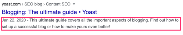
The meta description is your first opportunity to convince search engine users to visit your website. So put some time into crafting a great, persuasive call to action here.
Homepage
Your homepage should contain just a couple of clearly visible calls to action. Focus on the key goals that are priorities for your site.
If you want to include more than one CTA on your homepage, you can make a block that stands out (use sufficient whitespace around it) with a descriptive title, like “Make your choice”. Inside that block you can add three similar calls to action, letting the user choose which path to follow. That way, the entire block becomes your call-to-action. It’s a bit like we do on our current homepage:

Product pages
This should be the obvious one. Every product page needs an “Add to Cart” or “Buy Now” call-to-action. That button needs to stand out. Ecommerce sites tend to cram all kind of things around that button:
- social share buttons
- size options
- related products
- color options.
While these options should be available, it’s better if they don’t take the focus away from the “Add to Cart” button. Just make them a lot smaller than the call to action and locate them a bit further away from that button.
Contact pages
If the main goal of your website is getting in touch with potential buyers, the main concern on the website is to make it absolutely clear how you can be reached. At the very least, you’ll want to make your contact page clearly accessible from your homepage. Even better — add a contact option right there on your homepage, and make it bold:

On your contact page itself, you can do more than just adding your company’s email and physical address. You might want to add a short contact form, a phone number, or a “Chat now” button. Make sure to give your contact options an appealing label, too. Clicking “Send” at the end of a contact form feels a lot less enticing than “Please contact me!”.
Blog posts and informational pages
Aside from pages with a really specific call to action, you probably have blog posts or informational pages too. Some of these might not need a CTA — your ‘About Us’ page, for instance. But if you have blog posts or pages which tie in with your goals, such as increasing brand awareness or persuading customers to buy your products, it’s good to add a CTA to those. Even if it’s just a “Read more” link to a related article.
Common mistakes
There are a few things that you want to avoid when adding calls to action on your site. Don’t make these mistakes!
Too many CTAs on one page
Don’t fill your pages up with dozens of CTAs for every purpose and every kind of visitor. Make sure that each call to action stands out from the rest of your design. You can do this by using a contrasting button color, an actionable link or button text and reducing other clutter on the page.
Confusing buttons
If users can’t tell what’s clickable and what isn’t, they’ll have a hard time carrying out any actions on your site. The principles behind a good button are timeless. There is a nice, simple round-up of these button best practices on Blogs.adobe.com that we’ve combined with one from DesignExcellent:
- Make it look like a button (size, shape, color, depth).
- Add a clear message of what happens after the click.
- Mind the order and position (placement) of buttons.
The first item in the list above summarizes the point well: a button is a button. Not so much a design element. Button design is about recognition and clarity.
Asking too much from users
A good call to action needs to be easy for your users to complete. However nicely you phrase your CTA, very few users will want to complete a lot of complicated steps all in one go. For instance, if you’re encouraging people to ‘buy now!’, let them check out quickly — don’t require them to fill in a long set of questions to create an account first.
Time to work on your CTAs!
These are all our top tips about where and how to add a call to action on your site. Remember though, this is just general advice — what works for you and your users might be a bit different. So have a go at writing (or improving) your CTAs and see what happens. You can always keep tweaking them to get the best results!

I have actually seen the impact of switching from passive voice content to active voice. Totally relatable! I feel writing in the first person, helps readers relate to our content more! What do you say, Amy?
Hi Aditya, I agree that active voice is definitely a good thing when it comes to CTAs! And you make a great point about writing calls to action in the first person perspective. A button that says ‘I’d like to learn more’ could be a lot more effective than a button that simply says ‘Learn more’. Your comment got me Googling, and I found an interesting blog post about A/B testing with first person vs second person CTAs. It looks like first person copy can make a big difference! Thanks for sharing :)