Product page UX: 3 great examples

If you’ve done our All-around SEO training, you already realize that product page SEO isn’t just about optimizing your title and headings. Product page SEO is about making that product page as user-friendly as possible, making sure bounce rate is as low as possible and the page looks awesome in Google. It’s about product page UX (user experience) and technical optimization. This article is about the first part: product page UX.
Before we dive in, if you want to learn more about user experience (UX) and other essential SEO skills, you should check out our All-around SEO training! It doesn’t just tell you about SEO: it makes sure you know how to put these skills into actual practice!In this post, I will show you a couple of great product pages. These pages have most if not all elements to make it a killer product page. Besides that, I’ll show you a number of more technical improvements that are absolutely necessary if you’re serious about product page UX.
Coolblue’s product page UX
SEO isn’t all about optimizing your meta description, although that seriously helps. In most cases, leaving a meta description blank will make sure Google creates the best automatic meta description it can make. For your product pages, you’d want to convince the visitor to click your link. Coolblue, one of the largest online retailers of the Netherlands, exploiting a huge number of specialized webshops, adds some triggers to every meta description:
Order the Philips 273V5LHAB at Coolblue. Ordered before 23:59? Delivered for free tomorrow. Coolblue: anything for a smile.
When I buy something online, I’d like it to be delivered a.s.a.p.. Makes sense to focus on that. Most of the competition in the Netherlands can’t match the USP of fast delivery like that.
Let’s look at an actual product page:
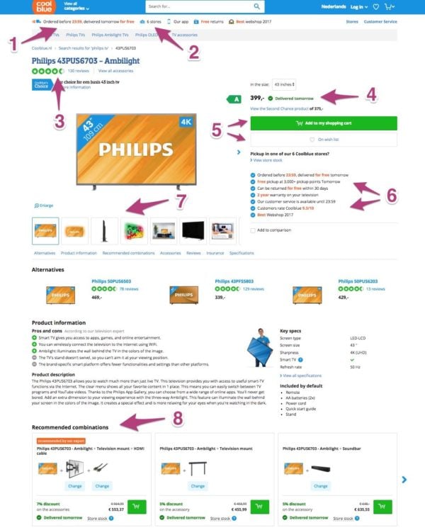
I added a couple of numbers here that I wanted to elaborate on:
- Ordered before 11.59PM, delivered the next day for free. I want it and I want it now, or at least as fast as possible.
- 6 stores. This is clearly a trust factor. I can go to a store in case of issues, which makes it easier to spend a higher amount of money.
- Ratings and reviews. We did an article on testimonials; these are like that.
- Delivered tomorrow. So small, yet so valuable. It’s available right now. Add that to item #1 in this list and you know you want to buy from this webshop.
- Primary and secondary call-to-action. Very important. Add a main call-to-action and an alternative. (In this case Buy now, or On wish list). You’ll find this on most online shops for a reason.
- All kinds of trust indicators like ‘can be returned for free within 30 days’, ‘customer service available until 11.59PM’ and so on.
- Alternative views. To give the visitor a shop-like experience, you’d want the visitor to be able to ‘hold’ the product and look at it from multiple angles.
- Product bundles. Everybody is looking for a bargain or a nice deal, right? That’s not just something we Dutch people do ;)
All these user-focused elements will make the user like the webshop, and this will make Google like the website as well. As mentioned, Product page UX isn’t just about adding the right meta description or headings. Coolblue does an awesome job on product page UX, in my honest opinion.
Amazon’s Product Page UX
Coolblue’s product page is actually a bit like Amazon‘s. Here it is:
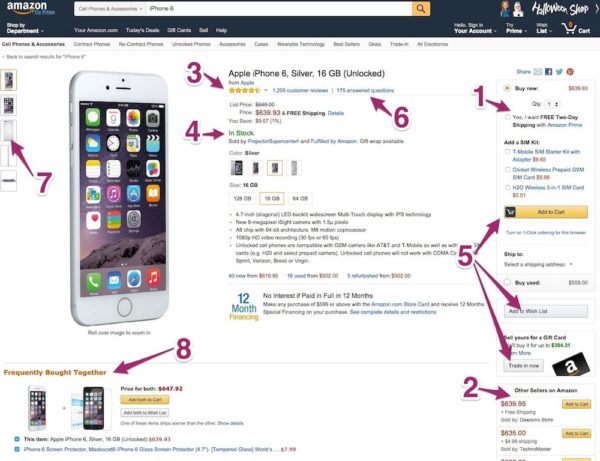
There are certainly similarities, as you can see. Let’s go over the numbers:
- Free two day delivery. OK, for this specific product, I’d order at Coolblue, but given the fact that Amazon ships abroad, makes that two-day delivery pretty awesome.
- Alternatives. I like this. It allows me to order at the supplier I have a great experience with, instead of just going for the cheapest that is usually displayed first.
- Ratings and reviews. Huge numbers of these, what makes me trust these ratings and reviews even more.
- In stock. Like at Coolblue’s.
- Call-to-action and alternatives. Amazon actually offers an option to sell your own Apple iPhone 6 for a Gift Card as a third option.
- X answered questions. It’s comforting to know that the actual seller takes the time to help you out if needed.
- Alternative views. See Coolblue’s.
- Product bundles. As at Coolblue’s.
Besides these elements, Amazon has a huge advantage on other online resellers: an awesome, well-known brand. And that most certainly helps a lot too.
Last but not least, I’d like to show you a slightly different shop, named ThinkGeek.
ThinkGeek’s Product Page UX
Both the above shops, Coolblue and Amazon, show how most product pages should be set up. But there are also a lot of online retailers that don’t offer all the options mentioned before, like stock, delivery advantages and reviews. Some shops sell niche products, and don’t need these ‘extra’ triggers. ThinkGeek is one of these shops.
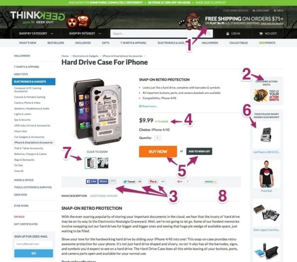
This last page looks much cleaner and more focused. It lacks a number of elements that Amazon and Coolblue did add to their product pages, but I am sure loads of people will prefer the clean and focused appearance of ThinkGeek’s product page. Product page UX is also about focusing on what’s most important. ThinkGeek does add a number of extra elements I’d like to mention:
- Free shipping on orders over $75. Or whatever amount seems reasonable for your business. Just the other day, for example, I ordered 12 plectrums I just did not need per se to match the $50 that would get me free shipping. It seems nice, but actually is also just another trigger to make you want to buy more.
- Customer action shots. Showing actual people using your products makes that people see themselves using your product. This is a nice addition!
- Social proof. Only works with a certain number of shares, obviously. It’s like reviews and ratings, but without the reviews and ratings.
- In stock. There it is again.
- Call-to-action and an alternative. I like the way ThinkGeek designed this. The main orange button and the smaller, secondary black button work really well together.
- People also bought these products. That’s the bundle without a discount. Might be obvious, but showing related products could lead to extra sales per visit.
- Alternative views. No matter how cheap the product, provide alternative views on the product.
- Last but not least, ThinkGeek added a pretty large product description to accompany this quite simple, dull product. It shows that ThinkGeek takes their optimization very seriously and realizes that content and content SEO is just as important as creating a nicely looking page for their products (judging by this page).
Read more: How to handle out-of-stock products for ecommerce SEO »
What about your own product page?
I trust this article’s got you thinking about your own page. If you are an online retailer, I’d love to know what you did to optimize your page. Did you add that in stock option? Did you add urgency by listing only 3 items left? Drop me a line in the comments. I’m looking forward to it. And if you’re looking for more inspiration for your product page, check out these 7 ways to improve your product descriptions.
Keep reading: Using storytelling on product pages »
