Focus on Clarity First
With the current trend of larger and larger header images being used on homepages, there is one thing that seems to be forgotten a lot: the purpose of a website. How often have you found yourself browsing a website, to find out only after a couple of minutes what it is the website owner wants you to do? Or what he is offering you as a product or service?
Before we dive in, if you want to learn more about image SEO and other essential SEO skills, you should check out our All-around SEO training! It doesn’t just tell you about SEO: it makes sure you know how to put these skills into actual practice!!
I imagine a web developer telling his unknowing customer that he needs his website to “sell an online experience”, or “set a distinguishing mood”. Sales talks like that lead to a more challenging project (for the web developer), and more hours to bill (for the developer). Plus ongoing business (for the developer) when the website doesn’t perform like expected and needs to be changed. For the customer, that means rethinking his business just for the website, more costs and probably more headaches.
In this post I will try to explain why you should always focus on clarity first, even when using larger header images.
So, what do you do?
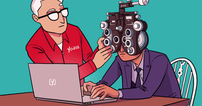
Especially when your product isn’t clear, be sure to focus on the benefits of hiring specifically you or buying your specific product. These should of course be the benefits for the customer. Looking at for instance business consulting, I found this website in the paid Google results:
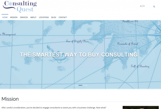
This is exactly what I mean. This website allows you to find the right business consultant for your specific issue. Is that clear? I don’t think so. The *cough* slider *cough* on this website rotates a random list of empty phrases. After that, the mission is displayed and below that unfolds a one-page website ending in a contact form. Especially when you want to convince me in a one-page website, make sure that you are clear from the start. Explain why I should use you, your website or your products to reach my ultimate goal: finding the right business consultant for my problem.
Define your USP or UBR and communicate that to your new customer immediately. ConsultingQuest seems to be a relatively young business, I think this advice will surely help them improve their website.
What’s the next step?
In my own interpretation of Getting Things Done, I have a rotating wallpaper on my MacBook, asking me now and then that very question: what’s the next step? When someone lands on your website, what’s the next step? When someone clicks your call-to-action, what’s the next step? When someone buys your product, what’s the next step?
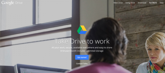
I like this setup. There is one clear call-to-action, that isn’t too aggressive. Although I would perhaps have chosen a slightly larger, orange button. On the other hand, most visitors of that page probably don’t need to be persuaded anymore. What I like most is that although you can assume that the visitor knows what Google Drive is, Google explains pretty clear what the benefits are: “All your work, secure, available everywhere and easy to share – $10/user/month includes unlimited storage”. What’s the next step? Get started. Not persuaded yet? Contact sales.
Now think about the screenshot for ConsultingQuest above. There is no next step presented without scrolling all the way down. Clarity isn’t just about what you do, it’s also about what you want your visitor to do.
Clarity is a combination of things
The first thing we did when reviewing a website, isn’t to check for meta descriptions or branded page titles. It’s way more personal, but still a mutual feeling we all share. We don’t want to be lost. We want clarity. It’s the experience we get when visiting that website for the very first time: do we get the website? Is it clear what the benefits are for us visitors? And where or how can I get these benefits?
The two examples above show that there are some considerations to be made when adding a huge image to your website. It can be done and might be effective, when done right. Last week, I was talking to a friend of mine about the same subject: larger images and how that might impact your conversion. Our new design has a larger header image. But that one won’t bug you on all of our pages. And holds our menu, as well as your cart. It contains a clear tagline, containing a reference to the upcoming Yoast Academy. But perhaps even more important, the header isn’t so high that it will leave you in the dark about what we offer. Right below the header, all our main products and services are mentioned with clear links to the appropriate sections on our site.
Conclusion
Be as clear as possible. And keep in mind that clarity is a combination of things. It’s not just about what you want to tell the customer, it’s about what you can do for the customer and why the customer should pick you before any of your competitors. Clarity is also being clear about the next action. It will for sure improve the user experience of your website.
Read more: eCommerce usability: the ultimate guide »
I’d really like to know how to get a button on a homepage photo the way Google Drive has on theirs. Anyone know of a plugin or some code for this?
G’day Gail,
There are a bunch of different themes available out there that use that style (photo with call to action button) for their home page. Maybe you don’t want to change your theme though.
Cheers.
Hi Michiel, you make some excellent and interesting points.
Is Drive a new type of car or a laptop with internet connection? Just kidding.
I have been working on my call to actions. I hope that people will now misunderstand what I want them to do. However, I would like to test variations but have been unable to get A/B testing to work as yet. Cheers!
I got such a laugh out of that Consulting Quest website. It was almost a self-parody with the weird collection of images – first the map, then the person, then the nature scene, then what appears to be an egg surrounded by styrofoam, then the kiwi and oranges, then the cities, then the old wood with the push pins! Yikes – it looked like a project for a web design class. Thanks for the good example and the good advice – Susan