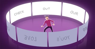
Sliders suck and should be banned from your website
Five years ago, we wrote about why we really don’t like sliders. We still don’t like sliders. If your theme forces you to include a slider (also named carousels) on your homepage, please realize that it’s making you use a feature that has no value for SEO. A feature that is probably slowing down your site by loading extra JavaScript. And prevents your user from reading the good stuff (your content) immediately. It will most probably account for less conversion as well.
Before we dive in, if you want to learn more about conversion and other essential SEO skills, you should check out our All-around SEO training! It doesn’t just tell you about SEO: it makes sure you know how to put these skills into actual practice!!
Even though both SEO experts and conversion experts agree on the fact that sliders have little use 99% of the time, website developers insist on adding sliders to their themes. Some customers refer to sliderless themes as “outdated” but we strongly disagree. Let’s make one thing very clear: sliders suck. Let’s explain once more why they suck.
Science and experiments
It’s not often that science is conclusive in its findings. However, sliders seem to be one topic on which it is. There’s literally not one study that we’ve found that says sliders are a good idea. We often point people to shouldiuseacarousel.com when wanting to explain why not to use a slider. This simple website does an awesome job at showing the statistics as well as trigger the annoyance sliders usually evoke.

Let’s look at some of the findings:
- Only 1% of people actually click on a slider, which almost always was the first slide;
- Sliders confuse people, as you’re sending multiple offers they may or may not be interested in at once;
- People simply ignore your slider, because it triggers banner blindness;
- On that same note, visitors just don’t get the message because they will skip the messages in your slider as they consider it advertisement or promotions;
- They slow down your site, negatively impacting your SEO and conversion rate;
- Sliders don’t always work well on mobile devices;
- They push down your content, which is not smart, as Google already mentioned in 2012;
- It’s most probably as effective to use just one image instead of putting all that effort in slider plugins and images.
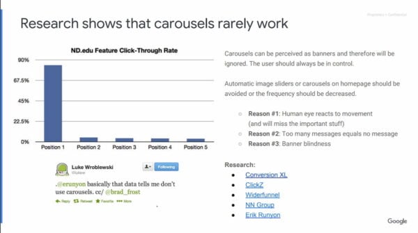
And here’s a sheet from Google’s eCommerce Retail Playbook:
That’s just the tip of the iceberg. Over the years, many studies have shown that sliders should be avoided.
But… I need a slider!
Ok, so you’re, for instance, a photographer. You need that slider, right? Wrong. People tend to act as if there’s no other way to show their images but by sliders. This simply isn’t true. If you can’t have a slider and you’re a photographer, would you just give up having a website altogether? Of course not, you would look for other options, such as the revolutionary idea of showing static pictures. If you want moving pictures, you should change careers and become a filmmaker.
Seriously, whatever makes people think that having stuff move on your website is a good idea, ever, is still beyond me. Auto-playing videos are also annoying, right? You can create awesome collages through which people can browse at will. The pictures won’t be forced onto them (if they even notice them in the first place), they’ll just notice the ones they like. And trust me, that will sell better.
If you’re a photographer, it’s likely you’re a creative person. You probably make photo albums for people from time to time, which presumably don’t have sliding images. So how about you showcase that skill and creativity by designing your web pages with static images?
Focus
What you’re saying with a slider is basically: “I really don’t know which product or picture I should put on display on my homepage, so I’ll just grab 10 of them!” In that case, you really need to add focus. If you don’t know what to choose, how would your visitors or clients?
You should know what your own business is about and what product or picture deserves that front page spotlight.
By focusing on the right (static) image or message, you will give people a far better feel of your business, and you as a person, than a slider ever could. Not in the least because sliders, as we’ve said twice now, are simply ignored in most cases. And a message that’s ignored hardly ever comes across (notice the sarcasm).
SEO and Conversion Rate Optimization
There is another reason why we recommend against sliders. Sliders push down your main content, plain and simple. In fact, most sliders we encounter in our consultancy these days, are big enough to fill out any screen. This means the content won’t even be visible above the fold. And this backfires on your SEO efforts, which we’ve already shown through the article linked in the list of findings above.
There’s not a CRO expert that will disagree with us on this: sliders kill your conversions. So simply having a slider on your website, will get you fewer sales than without that slider! If that’s not a deal breaker, I seriously don’t know what is.
Just combine the two and realize what a monstrosity the slider actually is. It kills your rankings and your conversions!
Mobile websites and sliders
It’s really convenient to include a slider on a mobile website. It allows you to add more content to that page, that smaller screen, without the page becoming too long. What if people have to scroll, right? Well, quite frankly, they are used to that. That’s just one myth you can forget about. It’s not just that. Lots of times, things go wrong when using a slider on a mobile website. Some of the other pitfalls you’ll encounter when adding a slider to a mobile website:
- Image sliders tend to load the desktop site images, not optimized for mobile speed or in fact ruining it for phones on 3g or less.
- The same goes for sliders running on JavaScript. Why add JavaScript for something people will treat as a banner or simply skip to get to your content instead?
- If your slider isn’t responsive, it will ruin your otherwise responsive website. This happens all too often, unfortunately.
Bottom line is that sliders might break more than they add in value for your website. But the main question you should ask yourself when using that slider on your mobile website, even if it’s responsive and optimized, is: do I really need that slider? I can’t imagine you do.
Why should you believe us?
If you don’t believe us, believe these experts who we’ve asked for their opinion and experience with sliders:
Sliders never converted and never will
“Sliders only exist because web designers love them. And because they make the life of the web team easy: they can give every department or product division a place on the homepage. And they don’t have to make choices.
But it’s not your job to make your colleagues happy. It’s your job to make your visitors happy. And to sell.
And that’s the biggest problem with sliders: they don’t convert. Never did and never will.”
Karl Gilis, Owner of AGConsult and renowned conversion expert
Use static images and copy instead
“It’s extremely rare to see sliders work. You’re better off using static images and copy.”
Peep Laja, Owner of ConversionXL.com and Markitekt
Just for portfolio displays
“I think sliders are interesting but somewhat problematic. The biggest problem I see is that if visitors are bouncing from the page in a second or two, they will never see the other options on the slider. If you use a slider for navigation, be sure the same choices are visible in static form, too. I think sliders work best for portfolio displays where several large, strong images can be displayed in the same space without impeding the visitor’s ability to navigate or determine what other content is on the site.”
Roger Dooley, Author of Brainfluence (also available on Kindle) and owner of Neurosciencemarketing.com
Sliders are distracting
“I think sliders are distracting. It’s a way to put extra crap on a page that’s typically not best for visitors. If it’s important in most cases you should just put it on the page without sliders or extra clicks.”
Hiten Shah, Co-Founder of Crazyegg and KISSMetrics
Sliders suck 99.8% of the time
“Sliders suck 99.8% of the time! We once did a test with a client where we changed their slider to a static image with 3 core benefits and lifted conversions by a nice amount.”
Bryan Eisenberg, Author of Be Like Amazon: Even a Lemonade Stand Can Do It and Waiting For Your Cat to Bark (also available on Kindle)
Sliders are evil
“This popular design element is – for many – the go-to solution when there are more messages to put on the home page than there is room to put them. Rather than make the tough decisions that require prioritizing conversion goals, web teams turn to the rotating banner as an offer of compromise.
Sliders are absolutely evil and should be removed immediately.”
Tim Ash, CEO at SiteTuners, Author of Landing Page Optimization (also available on Kindle)
Use a static image instead
“In A/B tests, sliders tend to lose. In fact, one of the easiest ways to grow a page’s conversion rate is to remove the slider, and to replace it with a static image. If you want to be really lazy, you can just test the slider against the static version of each of the slider’s options. The static version usually wins.”
Karl Blanks, Chairman and Co-Founder of Conversion Rate Experts
Sliders deliver little to no value to the customer
“Sliders please the owner of the site, but they deliver little to no value to the customers. The reason is that we are not going to sit there and wait for your ‘movie’ to play out. I’m also not a fan of sliders because for most businesses they provide an excuse not to think about personalization and being good at giving the customer the right answer, right away.”
Avinash Kaushik, Digital Marketing Evangelist for Google, Author of Web Analytics 2.0 (Also available on Kindle)
Sliders are hardly accessible
Conversion is one thing, but from an accessibility stand, sliders suck as well. Here’s what our own Andrea has to say about this:
Though there are examples and recommendations to follow to make sliders as accessible as possible, I’ve rarely seen a fully accessible slider being used in production. Sometimes sliders are just not coded with accessibility in mind, sometimes they are but there are so many accessibility requirements to address that missing just a couple of them can be disastrous for accessibility. Interaction with keyboards and assistive technologies is so hard that static content is always preferable. It’s no coincidence that shouldiuseacarousel.com was launched by Jared Smith of WebAIM, one of the most influential and respected organizations committed to spreading out accessibility culture and developing accessible web content.
Andrea Fercia, accessibility expert at Yoast
Honestly, we could go on and on. So no matter how pretty you think sliders are, know this: sliders simply suck.
Epilogue
When we first published our (unchanged) opinion on sliders back in 2014, UX designer Ian Armstrong commented that “in some cases, sliders make sense. A slider can be used effectively if it a) tells a story and b) doesn’t auto-forward.” Imagine a real estate page that has a slider for images of a house. It’s not auto-forwarding and helps you to get an idea of the entire house – it tells that story.
Ian also states that “if you properly set expectations and really stress the slider as a story mechanism, you’ll probably see a major uptick in interest.” He’s probably right, or, as Rich Page stated below that initial 2014 post: “If in doubt, TEST IT!” Most of us are used to sliders like that on real estate sites. There is always an exception to the rule, right? Although in this specific case, one might even argue if the ‘slider’ even qualifies as a slider.
Read more: eCommerce usability: the ultimate guide »
