Case study: SEO for a quality brand
With our Ask Yoast case studies we helped clients with their SEO by reviewing the website and giving clear advice and hands-on tips. Those clients send us their website because they’re curious what improvements can be made to improve the overall rankings. This time, we reviewed the website of a high-quality sun protection brand: Calypso. The brand started many years ago in the UK but is nowadays sold all around the globe. Let’s dive into the website to see what they’re doing well and what things need improvement.
A clean entrance
On entering the website, we immediately see a clean and inviting homepage. The homepage makes sure visitors can easily navigate to the most important content of the website: the actual products. However, we also see things that can be improved.
First of all, we see the slider on top of the homepage. We’re not a big fan of sliders because different studies show that only around 1% of your visitors would actually click on a slide. Besides, sliders often slow down your website a lot, and there are a lot more reasons which you can find in the post linked above.
We think the slider on Calypsosun.com is even more confusing because it contains a video. When a visitor presses the play button within the video, he or she is sent to the video on YouTube:
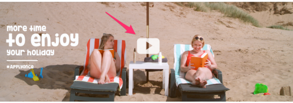
This means that you say goodbye to your visitors in an early stage of their visit. Try to keep them on your website and send them to your content.
What is the best practice in this case? In our eyes, another image, which is now below the fold on the homepage, would be a great top image:

The image contains some introductory content which tells your visitors what’s on the website. Adding a clear call-to-action below this image would be great. Think of a button with a text such as ‘See all products’ to guide your visitors to the product overview page. Below this call-to-action, you can still show the top sellers as you do now.
What are the site’s pages about?
Google needs to understand what a website’s pages are about before the pages can rank for certain keywords. Of course, textual content tells Google what a page is about. An important part of your text are the headings. Headings are meant to tell Google what the main subject of a page is and what other relevant subjects are on the page. This means that the main subject of a page should always be an H1 heading. Subheadings in the text should be H2 or H3 and less important headings should be H4, H5, etc. We recommend using H4 and higher for headings in a sidebar or footer because Google shouldn’t use those to determine what the page is about.
For example, checking one of the product pages of Calypso, we noticed there is no H1 or H2 heading.
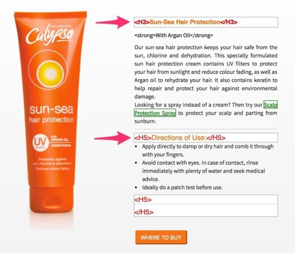
The name of the product is an H3 heading, but this should be the H1 heading. The subheading ‘Directions of Use’ doesn’t tell so much about the subject of this page so this could indeed be an H5. When the subheading is relevant to the text, it should be an H2 of H3 heading.
Another way of telling Google what a page or post is about is optimizing your site’s metadata such as page titles and meta descriptions. We noticed that Calypso uses great page titles and meta descriptions so they’ve already understood how important this can be for SEO.
Making your pages stronger
It’s clear that every website needs content to rank for certain keywords. If content is well-structured with headings, and page titles are optimized, it’s time to make your most important pages stronger. For Calypso, their product pages are most important because these reflect the products the company is based on. In this case, the product overview page could benefit from a little more SEO-optimized copy.
You might think that blog posts on the website are less relevant. However, blog posts can be valuable in another way, which we’ll explain in the next paragraph. You’ll always have important content and less important pages and posts, but even those have their purpose.
Let Google know what’s important
How do you let Google know what pages are more important? By adding internal links from all relevant pages to the most important pages, you make those pages stronger. When a certain page has lots of links from relevant other pages, Google understands that this page might contain the most important content around a keyword. Make sure you add relevant anchor texts to the internal links to make Google understand for what keywords the most important pages of your website should rank.
For example, when you write a blog post about the best sun protection for kids, you should add internal links to the actual products. If you use anchor text such as ‘Sun protection for kids’, it will be clear to Google what the relevancy between the pages is. Doing this consistently, your product pages will get more and more links and will become the strongest pages of your website.
The ‘Be Sun Ready’ page could be a great cornerstone article for ranking on relevant keywords. This page, however, could benefit from a few optimizations: they could add links to relevant products in the content and a call-to-action-button to the products page. Doing keyword research should provide them with enough keyword suggestions to make this great page SEO-proof.
The products overview
Navigating to the product overview page, we noticed that the categories are visible in tabs above the products:
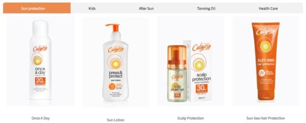
We recommend adding narrow signs to make sure visitors understand that more content can be found clicking on those tabs.
You’ll see that these signs will make it clearer to your visitors that they can click on the tabs. Make your site as user-friendly as possible, because the signals users provide are precious as Google uses these as well in their algorithm. Since SEO and UX are increasingly tied, it’s important to improve those user signals.
Using buttons to guide your visitors
Clear buttons can have a positive effect on the page path visitors take. You can guide your visitors to the pages you want them to go to next page. For example, you could add a button below each product which says ‘More information’. Doing this, you guide the visitors to the specific product pages and you make sure visitors understand that they can find more content related to the product by clicking on it. Now, the only way visitors see that there is a link behind the product on the current overview is by hovering over the image.
The product pages already have clear calls-to-action added: buttons which say ‘Where to buy’:
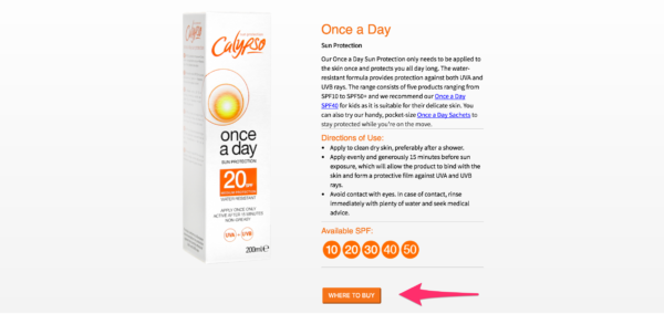
However, there is a way to increase the number of clicks on this button. We recommend changing the color of the button into a color that’s not in your color scheme. Doing this, the button will stand out more and might get more visitors to click on the button. Don’t you think the button catches your eye when it’s in another color?
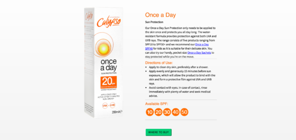
Of course, if you have a sufficient amount of traffic you can – and should – do A/B tests for these kinds of things. After an A/B test, you can easily conclude what color works best.
The last tip we want to give for the product page is related to the ‘Where to buy’ section. After clicking on the button, a screen pops up with the names of all the different resellers of the products. However, the only supplier which contains a link is Amazon and this logo is placed at the bottom of the popup screen. When visitors come to your website, they are already online, and they might immediately want to buy your products online. This means that it could be a good idea to guide them to Amazon first to give them the opportunity to buy your products directly.
Make sure your website loads fast
An important issue on the website of Calypso is page speed. Page speed is crucial in the eyes of Google and is considered to be a ranking factor in the future mobile-first index. The longer it takes to load a page, the less user-friendly the page is. Probably you’ll agree that it can be annoying if you have to wait too long for a web page to load. Visitors will bounce because of the loading times and this is a negative user signal, like we mentioned before.[
Testing the website of Calypso in the Google PageSpeed Tool we noticed a very low score: 18/100. This means you’ll have to start working on the loading times of the website. All possible improvements regarding speed are listed in the Google PageSpeed tool. We recommend starting with enabling compression and with optimizing images. Resolving those two issues probably results in the quickest and easiest increase in the page speed score.
To sum it up
We really loved reviewing the website of your well-known sun protection brand. You’ve created a very clean and clear website and with a couple of changes, you can improve your site’s SEO as well.
For your homepage, we recommend removing the slider and instead, add a clear image which reflects the website. Some introductory content will tell your visitors what the website is about and with a clear call-to-action you can guide your visitors to the most important pages.
To make those crucial pages even stronger, we recommend setting up an internal linking strategy. Make sure your internal linking reflects the hierarchy of the website to help Google understand the site structure. Besides that, using the right headings will improve the site structure as well.
And last, but definitely not least, working on your site’s loading times can be very beneficial. Increasing the page speed score will be valuable for both your visitors as for your site’s SEO. Good luck!
Caplyso replied to our SEO review
“We found Yoast’s advice about our website very helpful and they explained clearly the changes we needed to make in order to increase our web traffic. We have already started making changes to the website, particularly on adding more keywords and improving the loading times. We would recommend every company have their website reviewed by Yoast so they ensure it’s SEO and user-friendly.” – Sina Joneidy
Read more: Ask Yoast case study: SEO of an online shop »


Awesome in depth case study! The site speed for user experience is so important, I see so many websites as a consumer even and hit the back button because it takes too long to load!!
Wow amazing guide for me to improve my e-commerce website.
Thanks sir
Very great information.
Can you please publish a guide on SEO for Technology and Gadget blogs?
Hi Gerva, Do you own a Technology and Gadget blog? Perhaps we could review yours? :-)
its important to add h1 and h2 on ecommerce website?
Yes it is, even if its an ecommerce site you should let google know what is the main title of this site then people can reach your page via keywords and buy from you.
All mentioned points are really essential for a quality website. This is also an important factor for SEO too. Thanks for the amazing post.
You’re welcome!
Hello Meike,
Great information over here :)
The slider tips was something new and rare for me to know over here.
The speed of the web site seems to be the current testing in the SEO. Its better to make our web site fast as lightning so
that our readers do not go away.
Thanks for the awesome tips.
Shantanu.
Hi Shantanu,
You’re right! Making your website faster will definitely improve your site’s SEO, directly and indirectly.
Regards,
Meike
Thanks for the Slider tip. I will remove that from my blog.
You’re welcome! Removing the slider will definitely improve your website!
Wonderful article thank you for your contribution!
My pleasure!
There’s many additional creative ways to make money online. As with anything, you can make more or less. Nothing is guaranteed on the World Wide Web. What you put into it is what you get out of it.
nice post, really helpful post. Like it somuch
Thanks!
Thank you for sharing this
BandarQ
You’re welcome!
Wow. This is simple but a great post. Thank you!
My pleasure!
Nice Case study
and a great/resource writeup
Thanks!
Great Information Thanks!
You’re welcome!
“the main subject of a page should always be an H1 heading. Subheadings in the text should be H2 or H3 and less important headings should be H4, H5, etc.”
QURSTION if this were a wp blog how would you set up the headers? ie: header file uses H1 & H2 for title/description, single post/page file uses H1 for title. Should the website header file be changed to H3 can you explain or ref article to help?
Hi Michael,
If the main title of your page or post reflects the main subject of the page or post, it’s ok that it gets an H1 heading tag automatically. However, if you want to change anything about it this article can be helpful:
https://codex.wordpress.org/Designing_Headings
Regards,
Meike
great case !!
great results
Thank you!
Shouldn’t links open in new tabs? Well written article BTW.
Hi Mike,
Thanks for your comment! Of course, this is a choice you can make. Normally, we make sure external links open in a new tab to prevent from a higher bounce rate but this one slipped through! We’ll change it:)
Thanx For Sharing this info.
Website Speed currently Seems To be Mazor Factor in seo, informative :)
Hi Aayush,
It indeed is and it will probably become even more important in the future!
Regards,
Meike
Nice article, and useful to me as we are in a similar situation (at least in some ways) to Calypso. I especially found interesting your recommendation of ensuring that H1 tags are used appropriately. I’ve seen instances on our website and others where other headings (H2, H3, etc.) were used because the text size that the theme associates with those headings was desired.
I also like your recommendation of using hero images vs. sliders. I’ve come to the same conclusion myself in the last couple of years, but it’s sometimes tough to convince site owners that people aren’t going to sit there and watch their slider to completion.
Hi Donald,
Thank you for your comment! It can be beneficial to add H1 tags to your main titles:) Good to read that you don’t use sliders anymore! More focus will increase the CTR definitely.
Regards,
Meike
This is interesting post for me, It will helpful for every age of peoples for business marketing.
Thank you for sharing this information
My pleasure!