How to improve the accessibility of your website
Accessibility matters. And making sure that your website is accessible for everyone shouldn’t be an afterthought. It plays a big part in the usability of your website and that’s why Google is also focusing more on how accessible your content is. Fortunately, awareness is growing and platforms such as WordPress offer lots of possibilities to make your website more accessible. We’re well on our way, but there’s still lots of work to be done. In this blog post, we’ll tell you why you should focus on accessibility and which tools can help you!
Key takeaways
- Accessibility ensures everyone, including those with disabilities, can use your website effectively.
- Google emphasizes the importance of accessibility, as it impacts user experience and content accessibility.
- Key areas to improve accessibility include proper use of headings, ensuring good color contrast, and providing descriptive links and alt text.
- Several tools, like contrast checkers and screen readers, can help you assess and enhance your website’s accessibility.
- Making your website accessible is an ongoing process that benefits all users, not just those with disabilities.
What is accessibility?
Accessibility is about how well your software or website can be used by everyone, including people with disabilities. Wikipedia puts it like this:
Accessibility refers to the design of products, devices, services, or environments so as to be usable by people with disabilities. The concept of accessible design and practice of accessible development ensures both “direct access” (i.e. unassisted) and “indirect access” meaning compatibility with a person’s assistive technology (for example, computer screen readers).
Accessibility is the ability for someone to access and benefit from a system or other entity, such as your website. To ensure this, accessibility focuses on enabling access for people with disabilities.
In their Search Essentials documentation, Google mentions the importance of making your content accessible. Although it’s not mentioned in so many words, they also have the following statement on their website: “Everyone should be able to access and enjoy the web. We’re committed to making that a reality.” This means that Google also sees that accessibility matters.
Coming soon: the inclusive language check!
To help you make content that everyone can benefit from, we’re working on a new check that can guide you to choose more inclusive language. The inclusive language check is currently in beta, but if you’re using Yoast SEO Premium you can already try it out!
Accessibility matters
Even though the internet isn’t that old, most of us can’t imagine what life would be like without it. The web connects billions of people worldwide, regardless of where or who they are. The great thing about the internet is that it provides loads of information on pretty much any topic you can think of.
However, our worldwide population is made out of lots of different people. And every one of those people should have access to all the information that is freely available online. That’s why accessibility matters. Take, for example, everyone with a vision impairment. Globally, at least 2.2 billion people have a near or distance vision impairment. In addition, color blindness affects approximately 1 in 12 men (8%) and 1 in 200 women (0.5%). That’s quite a lot of people you’re missing out on when you’re not making your website accessible for them.
But there’s more!
Visual impairment is one of the things you need to consider, but definitely not the only one. Think of dyslexia and other reading difficulties or dexterity difficulties. Users with severe dexterity difficulties are unlikely to use a mouse and often rely on the keyboard instead. Have you ever tried to use your website, or our plugin for that matter, without using a mouse? It’s a tough job.
To give another example, a few years ago, we had a customer with hearing difficulties who wanted to take our all-around SEO training. He was faced with over two hours of videos without subtitles. It’s quite easy to add these and so we did.
We know it sounds like there’s a lot that you need to work on, that you might not have thought about before. But luckily, there are lots of great tools that can help you figure out what you can still improve on. And if you have a website on WordPress, you’ll be glad to know that there’s actually an accessibility team that dedicates its time to making WordPress more accessible with every release. But that’s not the only platform that sees the importance; for example, Drupal is also working on its accessibility.
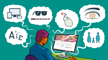
Accessibility tools
Do you want to make your website more accessible? That’s great! There are a few things you can do right away. The obvious things that are easily changed are your use of headings, contrast and descriptive links.
Use of headings
Headings help both search engines and users understand your text. It makes it easier for them to find out what a post or page is about. As the Web Accessibility Initiative W3C puts it, headings tell you more about the organization of content on a page, and web browsers or assistive technologies can use them to provide in-page navigation.
Headings help every one of your visitors figure out what your text is about. So make sure that they’re descriptive and nested the right way. Don’t just use them as a design element (“it’s the only way I know how to enlarge my text”) or to impact SEO (“I use all H1 headings, that makes it all very important to Google”). Both might seem like an easy solution, but they are bad practices as your headings should have a clear structure.
A tool that you can use to test the heading structure on your site is HeadingsMap. This extension for Chrome and Firefox allows you to view the heading structure of a page. It’s good to know that you should only use one H1 heading on your page, which should be the title of your page or post. After that, you can use H2 and H3 subheadings (or even H4 headings and beyond) to define sections in your text. Read more in our article on how to use headings on your website.
Color contrast
Color contrast is the difference in light (technically, luminance) between anything in the foreground, like text, and its background. If you pick a black background for your menu and use text that is very dark, this text will become very hard to read. And choosing two colors that look very contrasting to you, does not mean that this contrast is good enough for everyone. That’s why there are a few tools out there that you can use to audit the contrast on your page. For example, contrastchecker.com which checks contrast levels and gives information on the accessibility levels:
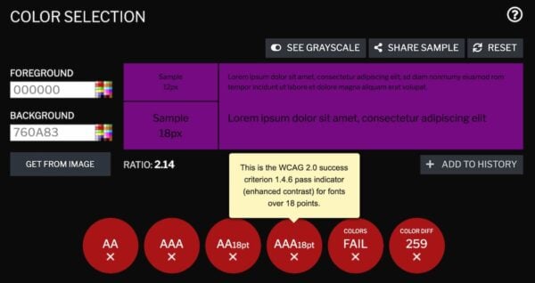
It also gives you a contrast ratio score based on the W3C contrast guidelines, which consider 4.5:1 to be OK. As you can see in this example, the colors I’ve picked are nowhere near this minimum score.
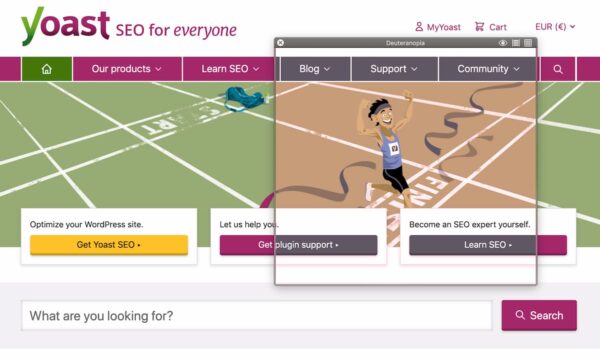
The contrast checker is pretty straightforward. If you want to play around with contrast to find how this affects visits by, for instance, colorblind people, you might want to check the Color Contrast Analyser, which comes with a color blindness simulator. It allows you to preview designs as they might be seen by users with colorblindness.
If you’re a Mac user, Sim Daltonism is also a great tool. Like the Color Contrast Analyzer, it allows you to hover a website and test a number of colorblindness variations:
Descriptive links, alt text, etc.
The last accessibility tool we’d like to highlight is one that tests how well your content holds up when a screen reader is used. For many people with visual impairment, this assistive technology helps them make sense of a page. A screen reader converts text, images, links, and other elements into speech or braille. On a Mac, you can use VoiceOver (which is already on your computer) to test this. On a Windows computer, you can download NVDA for free.
Now, why would you want to ‘listen’ to how your content is being presented through a screen reader? Because it helps you experience your content from the perspective of someone who’s not able to see it. This helps you identify problems with reading order, table markup, images and other form elements and links on your page. Images without any alt text will not be described to this site visitor. And non-descriptive links with a text like ‘read more’ or ‘click here’ give no information whatsoever on where this link is taking you. These may seem like small things, but for someone who is experiencing these issues, it’s enough reason to leave your page straight away.
Read more: Voice-to-text: The future of search? »
One more thing
The people at WAVE Web Accessibility created a tool to quickly identify many more rights and wrongs on your page. This is done completely automatically, but a human eye will need to evaluate what improvements are realistic and which are not. We wouldn’t recommend using this as a replacement for the accessibility tools mentioned above, but it is definitely worth looking into!
All of the tools mentioned above and more can be found in the WordPress Accessibility Handbook.
It’s a continuous process
All of this may feel a tad overwhelming, but you don’t have to fix everything today. Being aware of the importance is the first step. Now you can determine how accessible your pages are and what you still need to work on. Just don’t consider accessibility as an ‘extra’. If your website is not accessible, it will feel very unwelcoming for a considerable part of your audience. Also, following accessibility guidelines will improve your website for all of your visitors.
We at Yoast also work hard on making our website and Yoast SEO plugin more accessible. It’s an ongoing process that requires you to reevaluate every piece of software or content you’re putting out there. The important thing is to keep accessibility in mind and work on improving it where you can. If you want to learn more about accessibility and other essential SEO skills, make sure to check out our all-around SEO training.
Keep reading: Writing accessible content: 4 checks you can do with Yoast SEO and the block editor »
