Outrank your competitors, today!
SEO starts with Yoast
Boost your website’s visibility with straightforward SEO tools and training.
Join 13+ million happy Yoast SEO users!
GET AHEAD OF THE COMPETITION
Everything you need for SEO
Whether you’re a beginner, a blogger or a big business, Yoast gets your website into perfect shape to compete in the search results.

Automate your technical SEO
Get all the latest best practices and don’t worry about a thing

Optimize your content
Get help improving your content for your readers and search engines

Unlock rich results
Stand out in the search results with bigger, better listings

Learn from the experts
Get tips on what to do next, and where to learn more

Be in safe hands with 24/7 support
Reach out for help any time from our expert team

Unlock extra tools and features, save time on SEO, and grow your site’s visibility.
Gives you the tools to make SEO easy for you to increase your chances of growing traffic & sales.

To be honest, I wouldn’t know where to start or what to do without Yoast. Yoast is my best ‘right-hand’ for SEO…
Nicole Schoofs – haricoco.com
Power up Yoast SEO with add-ons
Get SEO tools for your niche

Increase your chances of appearing in Google News and Google Discover.

Use videos to compete in search results, and drive more views to your video content.

Optimize your website for a local audience and local shoppers.

Expand the visibility of your online store, and drive more sales from search.
WHAT’S IN OUR SEO CALENDAR?
Upcoming events
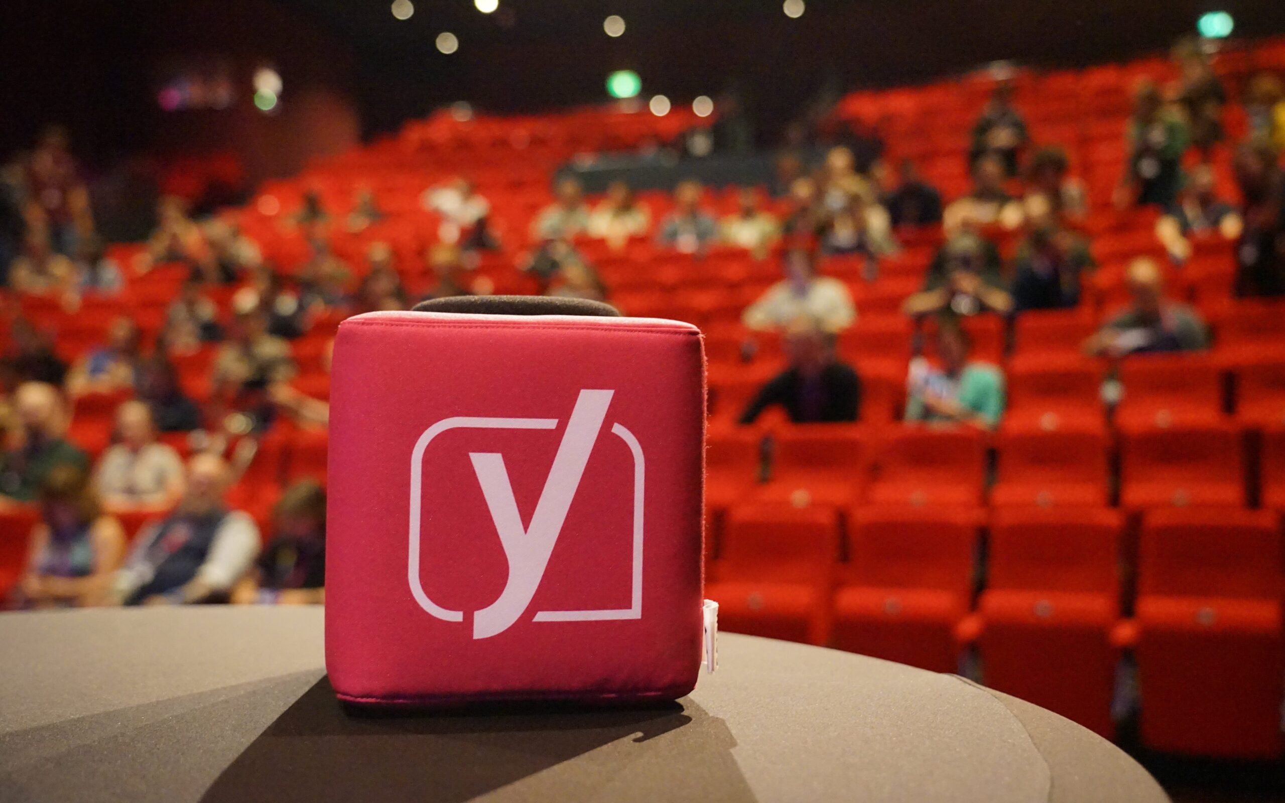
Yoast attends, organizes and sponsors many conferences and webinars. We can often be found at WordCamps in our booths or talking to the WordPress and SEO community.
We can’t wait to see you! Find out where you can find us next below!
Brighton SEO
Team Yoast is at Attending, Speaking, Sponsoring Brighton SEO! Click through to see who will be there, what we will do, and more!
See where you can find us nextThe SEO update by Yoast – April 2024 Edition
Get expert analysis on the latest SEO news developments with Carolyn Shelby and Alex Moss. Join our upcoming update! 📺️
All Yoast SEO WebinarsStay on top of your SEO game
Our top SEO guides
From beginner tips to comprehensive guides and deep technical insights, we’ve got everything you need to conquer the world of search engine optimization.


Are you feeling a bit lost?
Let us help you!
If you have a question about our products, need help if something isn’t working right, or just want to contact us, there are several ways to get in touch.
With a premium Yoast SEO subscription, you can contact the support team with your questions 24/7.
In the help center, you can find all the answers to questions about both free and premium plugins.

Learn everything about SEO, WordPress, and Yoast plugins with the free and premium online courses.