Interpreting your A/B test results
We’ve written a few posts on how to set up your A/B tests. However, the setup of your A/B tests is only the first step, obviously. Once you’ve set up a test and you’re getting some results, what should you do then?
In this post I’ll be explaining how you can interpret your A/B test results and what you should look out for.
Test duration
Before you can actually start interpreting your A/B test results, you need to be sure that your test has been running for at least 7 days. This means that you’ll have corrected for the fact that some days get you more traffic, sales or anything else than others.
There are some guides out there telling you to run until your test is at least 95% significant. Marieke has explained to great detail why this is oftentimes not a smart thing to do. Please be aware that this is not a hard requirement to our minds.
Interpreting your results
Sometimes it can be hard to actually know what’s going on when looking at the results of your A/B test. So let me walk you through what I always look at in the results:
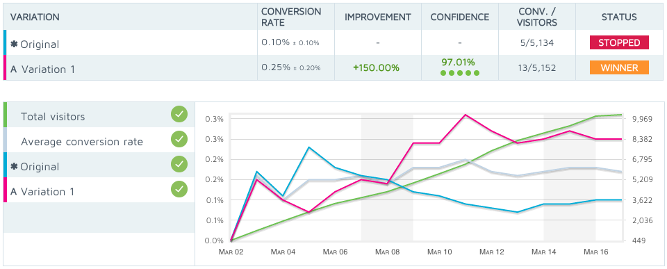
We’re using Convert for our A/B tests, and when a test is done, it will give us a chart that looks something like this one. There’s a lot going on here, which can be quite daunting. First of all, it shows quite clearly that Variation 1 is the winner. However, I’m always very careful when it comes to this. Let me show you why:
This chart shows you that there’s a pretty big jump in the conversion rate, the improvement is 150% and a nice confidence level. However, it also shows us that all this has been calculated over just 18 conversions. Over 10,000 visits, and just 18 conversions. I prefer to have at least 100 conversions on each variation, so this is pretty slim. Now we know that while this result is pretty awesome, we have to be careful in using this data to support any future action.
So, what’s next?
The next thing I’ll check is the graph:
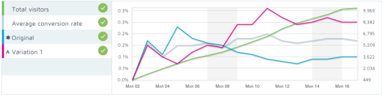
I always take a look at the trend of the test. This graph shows the conversion rate of the original version, the variation, the total visitors and the average conversion rate. The original version (blue line in this case) and the variation (purple line) should not be too close during the duration of the test. If there’s just a spike at the end that made the test variation the winner, you know the results aren’t trustworthy. In this case, it looks pretty good, as the variation outperformed the original pretty soon. But don’t get too ecstatic and stay aware of the low number of actual conversions, in this case.
Be sure you also look at the Y-axis (the vertical one) to make sure the differences aren’t really small. The Y-axis tends to change with results, so small differences can look like big ones.
Other statistics
Convert will give you quite some other statistics that could be interesting and important to look at:
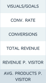
The conversion rate and amount of conversions are obvious ones, but I’m mostly interested in the revenue stats. Which version got you the most total revenue and revenue per visitor? But maybe you’re looking for a higher adoption rate of your product (more people using your product) instead of more revenue. In this case you should look at the bottom one: average products sold per visitor.
These statistics will be available per variation and will give you some detailed information on what the difference between the variations actually was. So be sure to look at these and use them for your interpretation!
Implementing the winning variation
In this case, we have chosen to implement the test variation, but we’ve also kept a close eye on the amount of sales and the revenue. We have checked the amount of sales and revenue against the weeks before, to be sure it wasn’t a fluke during the tests. And I implore you to do the same. It will probably not go wrong a lot, but when it does, you’ll be sorry for it. So stay aware of the fact that these tests are not perfect.
Over to you
Have you ever run a test without knowing what to do with the results? Did you ever make the wrong choice? Or you simply have something to mention about this post? Let me know in the comments!

Hey Guys, I’m just commenting on this post to check how your comment redirect page looks like!
Cheers!
Ok, a longer reply, I have more time now.
Most importantly, you cannot draw conclusions from 13+5 conversions from 10K visitors. The statistical power is just too weak. Hence my reply. It’s distracting considering the title of this post.
First thing to check after a test is this: have I met my pre-test thresholds?
– nr of conversions (if not, why not? You can calculate how many conversions you had the last n weeks, has anything changed?)
– p value (.05, tipically to reject the null hypothesis)
– power level (80%)
Then look at the graphs to check for odd things. Do I see trend breaches, weekend effects, does the result ‘flip’, etc.
Analyse this is your analytics tool, not your test tool.
Using e.g. Google analytics you can make segments. For example filter out customers, mobile users, etc. This depends on the hypothesis. Think of these segments before your test, not after.
If you have 10K visitors and a low conversion rate, pick a micro conversion, or filter out users. For a change in the footer of the page, segment visitors that have seen the footer. Use events to track that. This way, you weed out fluff.
Be thorough in your preparation. Testing is not a game, it’s serious stuff, you want to learn, not play.
When a conversion is worth $4500 and conversion rate is 0.3% @ 10K visitors: check your proposition. Do surveys, talk to your prospects. Don’t test button colors. Don’t draw conclusions that are based on sloppy testing.
First of all: thanks for your replies Jules and Nigel!
I agree with you on most parts Jules; we should have known beforehand that this wouldn’t have enough conversions. In this specific case that was actually a guess on our side, since it was a new product.
This was actually a pretty old example and one I specifically chose for the low amount of conversions, to show people that low conversions can actually lead to “significant” results according to these sorts of tools. I’ve also mentioned in the post that I’d like to have more visitors, but I’ll try and make this more clear.
I also totally agree with what you mentioned as being important to check after a test. I might make a more ‘advanced’ post on that. I wanted to make it understandable for everyone, because whether we like it or not, everyone is doing A/B testing these days.
Having said that, your additions are very welcome, as they’re spot on. Not that I expected anything less from you :)
I disagree with Jules Stuifbergen, 18 conversion per week from a page may be worthwhile if each conversion is worth say between $700 to $4500. Real data is almost always better than made up data and makes for a good way to explain what is not just a very clear result.
My questions to Yoast are:
1. Why didn’t they run the test for longer given the low conversion numbers?
2. Why use convert instead of the in-built google analytics experiments fuction?
3. Can Yoast make a function in the Yoast analytics plugin that allows for the Google analytics experiments code to be added naively?
Cheers!
Ok, a longer reply, I have more time now.
Most importantly, you cannot draw conclusions from 13+5 conversions from 10K visitors. The statistical power is just too weak. Hence my reply. It’s distracting considering the title of this post.
First thing to check after a test is this: have I met my pre-test thresholds?
– nr of conversions (if not, why not? You can calculate how many conversions you had the last n weeks, has anything changed?)
– p value (.05, tipically to reject the null hypothesis)
– power level (80%)
Then look at the graphs to check for odd things. Do I see trend breaches, weekend effects, does the result ‘flip’, etc.
Analyse this is your analytics tool, not your test tool.
Using e.g. Google analytics you can make segments. For example filter out customers, mobile users, etc. This depends on the hypothesis. Think of these segments before your test, not after.
If you have 10K visitors and a low conversion rate, pick a micro conversion, or filter out users. For a change in the footer of the page, segment visitors that have seen the footer. Use events to track that. This way, you weed out fluff.
Be thorough in your preparation. Testing is not a game, it’s serious stuff, you want to learn, not play.
When a conversion is worth $4500 and conversion rate is 0.3% @ 10K visitors: check your proposition. Do surveys, talk to your prospects. Don’t test button colors. Don’t draw conclusions that are based on sloppy testing.
G’day Jules,
Sorry for the confusion, I actually think that the results could have been clearer if the experiment ran longer (and had more conversions). All I was saying is that there may be a good reason to test that page. Seems to me it could use a conversion boost. Maybe they did change their proposition and that was what they were testing?
Cheers.
Your explanations of the graphs are OK. Your test preparation sucks.
My interpretation of these results: find a different page to test. 18 conversions per week is way too few. Not worth your testing time.
You should have known this upfront.
For the sake of this post, you should just make some numbers up. Now these figures are just distracting.