Boost your checkout page UX: Vital tips for online stores
The last step in an online buying process is always the checkout page; your website’s cash register. It consists of a number of steps that lead to a completion of a purchase. It’s not uncommon for people to abandon their shopping carts during the checkout process due to a bad user experience. And it’s a shame when this happens. In this post, we’ll discuss the things you can improve, from the UX of your shopping cart to your thank you page. We’ll tell you how to make your visitors as comfortable as possible while they complete their purchases.
If you want to learn more about user experience (UX) and other essential SEO skills, you should check out our All-around SEO training! It doesn’t just tell you about SEO: it makes sure you know how to put these skills into actual practice!
Before we begin, please realize that conversion and checkout page UX go hand in hand. Improving the UX of your checkout process will influence conversion as well. For instance, a too complicated checkout process accounts for 17% of cart abandonment. So you should be looking to make your potential customers as comfortable as possible while they complete their purchases. Don’t lose out on a purchase because of bad checkout page UX. With that said, let’s explore the various elements on your checkout page that affect user experience.
Design, layout and typography
Let’s quickly talk about the look of your checkout page before going into the actual content of the page. We recommend a clean design for the checkout page no matter the products or services you’re selling. The checkout page is all about completing purchases, and so everything on this page, including the page design should facilitate that. There’s no need to ‘wow’ your customers with fascinating images and interactive web elements anymore at this stage. Instead, try to make it quick and easy for them to go through the checkout process.
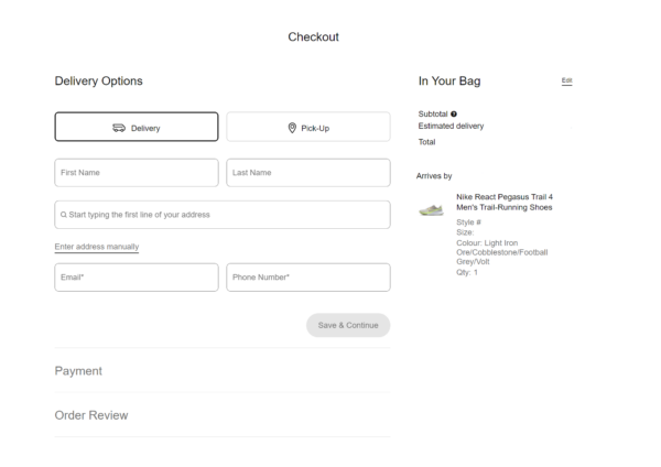
That could translate to employing a simple page design with lots of white space to make the important fields and information stands out. And the font choice should be easy to read on both desktop and mobile devices. Take Nike’s checkout page as an example, the page design is clean and simple, which makes it easy to get an overview of the checkout process.
Progress bar
One of the most important things to realize is that checkout page UX is actually about optimizing every single step (page) in the checkout process. Before going into detail, we’d like to mention your visitors’ best friend in the checkout process: the progress bar. It makes it visible for visitors how far along they are in the process. This actually results in gamification, which makes it even more likely they’ll finish the entire process.

At Yoast, we added a little motivational twist to improve the UX of our checkout page: a potential buyer starts in step 2 of the process. Step one is clicking the buy button, which the person has already done, right? That deserves validation as well! Starting in step 2 is like giving them a head start and will motivate them to complete the purchase.
If you don’t have a progress bar on your checkout page, it’s a good idea to design your page in a way that’s clear to customers where they are in the checkout process. For instance, Nike follows this approach on its checkout page (as seen in the example above).
Shopping cart overview
A very important aspect of your checkout page UX is the shopping cart overview. Regardless of what product you’re selling, every shopping cart overview should at least have these elements:
- Product images. These help a visitor remember what products they have added to the cart. Shopping takes time and this is just a friendly reminder.
- Prices. Clearly state the price of an individual article, the amount per article, any discounts if applicable and the total price customers have to pay.
- Shipping (and other additional) costs. Clearly state the shipping options and costs to prevent surprises. You shouldn’t have any additional costs after this point in the checkout process, as it will ruin any checkout page UX! In fact, 16% of cart abandonment is due to people not being able to see the total order cost up-front.
- Security signs. Clearly state that all is done in a safe, secure environment, for instance by a clear SSL certificate and things like Symantec seals. Testimonials also help for social security.
All these things combined create an optimal checkout page UX: a feeling of trust and convenience that will invite the visitor to complete the purchase.
An optional element to have in this overview is a list of available payment methods. You can just display their brand logos here to let customers know. We actually think that payment options should be clear even before going to the cart overview. That means having this information on product pages or on the footer of your website. This will prevent disappointments like the need to use an authentication device when there is none around.
Coupon codes
Nowadays, a lot more people are buying and giving gifts online with coupon/discount codes, so you must not forget about the coupon code option on your checkout page. The coupon code section should be clear and easy to find. There’s not a real harsh rule where you should place this option. But most companies make it convenient by placing it in the payment overview. Some companies also display this option both in the payment overview and in the shopping cart overview.
Next to that, when a customer uses a coupon code, it should be clear to the person that the code is indeed applied. This should also be reflected in the shopping cart overview by indicating the discount customers receive.
Guest purchase
Many online shops ask customers to create an account before they can move forward with completing their checkout process. We understand that a user account is more convenient for the customer and will make return visits and future purchases easier. It’ll allow for wish lists, invoice history and save a lot of support questions about that. And it is beneficial for you as the webshop owners because you can build a database about your users. However, creating that account is a barrier for a lot of potential customers and could lead to shopping cart abandonment.
It’s an extra step and it’s not improving your checkout page UX as such. Instead of that, you can ask customers to fill out their shipping details first and then provide them with the option to create an account after that. A second option would be to ask the customer to create an account for future purchases after the actual sale.
Shipping and invoice address
Many companies ask for this information as the first step in their checkout process (right after asking you to create an account or use the guest purchase option).
One of the most important things any UX or conversion expert will tell you: don’t ask too many details in an online form. You don’t need to know their pet’s name, unless you sell dog food and want to send the dog a present on his birthday, of course. No, not even then! There could be a nice gadget in your sidebar for that, but during the checkout process, only ask what’s necessary. Usually, that means you only need to ask for a:
- company name (in case you’re selling to companies)
- buyer’s name
- delivery/invoice address
- email address
- phone number
In a lot of cases, you don’t even need to ask for a phone number. And a simple checkbox will prevent them from filling in the same details twice: “Shipping and invoice address are the same”. Check. Of course, all these details are entered in a secure, safe environment and you’re using inline validation to guide the visitor through the form.
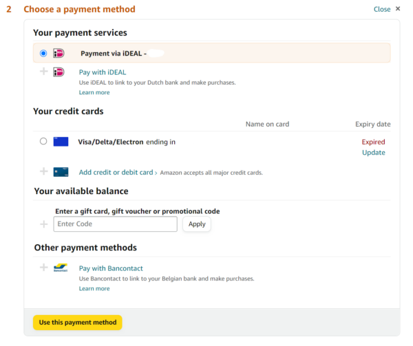
Payment overview and payment
All of the payment options should be listed clearly here. And as mentioned earlier: prevent surprise costs like additional shipping or other fees (or tax for that matter). Next to that, consider placing the discount code option in this section.
At this point, visitors will most likely finish their purchase. In this step of the checkout process, they will pick their preferred payment method and pay for the product(s). It’s a good idea to have an ‘order overview‘ step after the payment methods step and put your ‘place order’ button there. This gives people the chance to re-check their order one last time before they actually pay for the purchase.
After sales
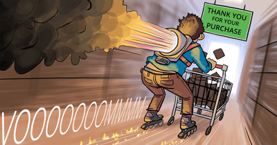
Now that the deal is closed, you need to guide the visitor to the door of your shop, thank them for their purchase and tell them to come back anytime. Nothing new here, as this is exactly what we do offline.
Thank them for the trust in your company. Tell them that you’ll do anything to make sure he’ll get the products asap and that you’ll handle the shipment with care. That’s just the general text on that thank-you page. There are more things you can do here:
- Create account. If your website has that account option like we mentioned before, you could offer the customer the option to create an account for future visits (again). Explain why this is beneficial.
- Subscribe to a newsletter. Ask the customer to subscribe to your newsletter, so he can stay up-to-date on promotions to come and new products you might have for him. If the buyer is enthusiastic about your website and/or products, he’ll subscribe.
- Discount for the next purchase. Everybody likes discounts and that’s undeniable. There are multiple ways to approach this. Offer it every time (“5% on your next purchase”), or combine it with the newsletter option (“subscribe and get a $10 discount code”). Send an email a few days before the coupon expires to remind people about the discount. Chances are they will buy, just because they don’t want to waste that discount.
- Share on social networks. Your (happy) customers are your marketeers. Ask them to share their purchase or a general promotion for your online shop. They made the purchase, probably like your website and chances are they will be willing to promote your site/products.
- Track & trace. Perhaps this should be on top of this list. If the purchase was for a reasonable amount of money, or the product is something the customer wants asap, track and trace allows them to see where the product is at any time (for instance ‘in production’, in the warehouse’, ‘delivery on its way to your house’).
That track & trace can usually be done by an app or online. But you should really consider sending updates per email as well about delivery dates, delays and things like that. Domino’s Pizza even tells you via push notifications that your pizza is in the oven. Apple sends an email a week before the delivery of your new iPhone. That’s not an email you’ll consider spam, right? Feel free to keep your customers up-to-speed on their purchase/delivery.
As mentioned at the top of this article, this isn’t a conversion guide for your checkout process. It deals with your checkout page UX. We think the checkout page UX shouldn’t have to differ much per webshop. And the checkout page UX shouldn’t discourage potential buyers from completing a purchase!
Read more: Shopping cart abandonment »
