How we designed Yoast SEO for Gutenberg

With the launch of Yoast SEO 8.0, we’re revealing our first real integration with Gutenberg. We’ve been working on this for a long time, and it hasn’t always been easy. Today, we’d like to take you behind the scenes of what it took to bring Yoast SEO to Gutenberg, why we took the approach we did, and how you can follow in our footsteps. Find out how we designed Yoast SEO for Gutenberg.
Don’t know what Gutenberg is? Catch up by reading our Gutenberg explainer article.
The long road
Before we get to the juicy details, a little history (feel free to skip ahead):
Around this time last year, I was made aware of the Gutenberg project by the Yoast leadership. My task was to envision how Yoast SEO could best integrate with this new editor experience. I spent some time playing around with it, and I was impressed by the new UI. The concept of blocks is really cool, both in design as well as functionality. Our conclusion at the end, however, was: this is nowhere near ready for any plugin to integrate with it.
The problem was two-fold:
- Gutenberg was in its early stages, with layout and functionality changing every week.
- It seemed as if minimal effort was put into thinking about how plugins should integrate.
It was understandable; the Gutenberg team was still prototyping. But their planning suggested it would launch by the end of the year, so we immediately treated it as an MVP that wasn’t ready.
Over the course of the next few months, we created a project team and started participating in the Gutenberg GitHub repo. We helped out in architecture discussions, made designs, and took the lead on building an API that allows plugins to register their sidebar, as well as building a modal component for when you need more space.
It took us a while to align our internal processes with that of the Gutenberg team. Over time we’ve become better at working together with them, and we’re still working side-by-side to improve the UI, UX and accessibility of Gutenberg to great effect.
We also started the Gut Guys video series, to inform people about this coming change to WordPress.
Best laid plans…
So how do you adapt a plugin as big as Yoast SEO to this entirely new environment?
Our initial plan was to integrate everywhere. Instead of being contained in a single metabox, could we break our plugin apart and put all the pieces in context? Maybe even some kind of SEO mode revealed at the flip of a switch like the gadgets in a James Bond car. This was a fascinating idea; it would mean we could give feedback exactly where it was relevant. Unfortunately, to date, this is still a bit difficult. We expect this will improve as Gutenberg gets closer to its release date.
So instead, we came up with a different solution: if every plugin has to integrate into the sidebar, the least we can do is give them their space, right? The sidebar isn’t very wide, and on small screens the default sections already fill the entire screen, let alone if you imagine a dozen plugins piling up in there, fighting for the top spot.
So we built the sidebar API. This gives you an entire blank sidebar to play with. You can pin it to the interface for quick access, and it puts your plugin in the spotlight.
After that, we began to adapt each feature of the Yoast SEO metabox to work in the sidebar.
Remastering Yoast SEO
We wanted to stick as close to the Gutenberg design language as we could so that the integration would appear seamless. Fortunately, Gutenberg uses a lot of modern design patterns and these mirrored things we were already doing in MyYoast. So merely by modernizing the UI and choosing JavaScript as the base, Gutenberg gave us the opportunity to unify our design across platforms much easier than we could before.
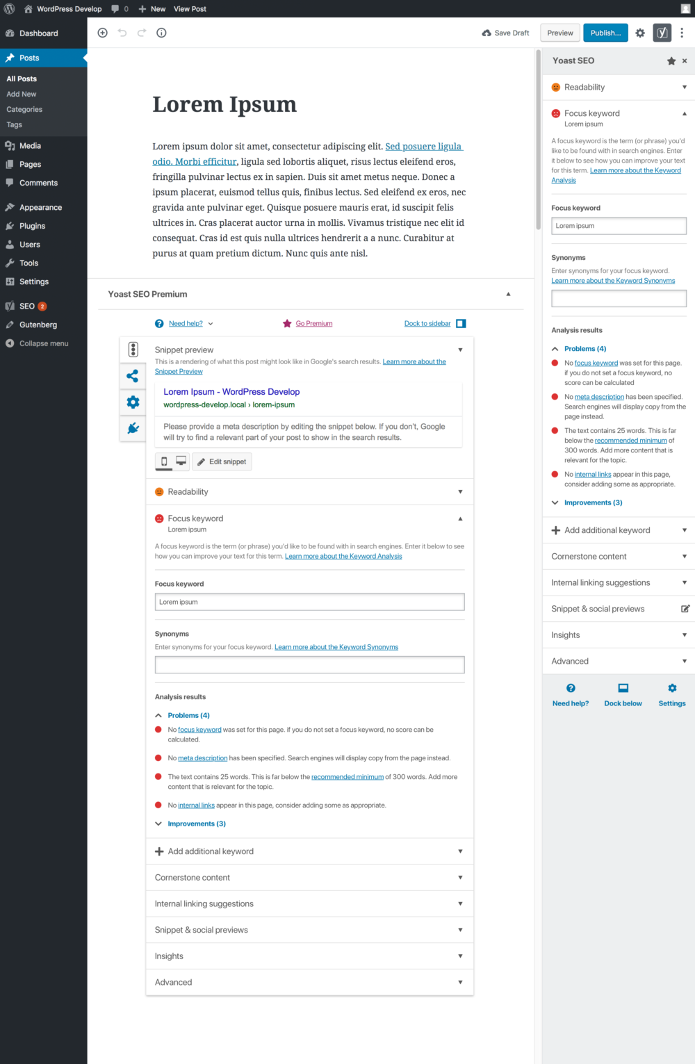 Needless to say though, having to fit a 640px metabox into a 280px sidebar isn’t easy. But it did force us to cut away a lot of the cruft. We used to have tabs above the metabox, tabs on the side of the metabox, sections within sections – it was a lot. When moving things to the sidebar, we had to be as economical with space as we could.
Collapsible headers
For the analysis, we introduced collapsible headers for each section. This vertical design helps keep things organized and focused. It’s also a much nicer pattern to work with in an increasingly mobile world. Similarly, Readability is no longer a separate tab but appears right above the focus keyword analysis.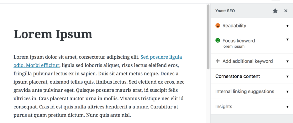
And even when collapsed, you can see your focus keyword and the resulting SEO score at a glance. We hope to bring this back to the publish box again too, so you can always keep an eye on your SEO.
Because some of these sections have a lot of features, we had to bump the font size of the headings up to 16px (from the default 13px for sidebar text and headings). That was one of the details where we intentionally departed from Gutenberg’s design language to improve the clarity of our interface.
The toggle and the input fields, too, are little details where we chose to use our version instead of the default Gutenberg one to give things a bit more depth and usability.
New smileys
We also introduced smileys to the bullets, to improve the clarity for people with visual impairments. Our accessibility expert Andrea is very pleased with those.
Multiple focus keywords
Since we can’t do horizontal tabs anymore in the sidebar, we’ve made adding multiple focus keywords an inline action. Whenever you’ve added a keyword, the option to add another one appears just below it. It only shows precisely what is needed, and that saves space.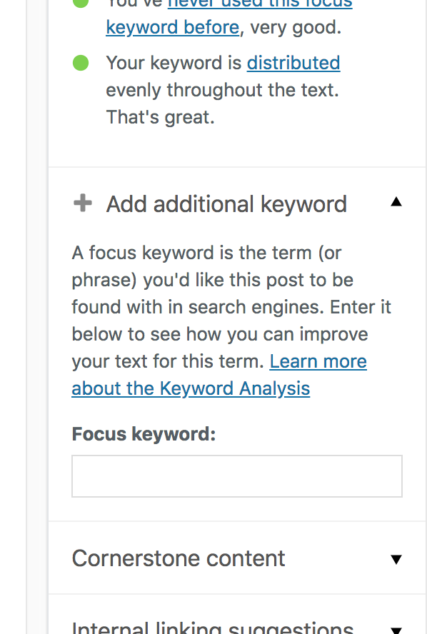
Cornerstone content
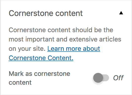
You’ll find the cornerstone content setting in its own section, with some extra explanation text. We’ve added this kind of context to every section so you can get a quick idea about what each section does, and a link to learn more if you want.
Internal linking
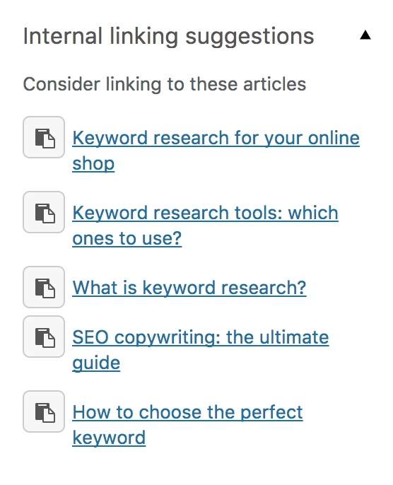
Internal linking is now also integrated into the meta box instead of being a separate section. We have a lot of exciting ideas with this feature in the future.
Snippet and social previews
The snippet and social previews present a unique challenge because you cannot reduce these to 280px. If we want to give you an accurate preview of a post on Facebook or Twitter, you have to see it exactly as it will appear. Therefore these functions are still in our ‘old’ meta box format. But we’ve got a plan for this in Yoast SEO 8.1 – which brings us to the next section:
What’s next
This new version of the Yoast SEO meta box is a big step forward in design, but you could argue that regarding functionality it hasn’t changed all that much, and you’d be right. But just as the Marvel Cinematic Universe operates in phases, so too is this just Phase One of our Gutenberg integration timeline.
The first thing we’ll be doing for Yoast SEO 8.1 (regarding our Gutenberg integration) is introducing modals.
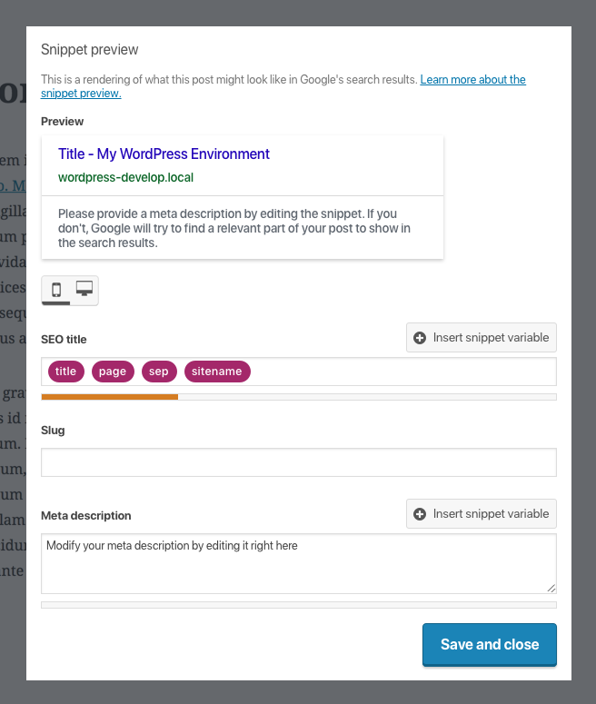 This will put Google, Facebook, Twitter et al. into one convenient box that will appear over the content. This will provide plenty of space to house everything, and it will all be presented with the new UI and template variables introduced in Yoast SEO 7.7.
 With these modals in place, we can entirely switch from our classic metabox to our new sidebar – that is, if you want, because we’ll offer the ability to toggle between the two. And that includes the classic editor. All of the above design improvements will come to the current WordPress editing experience too, so even if you decide not to use Gutenberg, you will still be able to enjoy our improved interface.
We’re also updating our extensions like News SEO and Local SEO to work with Gutenberg. These settings will soon also be available in the sidebar, and come with some accessibility improvements too.
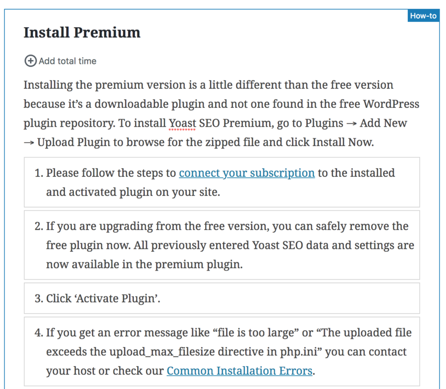 Another thing we’re working on are some blocks that make it easy to add Schema support for specific types of content. The how-to block above is one of the first but we’ve got more planned, stay tuned.
What you can do now
You may not have a whole team of developers at your disposal, but you can still do a few things to prepare your plugin or theme for Gutenberg.
First of all, check if your plugin works well with Gutenberg
Like we said, plugins will by default appear as a classic metabox in Gutenberg, and should still work if they don’t do too many fancy things. But check that. Install the Gutenberg plugin right now and see how your plugin or theme handles it.
Learn how you can make your plugin or theme compatible with Gutenberg
Basic compatibility with Gutenberg shouldn’t be a lot of work. There isn’t a ton of official documentation yet, but here are a few helpful links:
- Watch Linkedin Learning’s video about how Gutenberg and blocks work.
- Find out what the design principles of Gutenberg are.
- Read about how you can make your theme support Gutenberg.
- Try the Block Unit Test plugin which generates a sample page with every available block, so you can see what they all look like in your chosen theme.
If you want to get a bit more technical:
- Zac Gordon has a great course on developing for Gutenberg, and another course on theming for Gutenberg.
- Learn how metaboxes work in Gutenberg
- Learn how blocks work in Gutenberg
- Daniel Bachhuber made a list comparing actions, hooks and filters between the classic editor and Gutenberg.
Start thinking in blocks
Not everything about a plugin needs to be put in the sidebar. You can solve a lot of things with custom blocks. We’re building a few too for specific Schemas and Local SEO widgets. So spend some time using Gutenberg and building different things with it, so you get a feel for how blocks work. It might give you some unexpected ideas.
As a designer, take advantage of this Sketch template for WordPress mockups by 10up. It already includes Gutenberg interface elements to get creative within your mockups.
For developers, there is a great block starter kit by Ahmad Awais, and Atomic Blocks has some fun custom blocks to look at for inspiration. Shortcodes too are an excellent fit for blocks. Gary Pendergast wrote a useful script that shows how you can convert shortcodes into blocks.
Start small
Above all, start small. If your plugin or theme isn’t broken, don’t go crazy rebuilding it in React. Try making a custom block, and play around with the sidebar elements until you are comfortable with this new design language. That design language is still evolving every day, so stick with the basics. Use what there is and see what you can build with it.
Dream big
The future of Gutenberg goes well beyond just text editing. Eventually blocks will also be available in sidebars and maybe even directly in the WordPress customizer. If you’re a little creative, you can already use Gutenberg for page layouts now. Atomic Blocks offers some useful layout blocks for example and a theme that goes with it. And heck, look at what XWP made with a few custom blocks. If you’re up for it, this could be a chance to pave the way for modern design in WordPress.
The future of WordPress is exciting. We can’t wait to see what you make with it.
Read more: What is Gutenberg? »


If I “give the Gutenberg a whirl” in advance – Questions: 1) If other plugins do not work (yet) with Gutenberg, does that mean while we are “giving it a whirl” the plugins will be broken an cause sudden havoc on out site(s)?
2) With current posts we are working on , should we “switch over” to Gutenberg and publish them……meaning they will be forever in the new gutenberg format from the get go…….& then if we switch back to classic those posts will remain in Gutenberg….?
3) If we are able to publish new posts in Gutenberg now using the plugin, is it better to begin doing that now VS. publishing using the classic mode ??
BTW, I have look at the new format and it does look good.
Thank you in advance!
Hi Will,
1) Installing Gutenberg will not have an effect on your current site and posts, even if plugins are not fully compatible with it. Gutenberg adds nothing new to your site until you use it to publish a post. It could be that your theme does not show Gutenberg content correctly, but then it would only be that specific post that you published with Gutenberg that would have that problem, the rest of your site will still be fine.
2) However, if you open any existing posts with Gutenberg, they will be converted, and this might cause problems. Once posts are converted, that’s it, you cannot open them in the classic editor anymore (well, you can, but it’s officially discouraged to do that). So, you can make a few new posts to test Gutenberg, but I wouldn’t start converting old posts at least until Gutenberg is merged into WordPress 5.0.
3) Gutenberg makes it easier for you to write, but the resulting published content is not notably different or better than content made in the classic editor. So like I said, as all classic content is compatible with Gutenberg, but any Gutenberg content is not so easily opened in the classic editor if you decide not to switch, I would advise to keep publishing with the classic editor until WordPress 5.0 while you test Gutenberg.
Great post thank you for value bull words
Thank you!
Great to see the efforts to make Yoast Gutenberg-ready.
Everything looks great so far except for the way Content Analysis is placed in the sidebar.
It can become really long in some cases and will be difficult to navigate.
Glad you like our first efforts to integrate Puneet! I agree that the analysis sections can become quite long, we hope to eventually break it up into little pieces that we can show in context. It will require some more design exploration, but it’s definitely on our list.
Hi Tim,
Glad to see my favorite seo plugin is being prepared for gutenberg.
I have not yet tried gutenberg.But will certainly try it now.
Thanks for bringing us such awesome things
Thanks! Let us know if you have any feedback when you try Gutenberg.
I don’t know much about coding but I love the Gutenberg blocks. I also relish its idea of having Yoast in the sidebar instead of having to scroll up and down all the time.
Looking forward to 8.0 and the other 8s to come.
Thanks Lyn! We’re very happy to have the content analysis much closer to the action too, and there’s more to come in future versions.
Hi Tim,
Will we be using the Dock Below button to put Yoast under the content.
I am currently using the non-premium version of Yoast and when I install it, it appears in the sidebar. Currently if you try to drag a metabox under the content when n other block exists there you can’t. The only workaround at the moment is to go to the classic editor and move it there and then go back to Gutenberg. Similarly if you have all metaboxes from third parties that you can move beow the content, you can’t move any of these to the sidebar.
The GB team are aware of this but it is all these small glitches in GB that make me see it as a 1 star product. And it is not just that. Any of the standard WordPress sidebar items can’t be arranged at all, as is the case with the current editor, though your screenshots above suggest you can?. Many of my workflows depend on the ability to do this in the editor.
Hi Stephen,
Yes there is certainly a lot of UX work to be done in Gutenberg before it is fully ready, but you raising the issue with the GB team is definitely a great start. The problem you describe is something I had not thought about much yet, and so you can see that everyone has a unique perspective on how GB should work, so thanks for taking the time to share that!
We will indeed be adding our own toggle to move between the sidebar and the metabox (expect it in a forthcoming 8.x release), although I expect GB to support rearranging metaboxes in the future. Let’s hope it will come sooner rather than later!
I know Gutenberg is really under heavy development, although we can try it at this moment and yet…
If that means I cannot use yoast anymore, then I probably won’t update it.
I’m really glad to see this article, so that means yoast has been working on it to make it compatible once Gutenberg finally released.
Hi Hari, Gutenberg is definitely still under a lot of development, but you can count on us to support it when it is released, as well as the classic editor plugin if you don’t want to switch yet.