How to make your YouTube videos responsive

Embedding YouTube videos is one of the most effective ways to enrich your content, explain complex topics, and keep visitors engaged for longer. Video helps users absorb information more quickly and can significantly improve the time spent on a page. But if your videos do not scale correctly across different screen sizes, they can just as easily damage the user experience. A video that overflows the layout, appears cropped, or forces users to zoom on mobile creates friction and can undermine even the best content.
Key takeaways
- Responsive YouTube videos adapt to different screen sizes, improving user experience and SEO.
- You can make videos responsive using CSS, a responsive WordPress theme, or Yoast SEO Premium with Video SEO.
- A responsive design prevents layout shifts, supports mobile friendliness, and enhances performance metrics like Core Web Vitals.
- Users prefer responsive videos as they encourage longer viewing times and lower bounce rates, benefiting engagement.
- Overall, responsive video is crucial for modern websites and their SEO strategies.
In this guide, you will learn how to make your YouTube videos fully responsive, ensuring they display correctly on desktop, tablet, and mobile devices. You will also see why responsive video matters for usability, performance, and SEO, and how Yoast SEO Premium with Video SEO can support your video strategy at scale.
What does “responsive” mean for YouTube videos?
A responsive video automatically adjusts its size to match the screen it is viewed on, while maintaining the correct aspect ratio. Instead of being locked into fixed width and height values, a responsive video scales fluidly within its container. This allows the same embed to work seamlessly on a large desktop monitor, a tablet in landscape mode, and a smartphone held in a vertical orientation.
When a video is not responsive, the problems are immediately visible. It may extend beyond the page’s width, overlap other elements, or appear partially hidden. On smaller screens, users may be forced to scroll sideways or zoom in just to watch the content. These issues compromise accessibility and signal to search engines that the page may not be optimized for mobile devices.
Responsive video is, therefore, not just a design preference. It is a foundational requirement for modern, mobile-friendly websites.
Method 1: Make YouTube videos responsive with CSS
If you are comfortable working with CSS, you can make almost any YouTube embed responsive by wrapping the iframe inside a container and applying a simple set of styles. This approach is useful if your theme does not already handle responsive video embeds correctly.
This example shows the structure only. You do not need this code if your theme already supports responsive video embeds. It is included here for users who want to apply a manual fix or who are working with older themes or custom layouts.
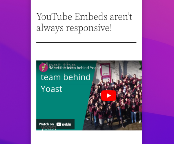
When embedding a YouTube video on your website, you’ve probably discovered a minor but very annoying issue: YouTube embeds are not natively responsive. This means that when you’re viewing your web page on a mobile device, for example, the video doesn’t properly resize with the rest of the page elements. This can negatively impact your website’s design and usability. So why does this happen, and what can you do about it?
<div class="video-container">
  <iframe src="https://www.youtube.com/embed/VIDEO-ID" frameborder="0" allowfullscreen></iframe>
</div>
.video-container {
position: relative;
padding-bottom: 56.25%;
height: 0;
overflow: hidden;
max-width: 100%;
}
.video-container iframe {
position: absolute;
top: 0;
left: 0;
width: 100%;
height: 100%;
}
The padding value of 56.25 percent corresponds to a 16:9 aspect ratio, which is the standard format for most YouTube videos. If you use videos with different aspect ratios, such as square or vertical formats, this value may need to be adjusted. This solution works seamlessly across almost all WordPress themes, providing precise control over how videos behave and interact with the rest of your layout.
Method 2: Use a responsive WordPress theme or the block editor
Most modern WordPress themes are responsive by default. When a theme follows WordPress coding standards, YouTube videos embedded through the block editor will usually resize automatically without any additional configuration.
To embed a responsive YouTube video using the editor, you simply add a YouTube block or paste the YouTube URL directly into the content area. WordPress will convert the link into an embedded player that adapts to the width of the surrounding content. In most cases, this is the easiest and most reliable solution because it requires no code and no manual styling.
If your videos are still not behaving responsively, the issue is usually not with YouTube itself, but rather with the way your theme handles embedded content. Some themes apply fixed-width styles to iframes, restrict overflow in content containers, or override default WordPress embed behavior. Older content created before the block editor was introduced may also rely on outdated embed methods that are not mobile-friendly.
Method 3: Use Yoast SEO Premium with Video SEO
If video is a central part of your content strategy, relying on manual fixes quickly becomes inefficient. Yoast SEO Premium includes full Video SEO functionality, which handles both the technical optimization of your videos and their presentation in search results at scale.
With Video SEO included in Yoast SEO Premium, your video embeds are detected automatically and enhanced with the appropriate video structured data. This helps search engines understand the relationship between your videos and the surrounding content, which improves how your pages appear in video-enhanced search results. The plugin also supports consistent mobile rendering, helping your videos remain responsive across various devices without requiring custom CSS on every page.
This is particularly valuable for websites that publish large volumes of video content, such as tutorial sites, online courses, product documentation hubs, and marketing platforms that rely heavily on demos or explainer videos.
Aspect ratios, formats, and modern viewing behavior
Most YouTube videos utilize a 16:9 aspect ratio, which is well-suited for use across desktops and widescreen mobile displays. However, modern viewing behavior is increasingly incorporating vertical and square formats, particularly for short-form and mobile-first content. When embedding these formats, responsiveness becomes even more important, as fixed layouts are more likely to break on smaller screens.
From a technical perspective, responsive containers ensure that the viewing area adjusts proportionally, regardless of whether the video is in landscape, square, or portrait orientation. From a usability perspective, this ensures that users do not encounter letterboxing, awkward cropping, or unreadable interface elements on mobile devices.
As viewing habits continue to shift toward mobile-first consumption, responsiveness is no longer something you optimize after the fact. It is something you must design for from the start.
Performance, Core Web Vitals, and responsive video
Responsive video also plays an indirect but important role in site performance. Poorly implemented embeds can cause layout shifts during page load, especially on mobile connections. These shifts affect Cumulative Layout Shift, which is one of Google’s Core Web Vitals metrics. Learn how to stop videos from negatively impacting Core Web Vitals.
A properly responsive embed reserves the correct space for the video before it loads, preventing sudden layout jumps. This results in a more stable visual experience and improved perceived performance. In addition, responsive containers prevent unnecessary scaling or oversizing, which can reduce rendering overhead on slower devices.
While YouTube itself handles video delivery and compression, how you embed and display the player still affects user experience and overall page quality.
Common reasons YouTube videos are not responsive
When YouTube videos fail to resize correctly on mobile or tablet devices, the cause is nearly always technical. Some sites hard-code width and height values directly into iframe embeds, which prevents fluid scaling. Others use theme containers that restrict width or hide overflow in ways that interfere with resizing.
Content created with older editors or legacy shortcodes may rely on techniques that predate responsive design, which can cause issues with rendering. Certain page builders can also override default WordPress behavior and introduce fixed layouts that break responsiveness.
In most cases, switching to the block editor’s native embed approach or applying the CSS solution described earlier is enough to restore proper scaling across devices.
Why responsive video matters for SEO
Responsive design is a fundamental part of mobile friendliness, which is a core factor in how search engines evaluate your pages. When videos resize smoothly across devices, visitors are more likely to engage with the content, watch for longer, and continue navigating your site.
These positive user signals contribute to improved dwell time, lower bounce rates, and stronger overall engagement metrics. While responsive video alone will not guarantee rankings, it removes a common technical barrier that can undermine otherwise strong content.
When responsive rendering is combined with proper video structured data through Yoast SEO Premium, your videos also gain better eligibility for enhanced search appearances.
Bringing everything together
Making your YouTube videos responsive is one of those technical improvements that pays dividends across usability, performance, and SEO. Whether you choose a simple block editor embed, a custom CSS solution, or a scalable approach using Yoast SEO Premium with Video SEO, the goal is the same: to ensure that every visitor can watch your content comfortably on any device.
Responsive video supports modern browsing behavior, enhances mobile friendliness, and fosters a more professional and trustworthy experience for users. As the web is increasingly video-driven and mobile-first, it is no longer optional. It is a baseline standard for any serious website.