The a11y Monthly: Making modals accessible

Modals are a pretty common interface on the Web. Developers and designers might give them different names: lightbox, modal window, dialog, overlay… but they’re basically the same thing. A modal is a window that appears on top of the page overlaying other content. In this post, I’ll try to explain what needs to be done to make modals accessible.
What is a modal dialog?
In the Accessible Rich Internet Applications (ARIA) specification a modal is a dialog or alertdialog. They’re inspired by the dialogs we see in our operating systems and have two different purposes. The “alertdialog” is used to convey an alert message to users, while the “dialog” is a generic purpose window.
On the web, in most of the cases dialogs are used to ask users for some input (for example, fill out a form or submit a response to a question), show additional textual information or larger version of an image, etc.
Usually, the rest of the page is dimmed and users are not allowed to interact with it until they close the dialog. In ARIA terms, this is a “modal” dialog. Yes, there are also “non-modal” dialogs that allow interaction with the rest of the page and in this case they’re more “panels” that float on the main window. In this post, we’ll talk about modal dialogs.
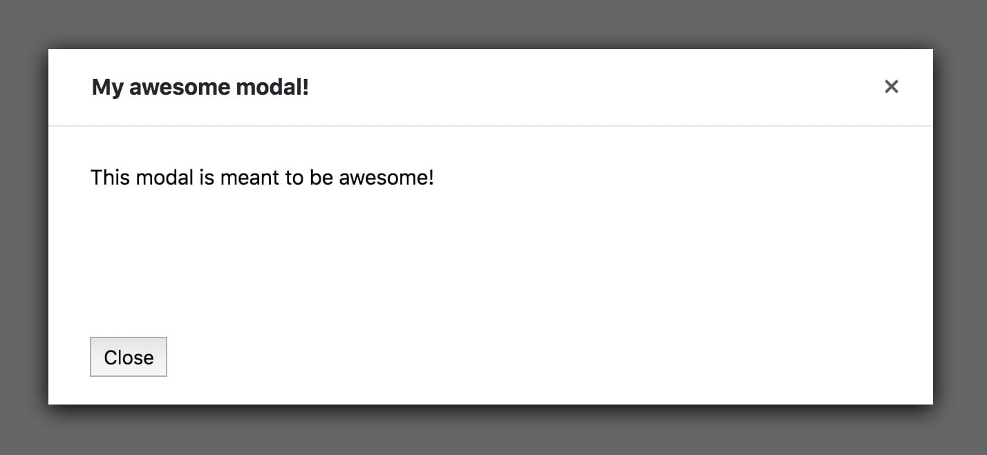
Here’s how a very basic modal dialog looks like:
The accessibility issue with modals
While visually everything is clear and mouse or touch users are perfectly able to interact with a modal dialog, keyboard users and assistive technology users may face a huge barrier. They could even be unaware a modal dialog is displayed on the page.
For example, the first problem to solve is that when using the keyboard to navigate a web page and a modal opens, keyboard focus stays on the background page. Pressing the Tab key to navigate will keep moving keyboard focus on the elements in the background page. While the overlay doesn’t allow mouse and touch users to interact with the rest of the page, keyboard users can still interact with it because keyboard focus is still there. This defeats the whole purpose of a modal dialog.
One more example: screen reader users might not even be aware a modal dialog opened: keyboard focus is still on the control that activated the modal and from a blind person perspective, nothing happened.
Keyboard accessibility
The content of a modal dialog is typically placed in the code at the bottom of a page, and so it’s taken out of the normal tab order. If this is the case, when the modal dialog opens and keyboard focus stays on the background page, users would be forced to tab through a big part of the page to be able to access and interact with the modal.
Similarly, when the modal closes, it’s very likely a focus loss is going to happen as the previously focused element was in the modal. When a focus loss happens, keyboard users are forced to start navigation from the document root (the top of the page). To address these issues, there’s the need to manage focus programmatically.
Managing focus
- when the modal dialog opens, keep and store a reference to the UI control (likely a button) that opened the modal; we’ll call this the “invoking context”
- move focus to the modal dialog: there must be at least one focusable control within the dialog
- depending on the modal dialog content, you may want to set the initial focus to the top of the modal or to the first form field (if there’s a form) or to the first focusable element; this really depends on the modal content and should be evaluated on a case by case basis
- “trap” focus within the dialog: remember the dialog is “modal”, meaning interaction with the rest of the page shouldn’t be allowed; when pressing the Tab key within the modal and the last focusable element is reached, focus should be moved to the first focusable element and vice-versa
- when the modal closes, either by pressing the Escape key or pressing the Close button, focus should be moved back to the “invoking context” previously stored
Worth reminding the expected interaction with a modal dialog is described in details in the ARIA Authoring Practices.
Screen readers and modal dialogs
Screen reader users are often keyboard users. Please consider not all screen reader users are blind, so some of them actually use the mouse to some extent. Anyways, all the previous points about keyboard accessibility apply to screen reader users too. Additional issues need to be addressed though, mostly about semantics and the way screen readers announce web content.
Use an appropriate ARIA role
When focus is moved to a modal dialog, the first thing screen reader users need to know, is what this part of the user interface is. ARIA roles answer this question: they describe the “role” an element plays in the context of a web page. Many HTML elements have an implicit “role”, for example a button is announced by screen readers as a “button” and so on.
Until the HTML dialog element is well supported, modal dialog use just a “div” element with no native semantics. We need to add the missing semantics using a dialog or alertdialog role. These two roles have different purposes and in most of the cases you will need the “dialog” one. Screen readers will announce the role as “dialog” or “web dialog”.
Give the modal dialog a label
For good accessibility, everything needs to be properly labelled. A modal dialog needs to inform screen reader users about is content and purpose so it needs to be labelled. This can be achieved in two ways:
- if the modal has a visible title, use the ARIA property aria-labelledby to associate the visible title with the modal container (the element that has role=dialog)
- if the modal doesn’t have a visible title, use the ARIA property aria-label with some meaningful text on the element that has role=dialog
Ideally, the first option is preferable because a visible title helps everyone in identifying the content and purpose of the modal. Again, all the necessary labelling is described in detail in the ARIA Authoring Practices.
A note about aria-modal=”true”
The ARIA property aria-modal is new in ARIA 1.1. Its purpose is to make assistive technologies automatically navigate to a modal when it opens and ignore other content on the page. That would save the need to manage focus programmatically and hide other content in the page. Awesome.
Unfortunately, based on my testing, aria-modal is not well supported by browsers yet and can have drastic, unexpected consequences. Specifically, Safari 11.1 considers the content within the modal as “hidden” for assistive technologies, thus screen readers (VoiceOver on macOS) are instructed to ignore any textual content. Aria-modal is the future but at the time of writing this post, I’d recommend to avoid to use it.
Hide from assistive technologies all the content outside of the modal
Since aria-modal doesn’t work well yet, there’s still the need to hide from assistive technologies all the content outside of the modal. Please consider screen reader offer to users alternative ways to navigate content other than pressing the Tab key. Using dedicated shortcuts, screen reader users can navigate through all the headings in a page, all the links, all the form fields, all the landmark regions, and so on. This means that at an moment screen readers can navigate outside of the modal because the rest of the content in the page is still perceivable by screen readers.
At the current state of the technology, the only reliable way to hide the content outside of the modal from assistive technologies is by using the aria-hidden state. Again, this is very well described in the ARIA Authoring Practices where it’s stated it’s important that:
- aria-hidden is set to true on each element containing a portion of the inert layer
- the dialog element is not a descendant of any element that has aria-hidden set to true
When all the points above are addressed, the modal will be the only available content in the page for screen reader users too: they can’t tab away from the modal, and there’s no other perceived content outside of the modal they can move to by using other shortcuts.
Of course, when the modal closes, don’t forget to remove any aria-hidden attribute that was previously set.
Screen readers interaction modes
In addition to all the previous points, there’s one important thing to clarify. Screen readers have different interaction models. VoiceOver on macOS has its own specific, peculiar model. All other major screen readers on Windows have “interaction modes”. Understanding screen reader interaction modes by Léonie Watson is a perfect start to understand these modes and I’d recommend to read it before we continue.
Welcome back! Did you read the article about screen reader interaction modes, right? So, forms (or focus) mode is designed to allow users input in form fields or to use some specific ARIA widgets. In this mode, text content is ignored. Why this is important for modal dialogs?
Putting it simply, some screen readers (NVDA among the major ones) used to automatically switch to “forms mode” when inside a modal with an ARIA role="dialog". The NVDA behavior was based on the fact that the modal dialog content was expected to be mostly made of form fields or other interactive controls, so “forms mode” was considered the most appropriate mode.
That made perfectly sense because in ARIA 1.0 a dialog was defined as follows:
A dialog is an application window that is designed to interrupt the current processing of an application in order to prompt the user to enter information or require a response
As a consequence, in the traditional approach to make modals accessible, it was recommended to associate any textual content to the modal itself using the aria-describedby property. This was necessary to make sure any text within the modal was announced by NVDA in “forms mode”. This whole traditional approach is described very well in the excellent post Advanced ARIA Tip #2: Accessible modal dialogs by Marco Zehe. You will still find around a lot of recommendations to use aria-describedby to associate all static text within a dialog with the dialog itself, and that was basically required by ARIA 1.0.
Something has changed in ARIA 1.1
In the ARIA 1.1 specification (14 December 2017) the definition of “dialog” has changed and it is now:
A dialog is a descendant window of the primary window of a web application. For HTML pages, the primary application window is the entire web document, i.e., the body element. Dialogs are most often used to prompt the user to enter or respond to information. A dialog that is designed to interrupt workflow is usually modal.
While the change may seem subtle, it implies that modal dialogs can be used not only for content that expects users input but also for different kind of content, for example content that is mainly made of static text or images. This new definition is certainly closer to the actual usage of modals in real life.
As a consequence, the NVDA team (they do a great job and NVDA is free and open source!) changed their screen reader behavior in the 2017.4 release and now NVDA doesn’t automatically switch to forms mode any longer when it encounters a dialog. For more details, you can follow the discussion that happened on the related GitHub issue.
To my knowledge, today all major screen readers don’t switch to forms mode when focus is moved into an element with role="dialog". Static text and images are read out as in a normal web page. In other words, there’s no need to associate static text to the modal itself using aria-describedby. Also the ARIA Authoring Practices 1.1 state:
Optionally, the aria-describedby property is set on the element with the dialog role to indicate which element or elements in the dialog contain content that describes the primary purpose or message of the dialog. Specifying descriptive elements enables screen readers to announce the description along with the dialog title and initially focused element when the dialog opens.
So, using aria-describedby is now optional and recommended just to describe the primary purpose or message, it is not required for all textual content. There’s only one edge case where using it may still make sense, and it’s when inside a role=”application” (which triggers “forms mode”). That’s certainly something to be aware of, but also a very rare case for advanced applications.
Other general accessibility considerations
As usual with accessibility, any implementation should be tested with different browsers and assistive technologies. Different kinds of users impairments should be taken into considerations and it is important to be aware there’s no implementation that can fully cover all the cases.
For example, when it comes to cognitive impairments, there’s a new whole world of potential accessibility barriers to take into considerations. Just a couple examples:
- modal dialogs may look like a “page” and users might try to use the browser’s “back” button to go back to the main page
- users might try to bookmark the content of a modal that looks like a page, just to realize that it won’t work as expected
There’s literally a multitude of different scenarios to take into consideration and the only valuable thing to do is continuously testing, involving users in the testing process as much as possible.
Want to help?
At Yoast, accessibility matters. We know it’s a process and we’re continuously improving, testing, iterating, and developing. We’re always open to feedback and contributions. Please do not hesitate to let us hear your voice. Please report any issues or potential improvements you notice in our products.
Read more: Web content accessibility at Yoast »
At Yoast, I help improving Yoast's technology accessibility, spreading accessibility culture and blogging about it. I try to do my best to do the same for WordPress, where I'm contributing as a permanent core committer.

Introduction to Yoast SEO webinar
A practical, demo-driven webinar on using Yoast SEO for WordPress with confidence.
All Yoast SEO WebinarsWordCamp US 2026
Team Yoast is Attending, Sponsoring, Yoast Booth at WordCamp US 2026! Click through to see who will be there, what we will do, and more!
See where you can find us nextThe SEO Update by Yoast – August 2026
Expert analysis of the latest SEO & AI news developments with Carolyn Shelby and Alex Moss. Watch the update here. 📺
All Yoast SEO Podcasts
Thank you for giving useful Information