Visually direct and captivate your visitors
In the last month I’ve been speaking at a few conferences with a talk I’ve dubbed “The Psychology behind Conversion”. In this talk I’m trying to explain why everyone who maintains a website should be interested in psychology and how it can help them.
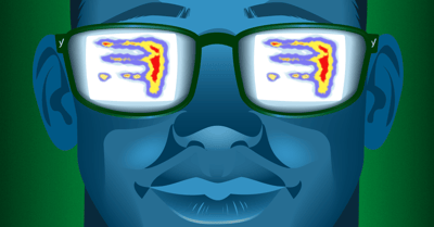
Being interested in psychology, especially when applied to the web, is more than just reading Cialdini’s Influence. Don’t get me wrong by the way, that book is awesome. But there are just so much more psychological processes at work than people are probably aware of. One of the most important ones, to my mind, is visual attention. People undoubtedly understand that attention is of importance when it comes to doing, well, anything really. So the same goes for visiting websites. But in my opinion it is not just attention, but visual attention that’s most important for visiting websites.
Visual attention
There are a lot of processes playing their part in this. We are very visual beings, and not being able to see, especially when you’re used to seeing, impairs us more than anything. It literally helps us understand our world. Our sight can even influence our other senses, such as taste.
So it’s of great importance to direct your visitor’s visual attention to those parts of your website you want them to see. To make sure you’re keeping their visual attention. In this post, I will discuss three aspects of visual attention: visual cueing, facial distraction and perceptual incongruence.
Visual cueing
Visual cueing basically means directing your visitors’ gazes. You can do this with colors or textual directions, but the most effective way is shapes. And there’s one shape that’s unparalleled when it comes to visual cueing: the arrow. Now, I use the term ‘arrow’ in a broad term, as it can be an actual arrow, or more of a triangle shape.
On wheelofpersuasion.com you can find a great explanation on this. Especially this picture makes it very clear:
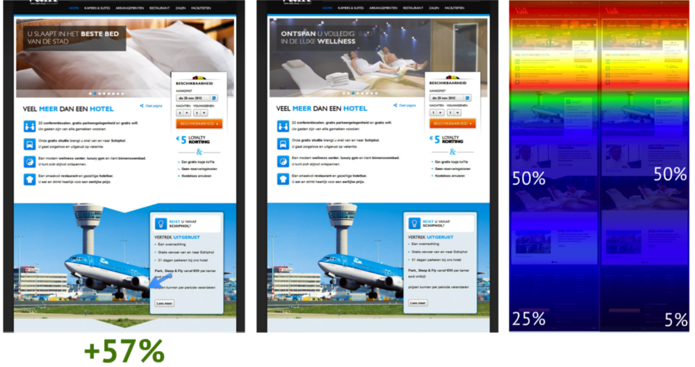
So adding those simple triangles in the images resulted in a huge increase in people scrolling down to the bottom of the page. But even more amazing: they had a 57% increase in conversion. So this already shows that keeping and directing your visitor’s visual attention pays off. Obviously, this is a process that every parallax website should be taking advantage of!
Facial distraction
The second aspect of visual attention I would like to discuss is facial distraction. If you’re interested in usability, eyetracking, conversion, or just read too many blogs, you’ve probably seen this image:
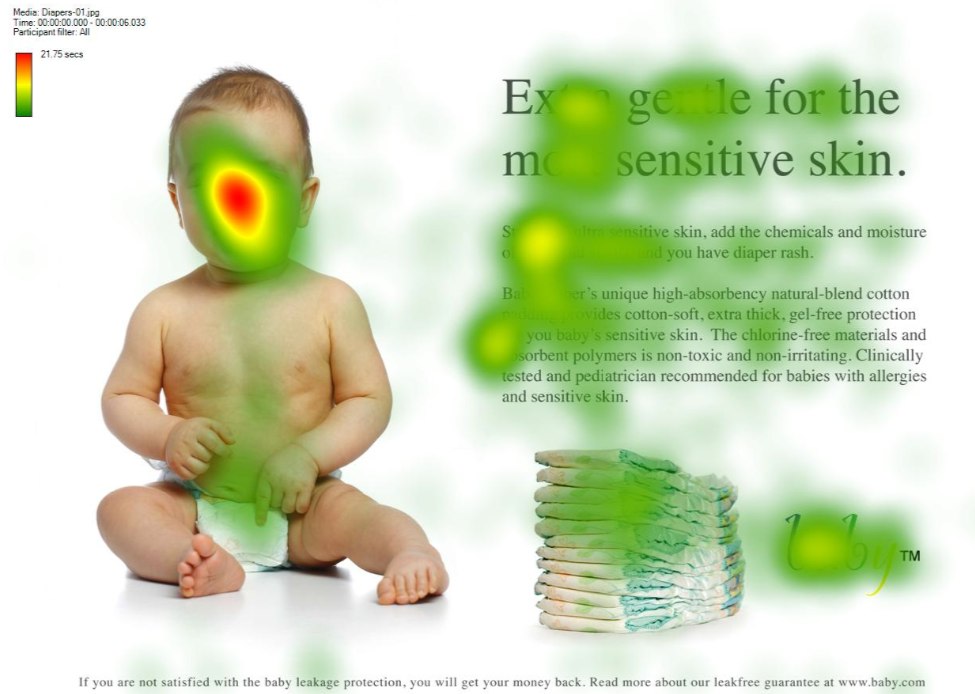
What you see on this visual heatmap is a classic example of facial distraction. People will look back at the baby’s face a lot more than they’ll actually read the text. This works for any kind of picture of a person. It doesn’t have to be a baby. It doesn’t even have to be a real person; avatars such as the ones we use will render the same effect!
So I shouldn’t use pictures of people?
Of course you should! Adding pictures of people to your website adds credibility and a sort of personality to your site. As long as it aren’t stock photos. All I’m saying is that you should make these pictures work for you.
When babies are about 9 months old, their mothers will start pointing and looking at objects to try and direct the baby’s attention to that object. This is called joint attention. And this is exactly the process you should be using to direct your visitors’ gazes to where you want them to go. The follow picture will probably explain it much better than I can:
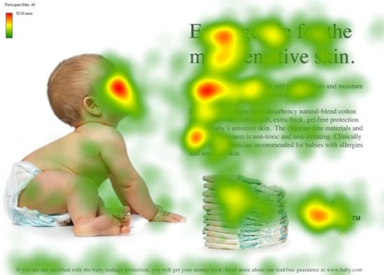
As you can see, people will look where the baby is looking. Again, this works with just about anything that we can recognize as a (depiction of a) human face. You might’ve noticed our WordPress plugins page has avatars that are all looking toward the text. This is no coincidence ;)

So definitely show pictures of people on your website, but also make sure they’re not distracting your visitors. Have these pictures help you direct your visitors’ attention instead.
Perceptual incongruence
The third aspect of visual attention I want to discuss is my personal favorite, probably because it’s a difficult word. However, the psychology behind it is pretty cool as well. Perceptual incongruence is basically a process where we automatically pay attention to things we don’t understand. Let me show you a video to try and explain it:
12 seconds into the video, you’ll notice that a glass is tilted sideways, without the liquid spilling out. This is something that our brain interprets as ‘weird’. It is not what’s supposed to happen, so we automatically and involuntarily pay attention to it. And for the ones who think this is just a fluke or a gimmick: within 5 seconds the Bacardi logo pops up.
However, you should be careful with this process. If there are a lot of distractions from this perceptual incongruence, such as other moving or bright elements on your website, its effect could be negated. The perceptual incongruence process will be negated by another process called ‘selective attention’. People should not be able to easily focus on, or be distracted by, other things. Simply because this would mean they won’t see the unexpected element which should trigger the perceptual incongruence process. This is all probably best explained by another video:
Did you notice anything strange? Most people actually don’t. And that’s because people were specifically instructed not to take notice of anything else. So the key here is to surprise your visitors in a place where there aren’t any (or a lot of) other distractions. If you surprise them there, they will pay attention. And once you’ve got their attention, be sure that you make it count!
Over to you
These are just a few of the psychological and visual triggers you can use to direct your visitors’ gaze and attention. Maybe you’ve heard about a few others that you thought were awesome? Or maybe you have something to say about this post? Let me know!

Highly agree with triangle shape attention, you can see this if some one wear the t-shirt with triangle neck. Now, i appreciate about this psycology to website. It’s great! Thank to writer.
Hi Thijs, yes im 100% agreed with you not only the text its image make visitor comfort with our website. Just like in yoast website, im watching the right top images always changing in every pages. Thanks
It’s surprising the psychology behind a call to action and clicking on buttons. I think the marketing tips from “real world” are valid for internet but in my opinion for conversion using visual tricks “less is more”. Very interesting article.
I learned about this in photo composition, but with websites, I never thought about this. What a revelation!
Thanks.
Just what I needed to read. I’ve got a meeting with a client next week to redesign their layout to maximise conversions.
This was a great revision on a few visual techniques that have worked for us in the past!
Cheers!
Thanks a lot Baz! :)
Thanks for the very informative post! You guys are making a habit of taking a complex topic and breaking it down into easy to follow advice and actionable steps.
Do you have any thoughts on how to best incorporate images of people into eCommerce websites that sell physical products? For example knives, or kitchenwares, or chocolates, basically a product that doesn’t lend itself to human models as easily as Jewellery, or Clothing, etc.
Thanks!
Thanks for the praise Ben!
One of the things that I feel a lot of ecommerce sites forget, is to simply use people to show the products in their context. So, if you’re selling knives, show pictures of people using that knife.
People tend to like products better if they can imagine themselves using them. And imagining themselves using products only becomes easier if you show how other people (the people in those pictures) are using them!
Does that make sense?
The joint attention theory works more for the baby than Joost’s avatar.
When I see those two avatars I’m fascinated on how nicely they portray expressions that I don’t bother looking where they are looking :-)
Haha, I’ll take this as a compliment in our illustrator’s direction! ;) Thanks!
Great post Thijs!
I am a partner in a marketing company and head of web design and analytics, but also a psychologist. I spend so much time explaining the importance of psychology to our clients.
Nice to see this is supported by our favorite SEO plugin!
Cheers and well done :)
Thanks a lot Tracey! :)
Awesome post, Thijs!
These same techniques can be applied to ppc campaigns and advertisements on facebook and elsewhere. Using pictures that point to or direct people to your ad copy or call to action can lead to a huge jump in overall CTR and conversions.
While this post is more about usable techniques and not about making changes, I would add that a good practice for new site owners to implement is to NOT go crazy making all kinds of changes to images, text content, and colors, etc. all at once. Change one thing at a time. Test it. Be patient. If it works better for you then go back and adjust another thing. Test it, so on and so forth. All of these kind of tips and more have been covered in previous posts in this category. So if you are a new site owner or a new visitor to this site definitely check those posts out! Extremely useful info.
Thanks for explaining the psychology behind the clicks! It is important for people to know and understand that this is more than reports, numbers and graphs, etc. There absolutely is psychology behind it all. It’s easy to see that making slight, simple changes to one’s website like those you mentioned above can make a WORLD of difference… to CTR and conversions.
I would love to see an in-depth post/study on using different colors on a site and their impact on conversions. i.e. the use of what’s known in the industry as “Amazon Orange” that we all know and love so much, and why it and other colors work the way they do.
Thanks a lot for the kind words Erik!
About your interest in a post on colors: this is something that a lot of people are interested in, it seems, so I might do a post, but all the studies are so different in their results that I don’t really know what to believe… If I find anything I can believe in, I’ll surely write a post! And otherwise we’ll start conducting our own study! ;)