Guidelines & downloads
Brand resource center
Dive into the Yoast brand and all of our design choices, and find everything you need right here.
What’s behind the yoast brand
Brand foundation
We are Yoast and our mission is SEO for everyone
We believe in creating equal chances for everyone in the search results.
Brand values
Brand is comprehensive. We incorporate the brand values in our design principles, but it’s much more than that. It’s being present and approachable at WordCamps, it’s being positive and helpful when providing support, and it’s the tone of voice when writing a blog post.
Design principles
Our design principles are a derivative of our culture at Yoast and are something that our users would recognize us by. But also something that can serve as a mindset when working on a design. All our users need to feel welcome when using our products.
Recognizable & colorful
Logos and icons
The Yoast brand has one main logo (wordmark) and an icon. You can find relevant versions in the zip file below, including specific files for both online usage and print.
Copyright: The Yoast logos and icons may only be used as a reference in a way that no harm is done to the Yoast brand. They can not be used to suggest a false relation to the brand and/or company.
Download logos & icons
Logo variations
Here you see a couple of variations of the Yoast logo. You can find the relevant versions in the zip file, including specific files for both online usage and print.
Logo with tagline
Yoast SEO Academy logo
Yoast pride logo
Yoast pride icon
Read more about why we believe so strongly in the importance of pride at Yoast.
Download logos, icons & guidelines ** We’ve compressed these files into one zip file (16 MB)
Do’s and don’ts
The logo can not be altered in any way. Choose the right size, the right logo for the right background, and make sure to use enough whitespace around the logo or the icon. You can find all the specifics in the pdf that’s included in the zip file.
Did you know?

The Yoast logo origin
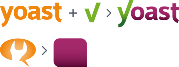
The Yoast logo got a redesign in 2015, the year the color orange was changed into green and purple. The wordmark is a combination of the old wordmark and a checkmark. The background of the icon is a stylized version of the speech bubble from the old logo.
Positive, colorful, enthusiastic, diverse & accessible
Brand colors
Our design principles form the basis for the Yoast brand color choice. Our brand must radiate positivity and enthusiasm, and the Yoast colors are a big part of that.
Main brand colors
You can find the two main brand colors in our logos’ and icon. Online we use an additional purple to make the gradient you see on the Yoast website. You can find more information about our secondary colors and color contrast in the downloadable PDF file.

#77B227

#A61E69

#5D237A – #A61E69

Rainbow
Our writing is accessible to everyone
Tone of voice
If you’re writing, try to be enthusiastic, informal, knowledgeable, helpful, friendly, and playful.
Inclusive language
We make an effort to write as inclusive as possible. So when you’re writing content for Yoast, keep inclusive language in mind. By writing more inclusively, you open up your content to more people and make it relatable for everyone. You can actually use the inclusive language check in Yoast SEO to get feedback on how inclusive your text is.
