The making of an illustration for Yoast
As a regular visitor of yoast.com, you probably know a lot of our branding is based on the use of illustrations. And, I’ve had the pleasure to make a lot of them over the past 7 years. Recently, I was asked to show a bit more of my illustration process. In this blog post, I’m going to tell you how I develop an image from start to finish. As most of my process can be a bit chaotic, I’ve broken it down into several steps for this post.
The assignment
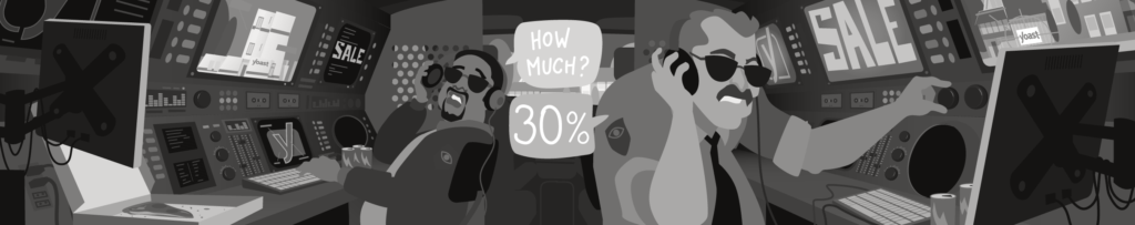
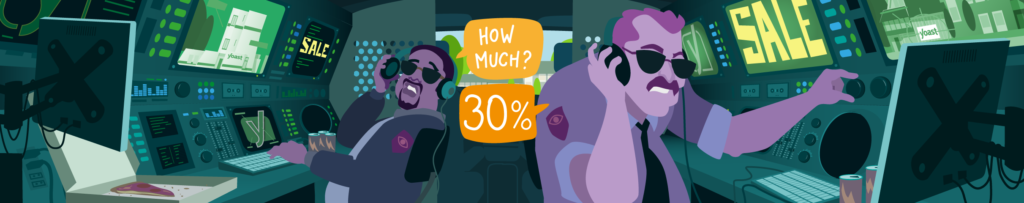
The marketing department asked me to make a new homepage illustration to support the 2019 Black Friday sale. The only set elements that the illustration had to have were the sale itself and the discount percentage. Before I started, I already knew some things that would affect the illustration.
First the dimensions. While most blog post illustrations on yoast.com are 1200 x 628 pixels, the homepage image is 2424 x 480 pixels. This means a different approach to the overall composition because it is much wider than the usual illustrations. The responsiveness of the website itself would also be a factor to take into account. The sides of the image would be cut off when viewed on a mobile device.
Then, the sale itself. Normally the only function of the homepage illustration is to show a bit of the playfulness of the Yoast brand. But, this image also had to promote a sale and, therefore, attract attention. By design, the homepage tries to directly guide visitors to the items they are looking for, so my design had to take that into account.
I knew that the sale would be promoted in several places at the same time. There would be posts on the website and social media. This meant that the sale wasn’t solely depending on this image, therefore I still had some freedom in the subject matter of the image itself.
Research
In this phase, I usually start by reading the concept blog post the illustration has to accompany, just to get a feel of the general direction the text is going. If a text is not yet written or available like in this case, I will do some research on the subject myself. A small internet search or asking the author a quick question is usually enough to get a grasp on the subject matter.
It can also be meaningful to see how others dealt with the same subject. This way I, can try to avoid the most common clichés associated with the subject. To make an image stand out often means presenting something people haven’t seen yet in connection with a particular subject.
Finding ideas
Coming up with an interesting idea can be a mysterious process. Sometimes an idea pops up immediately. Other times, it takes a little while to let the subject matter settle in my brain and let my subconscious make connections.
As an illustrator, I found that having a broad knowledge and basic understanding of things is a real advantage. Looking beyond my own working field gives me a vast range of things to pick from and make connections that engage the viewer with something fun or new.
Whether it’s popular media like movies, comics, and games or classic stories, politics, science, nature, household appliances, etc. I’ll try to be aware of it all without having to become an expert. Even with the most basic knowledge about something, I will know where to look when I need additional information.
I don’t have an eidetic memory – like Sheldon Cooper in the Big Bang Theory – so I’ve built up some archives to store stuff I find inspirational. My main two apps for this are Pinterest and Pocket. And if that doesn’t help, the image search on Google is my best friend. Although all knowledge of the world can be found on the web nowadays, it saves a lot of time to know where to start.
Keywords and scribbles
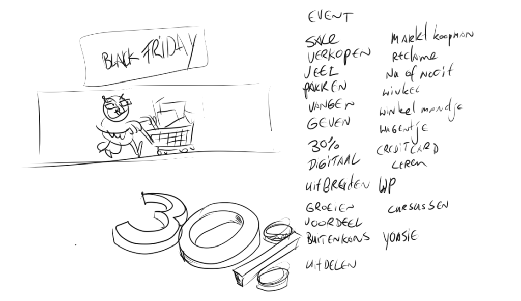
Depending on the deadline, I can let an idea grow organically or try to force it out. The latter means just sitting down, getting a clear head, avoid distractions, focus on the subject and start scribbling and writing. I find the combination of these two methods the most pleasant.
I’ll write down as many keywords as I can come up with and meanwhile make little sketches of situations that I associate with those words. This way I, can quickly dismiss ideas that are bland, overused, too negative or simply just don’t work as an image. Using these two methods together means they can feed off each other and one idea can lead to another until I find an idea I’m pleased with.
For the homepage image, I wanted to make a fun image that didn’t have much to do with shopping. That would be the main theme of the day anyway.
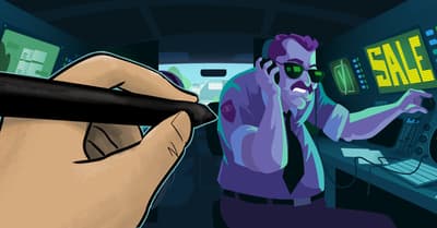
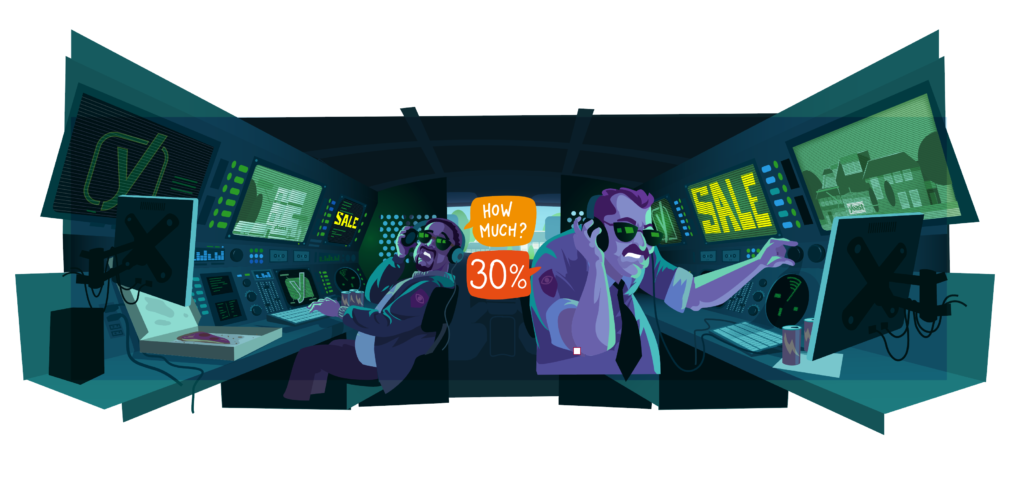
I started to think about how people anticipate Black Friday. Many keep a close eye on the sites they expect to buy something from during the sale, so I came up with the idea of a stakeout. Instead of customers keeping a close watch on our website, there would be some cops spying on the Yoast offices. Through their hi-tech equipment, they would then learn about the upcoming sale. This isn’t a standard situation associated with shopping.
My goal was to engage the viewers curiosity and get their attention, in spite of all the other elements on the homepage screaming to get noticed.
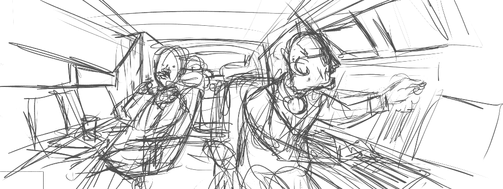
Sketching
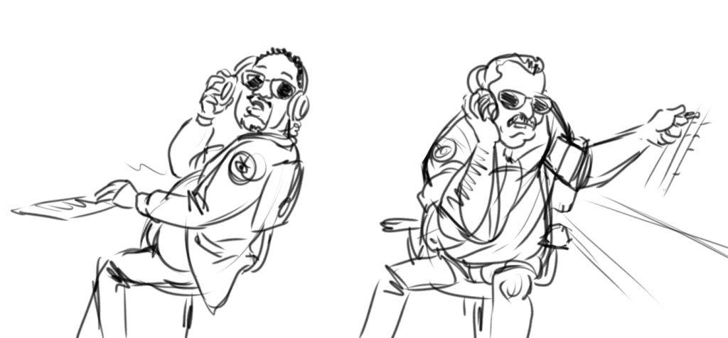
After the main idea finally emerged, the next phase came up: translating the basic scribble into a sketch that others can understand. Whatever I come up with has to be approved by the department or person that gives me the assignment. The sketch has to make clear what story I’m trying to tell with the illustration and how it connects with the main text.
To avoid getting stuck in details or taking too much time rendering the sketch I mostly draw in apps that have a limited number of tools. On the desktop that is mainly Mischief. A simple app with an infinite artboard, a few drawing tools and layers without layer styles like multiply, overlay, etc. Sadly it is discontinued so I’ll have to look for a replacement soon. On my iPad, I like to use Procreate or Concepts.
Composition
In the Homepage sketch, I focused mostly on the composition. As the most relevant information had to be visible in every size, I’ve put the focus in the middle of the image. It had to be clear what the message (sale) and the subject (stakeout) were. The sides of the image would be used for additional elements that supported the story but could also be missed.
I searched for some documentation about surveillance vans online to get familiar with typical elements that would make the situation instantly recognizable.
The stage of the story, the inside of a van, and the focus on the center, made the choice for the composition easy. With a one-point perspective, all the lines (visible and invisible) would automatically point to the middle.
The scene was also divided into three spaces: The back of the van where the cops are, the front cabin of the van and the office outside. Together these spaces gave an illusion of depth and also placed the focus on the middle of the picture.
Story design
With the composition determined the next task was designing the scene and characters so that they supported and enhanced the story. Telling a story means carefully placing all the elements in the picture so that the situation is clear within a single glance. As an illustrator, I am a set designer, character designer, camera operator, and director combined.
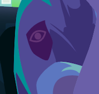
The two characters needed to look like typical cops that do this work all the time. I’ve used some stereotypes to emphasize this. If you watch a lot of cop shows on TV, you probably know the type. I made them middle-aged and not too athletic. Clothing, sunglasses and facial hair all added to the character.
The inside of the van I filled with screens, buttons and other hi-tech looking elements that gave the impression of spy equipment without being very exact or realistic. Sure, I could have made an exact copy of a real surveillance van, but that would have taken a lot more time to make. And, it wouldn’t necessarily add anything to the story. As the style would be a bit cartoony this was something I probably could get away with.
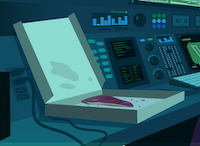
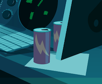
I added some empty energy drink cans and an almost empty pizza box. This supported the story that these cops were there for a longer period of time.
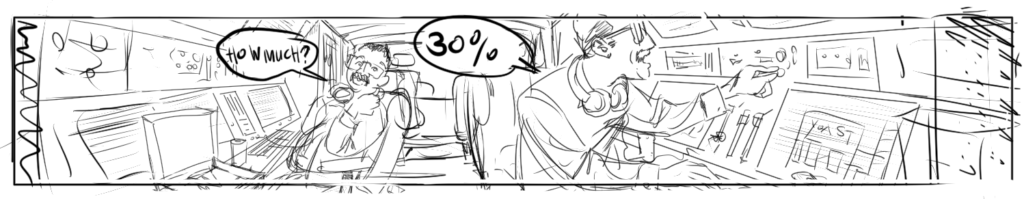
The screens would show the sale, the Yoast logo and some of our offices.
By adding the speech balloons two characters would not only have some interaction with each other but also introduced two distinct elements that weren’t part of the scene and therefore get the viewer’s attention.
Finalizing the illustration
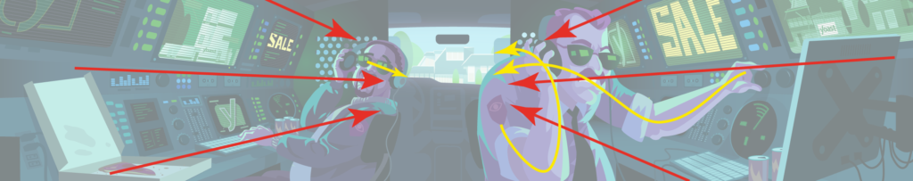
After the sketch was approved, it was time to turn the sketch into the final illustration. Although the composition was set, I still had to make some other creative decisions. I imported the sketch as a PNG into an artboard in Adobe Illustrator and set the layer to multiply. This way only the dark lines in the sketch would be visible. I could then trace the image with the sketch on top.
In the middle of the process, I decided that the pose of the cop with the mustache wasn’t expressive enough. Drawing digitally means that I can add as many layers as I want. So I made a new sketch of the two cops and imported it in a new layer and traced only the background of the original sketch.
Vectors
Working in Illustrator is a bit different than drawing in Photoshop. Instead of drawing or painting with pixels I draw in vector shapes. Every element in the image is a shape on its own layer that can be infinitely adjusted. This gives me full freedom to tweak the shape, position, and color of every element until I’m satisfied with the overall image. One of the dangers of this is that you can get lost in the details before the basic construction of the image is finished.
Working with vector shapes also means that the image can be scaled to every size without losing any sharpness. This can be an advantage when an image is used in various sizes. A lot of the images on yoast.com are often used in large-screen presentations where they need to be at least 4K to stay sharp.
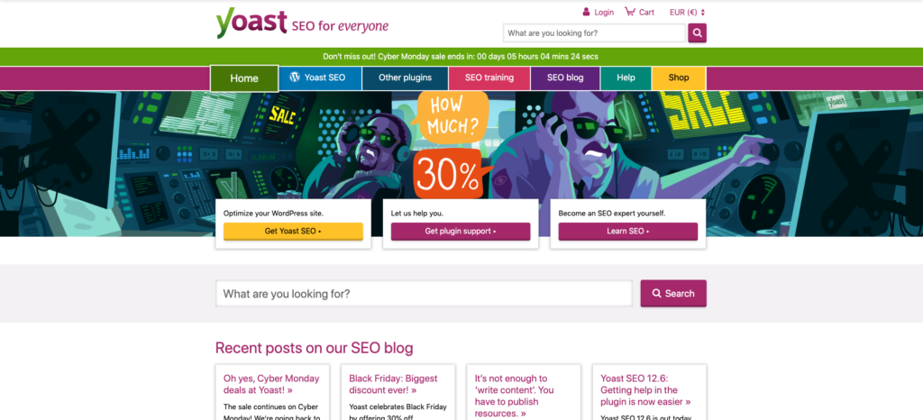
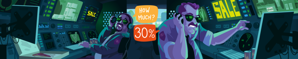
With vector shapes, I draw well beyond the borders of the image, most of the time. When needed I can move the whole image, or certain elements, within the frame without having to redraw a lot. It also makes delivering the image in another aspect ratio easier if this is requested. It was very easy to make the featured image at the top of this post because of this.
Colors
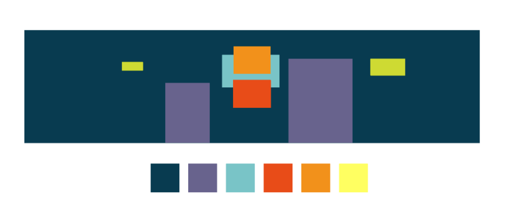
As the image would contain a lot of elements, I first built the interior of the van with shapes in different grey tones. This way I could determine the overall lighting of the scene.
I quickly decided to darken the interior of the van so most of the light would come from the screens and the window. The dark scene sets the mood, making the two cops more mysterious and secretive. A bright interior would lose this effect. Not only would the dark-light contrast guide the viewer to the lighter elements in the image, it created a nice contrast with the rest of the homepage too.
I gave the main elements a larger contrast with the background than the secondary elements, like the cops and their equipment. This way the visual hierarchy would be clear in one glance.
This hierarchy was then enhanced by adding a complementary color scheme. The elements that had to stand out were given very bright and saturated orange hues. The rest of the image got darker green, blue and purple hues blending all random shapes together into one group.
Dark contrasts with the rest of the page
With all the flat colors filled in the final step was fine-tuning the image by adding shadows and lighting effects. This would help the scene get even more depth and add more mood to the overall picture. After tweaking some last details, the illustration was finished.
Delivery
I saved it as a PNG file and ran it through an image optimizer. This made the file size as small as possible without losing any quality. I used to do this in ImageOptim but since then changed to Squoosh which gives me more control of the outcome when optimizing. And then my job for the 2019 Black Friday sale was done! The marketing department picked it up and made sure to place the image on the homepage and shared it on social media. And, off I went to work on new assignments.
To wrap things up
I hope this post has given you a better understanding of how an illustration on yoast.com comes to life. For me, it was insightful to write down my process. It forced me to think about how I make decisions, consciously and subconsciously. Sometimes, a certain way of working can become a habit so reflecting on that made me more aware of skills I need to loosen up and improve upon. Next to the variation in work, that’s one of the things I like most about being an illustrator — you never stop learning.
SEO for beginners webinar
Learn the essentials to start SEO confidently and boost your site’s visibility.
All Yoast SEO WebinarsWordCamp US 2026
Team Yoast is Attending, Sponsoring, Yoast Booth at WordCamp US 2026! Click through to see who will be there, what we will do, and more!
See where you can find us nextThe SEO Update by Yoast – August 2026
Expert analysis of the latest SEO & AI news developments with Carolyn Shelby and Alex Moss. Watch the update here. 📺
All Yoast SEO Podcasts
Very nice post, and illustration. I like read abaut. thank you
Erwin,
Thank you so much for this look into the creative process! Much of what you describe makes sense to me, as a photography, and by necessity as an “illustrator” for the technical documentation I’ve created. I never got to the level of complexity of your wonderful images, but I have thoroughly enjoyed every new one you create.
I have an all new challenge that may tap into my small reservoir of skills, and that, frankly, scares me a bit! I’ll take this article as my inspiration and apply your tips.
I hope you continue with Yoast and your amazing illustrations!
Mark