The a11y Monthly: Story of a toggle

This is the story of a little switch toggle, a custom HTML control we’ve recently implemented here at Yoast for our projects. Native HTML controls are always preferable, but we try to experiment and have a good balance between accessibility and good design. Wondering what custom controls are? Curious to see how modern design and web applications can also be accessible for everyone? In this post, I’ll try to explain how you can do that. Let’s debunk the myth that building accessible interfaces is hard.
Meet our friend the switch toggle
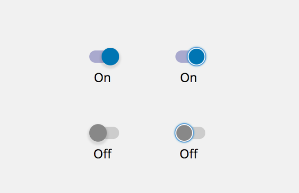
We’ve based our little switch toggle on Google’s material design guidelines. It’s a custom control to toggle the state of a setting. When clicked, it visually represents the changed state by moving a rounded thumb to the left or the right of its track.
There are several ways to build such a control with HTML and some scripting. From a logical point of view, our toggle has the same meaning and functionality of a native checkbox element. From an accessibility perspective, though, it’s made of elements with no native semantics such as div and span elements. How can we make it accessible? Some general considerations first.
Custom controls and widgets vs. native ones
People ask me what “native HTML” means as opposed to “custom widgets or controls” and how this relates to accessibility. “Native HTML” is a jargon term used to state anything that is in the HTML specification. When related to user interface controls, it is often used for elements that have built in keyboard interactivity and proper semantics: form fields, buttons, and so on.
Custom controls or “widgets” are any controls or interactive user interface components not specified in HTML. They have no built-in semantics and no predictable interaction models. With the advent of the so-called “rich internet applications” in the last years, we’ve seen an increasing number of such components. They’re often built using unsemantic elements like div and span, and JavaScript for interaction.
Importance for accessibility
Why is this important for accessibility? How do assistive technologies behave with native controls and custom widgets? I’ll try to explain this in non-technical terms.
Imagine you’re a developer and you have to build from scratch a brand new screen reader or speech recognition software. Where to start? How would you ensure your software can understand what’s on the screen and how to interact with it? Official specifications exist for this reason. You’ll start your work based on what the specifications say. This is the reason why a screen reader understands what, for example, an HTML form field or a button are and how to interact with them.
Native elements communicate to the browser what they are, their state and properties. The browser exposes this information to assistive technologies through the accessibility API. Well, at least this is the ideal process, but not everything is golden. The way Accessibility APIs work has evolved over time.
Of course, this is not possible with custom controls or widgets. When developing your new screen reader, it’s not possible to imagine what other developers build using non-standard elements and interaction models. After all, you’re not a mind reader. For this reason, your screen reader won’t be able to understand what, for example, a sliding panel is and how to interact with it or what a toggle switch is, unless…
Use WAI ARIA or don’t, or maybe…
WAI ARIA (for short, ARIA) is a W3C specification that tries to cover issues like this. The acronym stands for “Accessible Rich Internet Applications” where the word “Applications” should give you a clue about its purpose.
In a few words, ARIA provides proper semantics and predictable interaction models to user interface components (“widgets”) and controls that have no native accessibility because they don’t exist in the official specifications.
When to use ARIA?
When and how should you use ARIA? There’s some confusion around this. Sometimes people tend to think the more ARIA stuff you add in your projects, the more accessible it is. It doesn’t work this way. You shouldn’t think ARIA solves all your accessibility issues. There are five rules for ARIA use (at the time of writing the 5th rule is a work in progress). The first one states:
If you can use a native HTML element or attribute with the semantics and behavior you require already built in, instead of re-purposing an element and adding an ARIA role, state or property to make it accessible, then do so.
Simple enough: if you want your website or web application to have the highest possible level of accessibility, then always prefer native elements and controls. There are a few exceptions, though, and one of those states you can use ARIA:
If the visual design constraints rule out the use of a particular native element because the element cannot be styled as required.
Back to our little friend the switch toggle! That’s exactly our case. At Yoast, we know that a new design and user interface patterns can provide a better experience to our users. We also know that we can do this in an accessible way.
Build an accessible switch toggle
Many people think implementing accessibility is hard, but the process is very simple. In this case, we must provide our little component with the accessibility features it’s missing. We need to:
- Communicate to browsers what this control is
- Provide an accessible name to communicate the underlying setting/option
- Make it focusable and operable with a keyboard
- Use a focus style to make the keyboard focus visible
- Communicate its checked or unchecked state
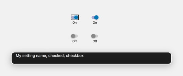
You can use ARIA roles to communicate the “what”. Our switch toggle changes the state of a setting or option. It’s comparable to a native HTML checkbox element. Thus, we give it an ARIA role of “checkbox”. Give it an accessible name via an aria-label attribute. We also set a tabindex attribute with a value of 0 to make it focusable. Also, we use some scripting to change the aria-checked property to communicate its state. Code speaks more than a thousand words:
[code]
<div tabindex="0" role="checkbox" aria-label="My setting name" aria-checked="false">
<span class="lbeQtx"></span>
</div>
[/code]
The inner span element is what we use for styling and has no impact on accessibility. Additionally, a visible text “On/Off” visually communicates the control state, while it is hidden from assistive technologies with an aria-hidden attribute. Worth reminding color alone is not enough to provide the state information.
It’s that easy and requires a few minutes of coding. This way, assistive technologies understand what this control is, they read out the name of the underlying setting and the state of the option. Here’s what a screen reader would announce;
Wrap up
Apart from our specific use case, I hope you can find some inspiration by reading this post. Accessibility is not so hard. Develop your applications with web standards and specifications, and you’re already on the right track! It’s all about communicating the same information you already communicate visually in a way that software can understand too and, through software, by people using that software.
Want to help?
At Yoast accessibility matters and we’re aware it’s a process based on continuous improvements, testing, iteration, and development. We’re always open to feedback and contributions. Please do not hesitate to let us hear your voice and please do report any issues or potential improvements you notice in our products.
Read more: Contributing to WordPress to spread accessibility culture »
At Yoast, I help improving Yoast's technology accessibility, spreading accessibility culture and blogging about it. I try to do my best to do the same for WordPress, where I'm contributing as a permanent core committer.

SEO for beginners webinar
Learn the essentials to start SEO confidently and boost your site’s visibility.
All Yoast SEO WebinarsWordCamp US 2026
Team Yoast is Attending, Sponsoring, Yoast Booth at WordCamp US 2026! Click through to see who will be there, what we will do, and more!
See where you can find us nextThe SEO Update by Yoast – August 2026
Expert analysis of the latest SEO & AI news developments with Carolyn Shelby and Alex Moss. Watch the update here. 📺
All Yoast SEO Podcasts